Thanks again @AMiller for the mockup. Which advert should I go for and how should I fix them up?
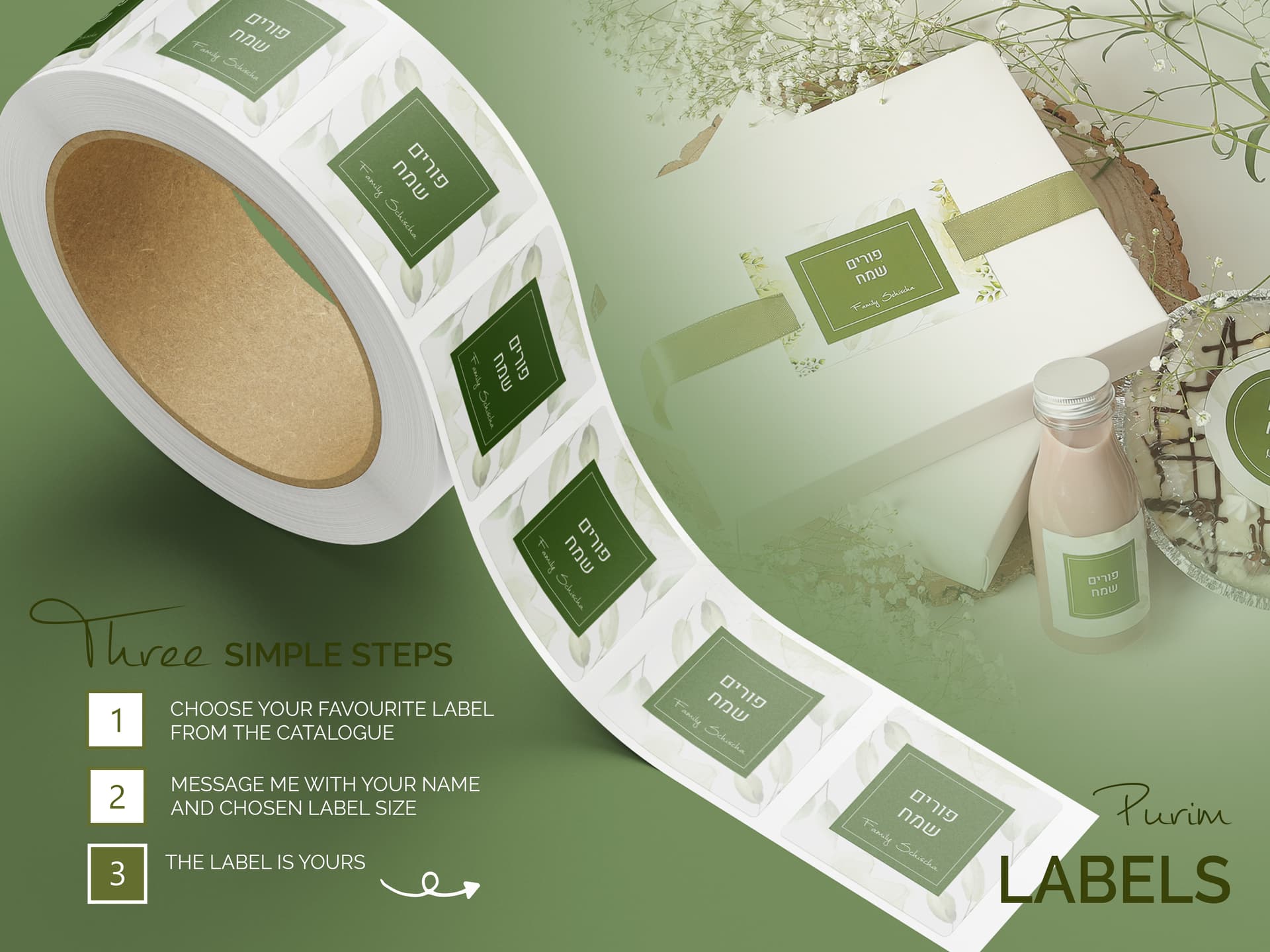
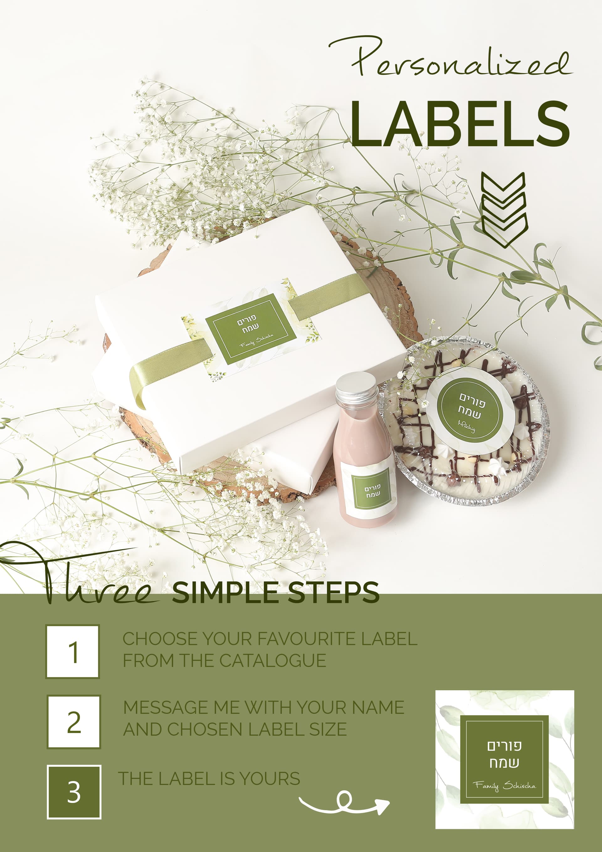
Love the dark one, #1.
Its extremely eye catching.
1 change: I would lower the words, “The label is yours” to be centered to the #3 and then move the arrow a bit more to the right.
Its really a nice ad!
And I need a label for Purim! Who’s the one who does the labels? I’d love to hire her, or him. Seems like a her based off of the color choice…
She’s getting a potential sale before the ad is up! That says something about your ad! Would it be ok to get me in touch with her?
Here are the corrections. Any way I could fix up the ‘purim labels’ - I don’t love the way it looks.

1 Like
 It is an advert for myself (I sell label designs every year and offer prints as well) You could check out the labels here and contact me through my site. However I did not post this to advertise myself-you could use my labels as inspiration and create your own.
1 Like
It looks really nice!
I am finding the dark green words a bit hard to see on the green.
What about sticking to one font for the tittles?
Your site it blocked by techloq you might want to ask them to categorize your site so that its not suspicious and blocked
You can try to email them
requests@techloq.com
wow beautiful ad!
maybe make the word Purim a bit bigger and bolder
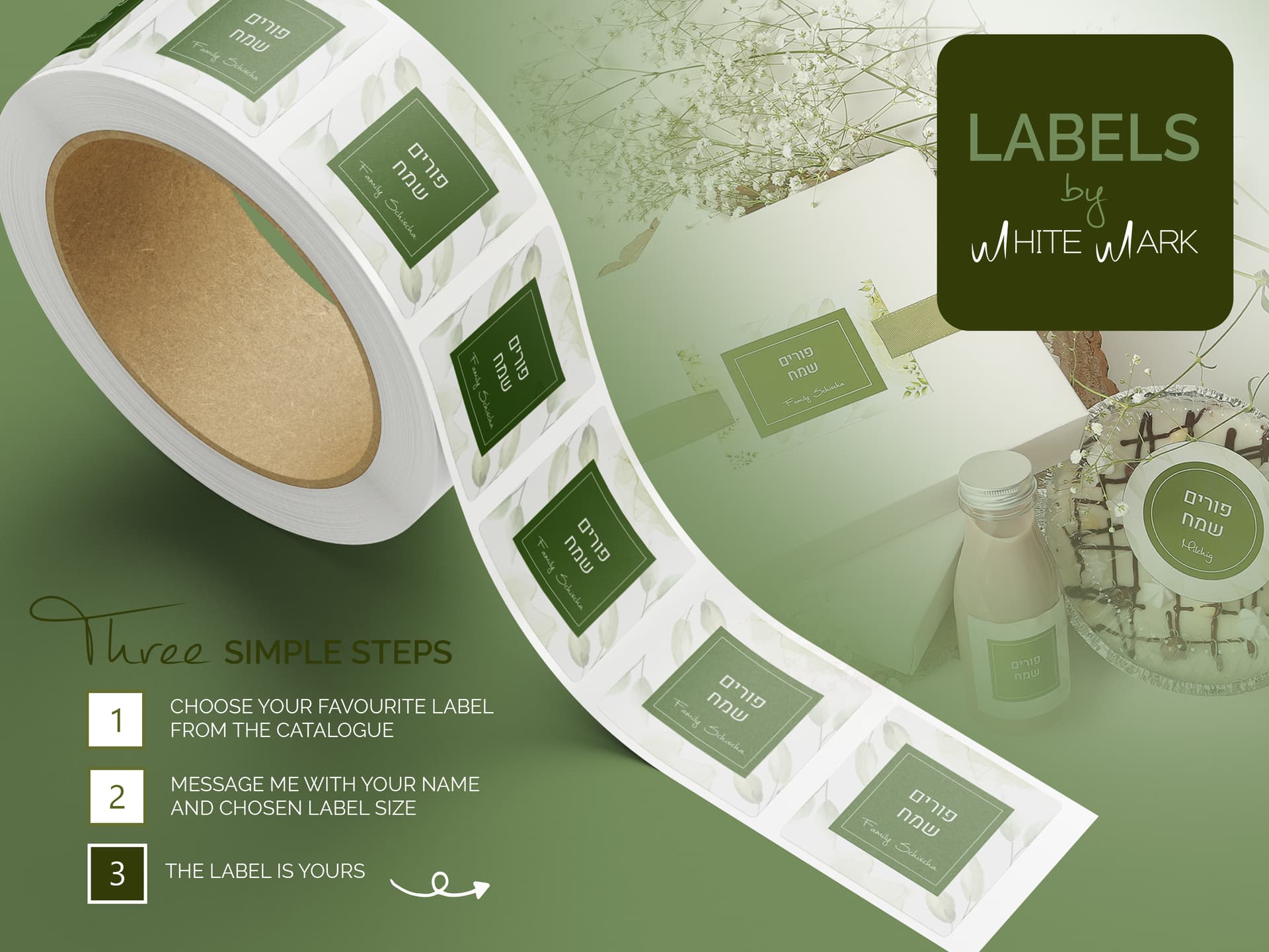
looks great! just double checking, is white mark your logo? it’s a little hard on the eye
I’m on a techloq computer now and it was actually working. Side note, anyone with an adobe portfolio website - ex. yourname.myportfolio.com - just know that techloq blocks your site since it is not categorized. It needs to be categorized somehow. I remember @malky-h mentioning something like that… you can prob find the thread…
@weiss4155 glad to help with the mockup! And both ads look amazing! I’m finding that the text that is green on green is a bit hard to read.
I contacted techloq and they said they will categorize it. Seems like that has been sorted. Should I change the green to white? Also do you prefer with the green box on right hand side or without? @hindigrinfeld I once worked on some logo’s for myself but ended up never using any. Somehow when it comes to your own logo it is way more challenging. This was one of them, I thought maybe I should start using, but I think I will just remove it.
@weiss4155 I understand… anything we do for ourselves has to be perfect…
i worked on my logo at the time with my teacher, it was super helpful.
Oh! I never thought you did, re advertise yourself! Just is very relevant to my current needs.