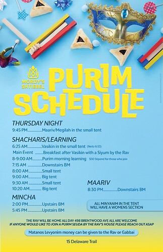
So purimdik and fun! Something with text on the bottom isnt looking so aligned, I think cause under the “DULE” there’s no text and alof of text by the other side.
Maybe you can bring up the bullet of All minyanim in the tent… to higher up and then the Maariv can align to the Mincha?
Yellow sometimes prints funny so maybe do a test run
Love the top look a lot!
I would work on the bottom text groups to make them neater / all the same way formated.
I would also take away the shadows behind the blue text boxes.
somehow the alignment of Main Event and 8-9:00 see a tad off.
Love the colors choice of the text and the headers.
Which font is the Purim Schedule?
Thanks will try all that
the font is DoubleBass
So good!
I would fade the yellow a little more sudeley
