Hi can I get some feedback on this ad
Thanks!

wow! Like it a lot!
wow looks rly good!! i would maybe make the line under together to be under the g rather than over it. maybe the whole illustration a bit smaller so the rest of the elements like the logo and wording has more breathing space. great job!!
Really neat!
I would take away the shadow from the gragger or make it much less opaque as everything else is flat.
and move the “making a difference” from the trees

Beautiful! nice job, Sim 
Maybe just tighten the leading by the Hebrew words (just a bit)
love how you did the underline of together.
can I see how it would look without the shadow under the gragger?
Thanks! Here’s with the leading tighter and no shadow under the gragger.
I feel like it’s dizzying without a shadow, no?
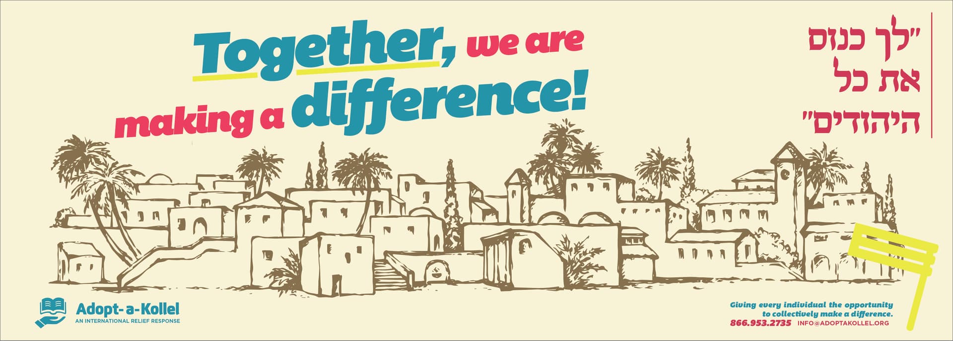
I think it’s a little hard to see the gragger without some sort of shadow.
Also I don’t know what there is to do but the space between the bottom two lines of hebrew looks bigger than the first two because of the ך and ל that extended into that space.
It’s really nice, where did you get that pic?
I actually like it without the shadow. It blends better into the ad.
At the end of the day it’s up to you.
Job well done!
Thanks, I’ll work on it.
The picture is actually straight off shutterstock