Hi,
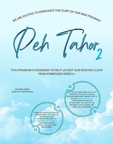
I created this ad (for personal use) and it seems rather plain and unbalanced. Any tips on how to make it more inviting and clear?
Thanks!
I would recommend using diff fonts
Maybe the Peh Tahor should be something bolder and more exciting, and the “Exciting Prizes…details” should be in some star or badge or something,
and the “We are excited…” should be a more exciting font as well, and slightly bigger.
Maybe “This program…speech” could be on a color strip at the bottom of the page (like blue or white)
Make the typography pop more, especially since the background image is nothing that stands out. Also, I first read it as Deh… So maybe change the font to something more readable.
I would also avoid a stroke around the text.

