Hi. I am working on this logo, any thoughts on it?
This is for a new publication.
I didn’t work on the colors yet, if anyone has any suggestions let me know.
Thanks.
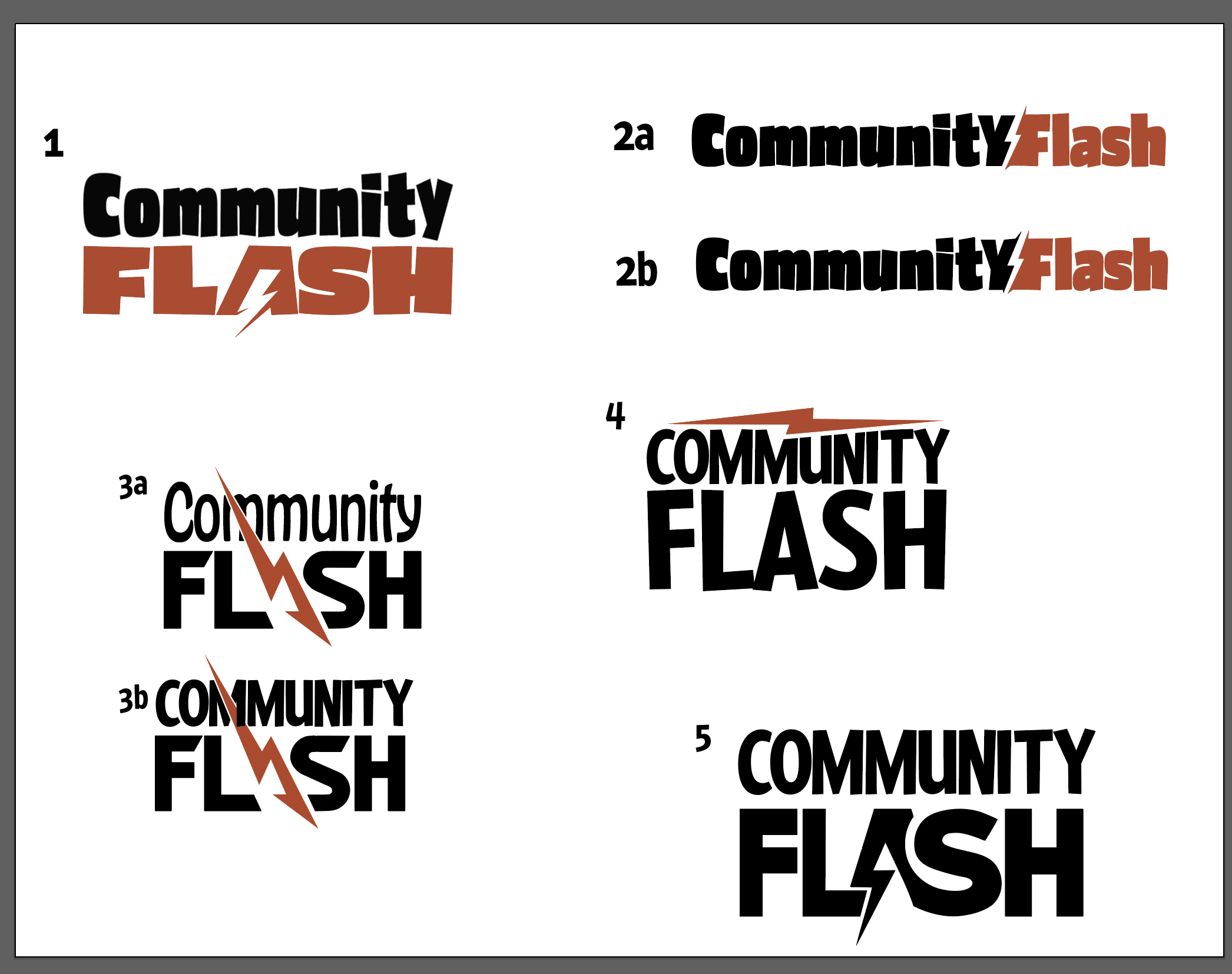
i like how you integrated the flash with the text in all of them - v.cleverly done!
I would say they are all a very similar style so if client wants a broad range of concepts, you may have to try some totally diff. ideas. But i guess you are closely following specifications they gave you.
It would be helpful to know who is the target audience? what are clients looking for? what kind of publication? then it would be easier to give feedback.
many of these fonts seem kinda young/comicy/child-like to me so if it’s for adults, i would consider a more formal font at least for one of the words. 3b could work for older but i’d probably space out the letters of community more.
I love 4 best. Next 5
but they are all really good.
It’s a weekly community advertising magazine.
My client specifically wanted a flash in the logo.
I like number 5 best
you could try yellow and blue although its probably flexible with colouring for this kind of project
Hi. My client decided that he doesn’t like the logo with the flash he rather wants a handshake. (he thinks the flash is too sharp)
Any thoughts on these.
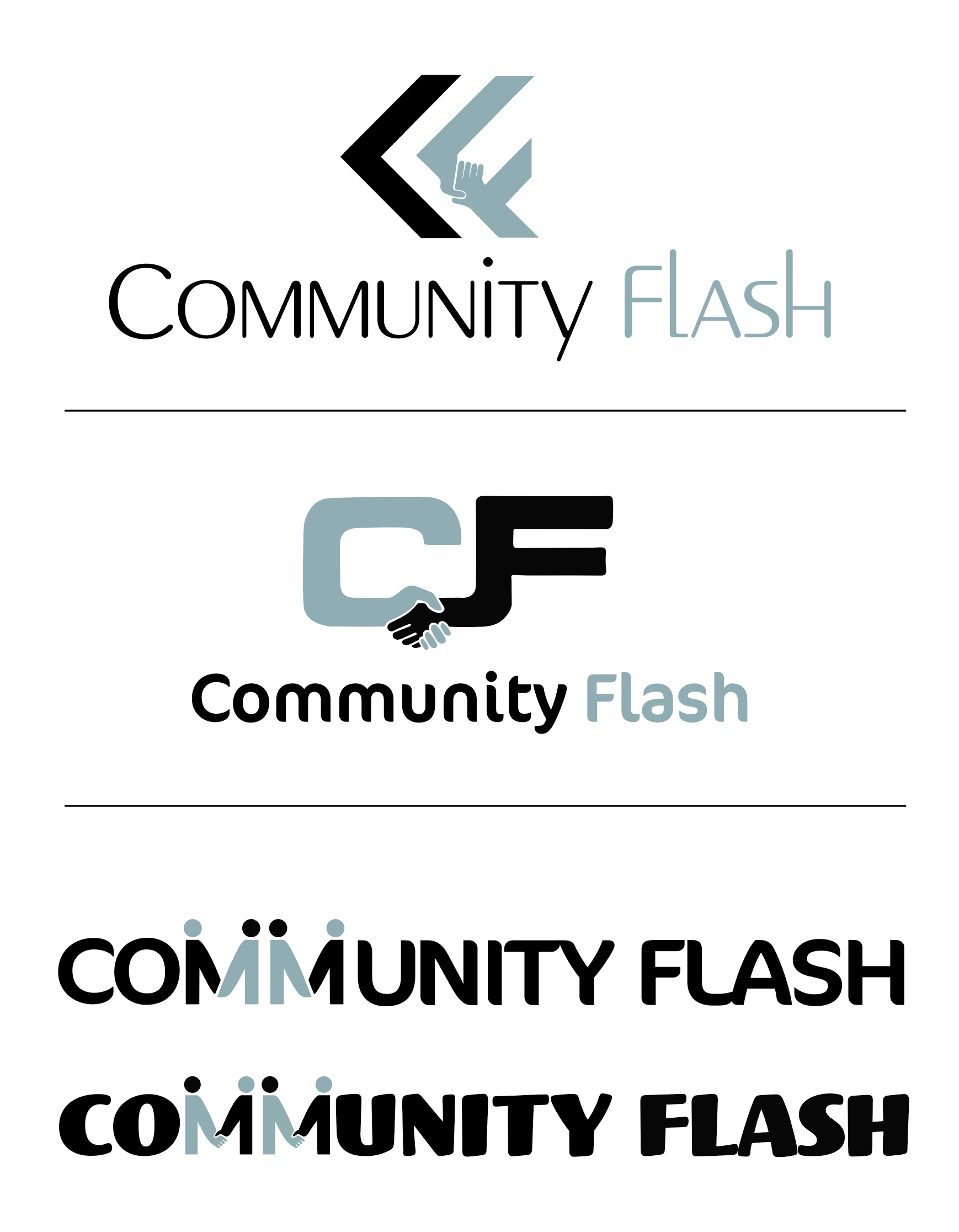
The middle option is amazing.
I really like the middle one
I vote the middle!
but why dont you send all three options to the client?
i think this one is the most professional looking - hands in a logo isn’t the most appealing…
Just work on the kerning!
Wow nice ideas!
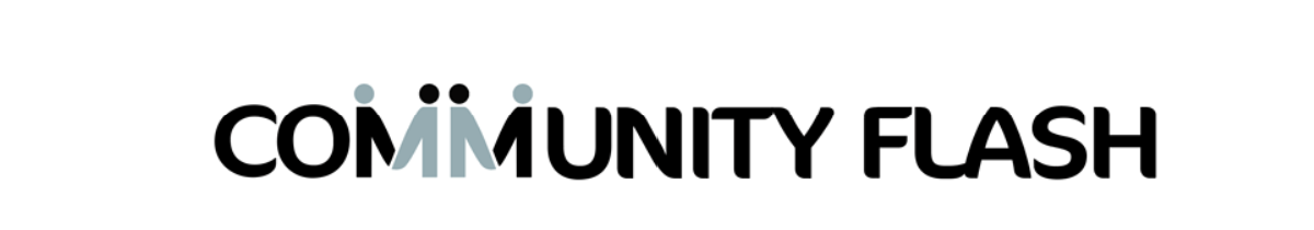
I agree with Malky, if you work aorund with the third option, maybe try increasing the size of the ‘M’ and have only 1 there, maybe it can be read as2 m’s since you have it divided.
I would also use a cleaner more professional font, this one seems a little “fun”.
You can also try working with this idea but with the words on separate lines.
Keep us posted!
Love them, but the third option is my favorite.
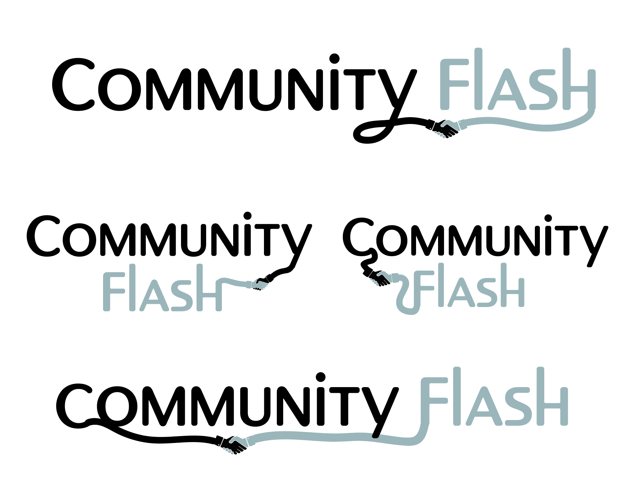
I sent all of them to him and he liked the middle option best but he wants the c and f part of the text like the below. Any ideas how I can make this look like a professional/modern/up do date.
The below is only a draft and just for the idea.
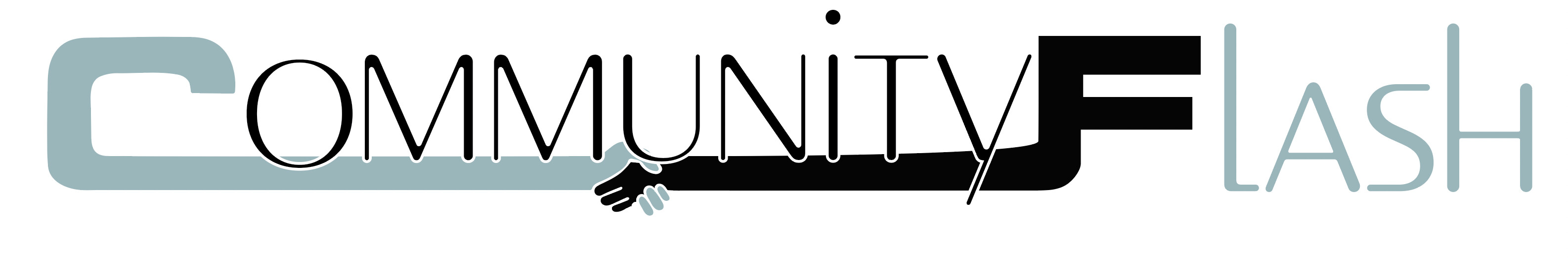
I would try it a little different. The same font for the whole logo, and take two different letters which are closer to each other and connect as you have done for the c and f. Maybe i would try the Y to the H curving over the FLAS. not sure if i am making too much sense…
I don’t love the use of so many different fonts… I really like to font used for LASH so would maybe try it out with that…
Sorry for the typo, “The font” not “to font”
I agree - there is too much going on here
I suggest making the word community all in grey and flash all in black and have the same font for ommunity and lash - I think you should actually make it a bold sans serif font - would look very sharp near the C and F
also - you can try another variation where the word flash is centered underneath the word community and still have the C and F shakings hands…it may make it look more unified
Hi.
Thanks everyone.
I tried all the options and I think the first one is the best, what do you think.
I hope my client likes it. ![]()
nice! I also like #1
I vote the first!
maybe fix the flow from the H to the blue arm to be a bit smoother.
I would suggest making the hands bigger in proportion to the words to make it more obvious.
I feel like it kind of looks like a wire plugged into an extension cord!
Maybe try connect the Y to the H from on top in a smooth curve, What i am thinking of is a little like the amazon smooth curve just upside down…