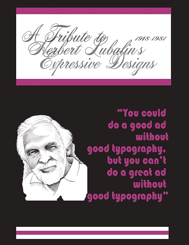
Hi. So I haven’t yet handed in my poster. I would love to hear your thoughts on it before I do. I don’t feel its fully finished but I do feel it’s pretty and its getting there. Why is it feminine? Because I originally thought of the Mother & Child logo of his and wanted that to be part of this. But since I don’t yet know if I have the capabilities to do that, I let it stay feminine and soft, but it’s still missing something, I think, no? Thoughts? Only constructive criticism is appreciated.
I still want to keep within the theme of his logo. Maybe change Expressive Designs to be more expressive in design. But can’t seem to come up with ideas. So I’m reaching out to you. Let me know what you think makes sense.
2 Things strike me right away, 1. its hard to read the top when its in cursive and overlayed text.
2. why doesn’t the design on the top and bottom go from edge to edge?
1 Like
Thanks for being the first to respond! Appreciate your feedback.
I will be changing expressive designs to a different font type. Would that be enough?
And not a bad idea, re putting the top and bottom boxes (is that what you’re referring to?) from edge to edge instead of in the middle. I’ll try it out and see if it makes it look better.

