Hi!
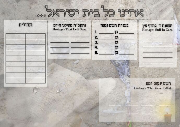
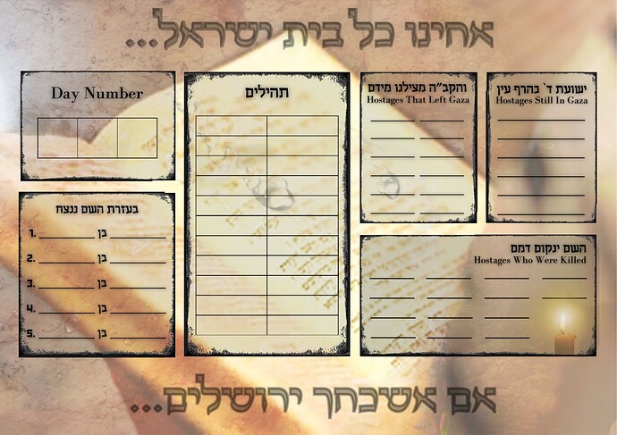
Someone asked me to make a poster like this to use in a High School. The Kosel design/siddur was the best I could think of to use for the background. I’m having a hard time figuring out where to put the words and how to make them fit better with the background.
If anyone has any other ideas for this, I’d love to hear!
Thanks in advance!
Really nice idea to do something like this!
The picture is great. It fits very well with the idea behind the poster.
I would recommend leaving more white space all around. If you are open to moving around the placement of the boxes, maybe you’d want to make some of them wider and shorter, instead of longer and wider. I think that might help create more space between everything.
I think bringing in more contrast will pull it together as well. An easy way to do that would be to swap the background for a dark one. Or to darken the text boxes more and lighten the text on top of them.
Thanks so much for your help!
This is what I have for now, but maybe I’ll try some of your ideas. Thanks!
The layout is much nicer now! Hatzlacha with whatever you decide to do!

