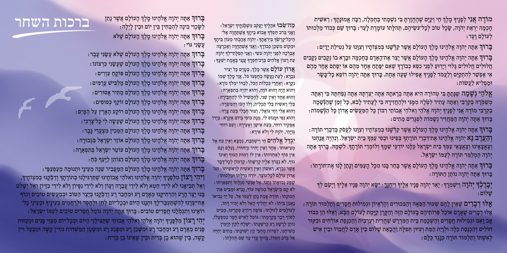
I am creating this birchos hashachar poster.
It’s purpose is to be hung in the kitchen so that a mother (for example: when trying to get the kids out the door) can daven brachos without feeling the need to daven by heart.
Therefor, the text needs to be clear and big enough to be read from a practical distance.
This poster attached is 28in/14in. The font is FrankRuehl, and the size of the main text is 28pt.
Is the text clear on the background?
How does the background look?
What do you say about making a verticle version? It has to be big, so which is more practical?
I want this poster to come out perfect, so please critique:)
Thank you!

The text looks very clear. I like that it’s horizontal and would keep it that way.
The birds are a little in the way, and they look a bit pixelated, though not sure if that’s just on my screen.
really like the colouring!
It looks nice! But if I would hang it in my kitchen I don’t think I’d want it to be purple but rather simple black etc. But that’s just a personal preference. Don’t get me wrong, it’s stunning! But it wouldn’t match ppls kitchens. I also feel like maybe it could use more contrast if it’s something you want ppl seeing easily and from far.
The order of the tefillos are in the boys version I think. I would put the 3 middle tefillos after Modeh Ani.
I would make the columns equal size
Also, maybe make the first word of each paragraph a bit bigger and bolder so it’s easier to see where each tefillah starts
Another idea, maybe the first word drop caps effect should be bolder or bigger so it’s noticeable what tefilla it is?
Lol Gitty! Great minds think alike 
lol 
if you are keeping the background colors as is, I would move the birds up to that empty space and make them a bit smaller like Gitty mentioned they’re in the way…
Maybe you could do 2 versions of this, 1 simple coloring and 1 like this?
Really nice!
also agree about bolding the first word to see where the Tefilla starts - it’ll make it easier to read…
About the coloring, I don’t think this will look bad if it’s hanging in the kitchen. Usually mothers have colorful projects from their kids on their fridge… this can also be placed somewhere there - I don’t think it really needs to match the kitchen…
Thank you! I will attach the updated version soon.
So I did make the first word/s bigger, but I guess not big enough.
There is no bold option, can I use the color “registration” instead of “black”? Would that work?
And regarding the order, I think everyone says it in a different order. There is no “right” way. So I won’t win no matter what order I choose!
Oh. And does anyone see the rooster?
Does it take away? Add? Not do anything?
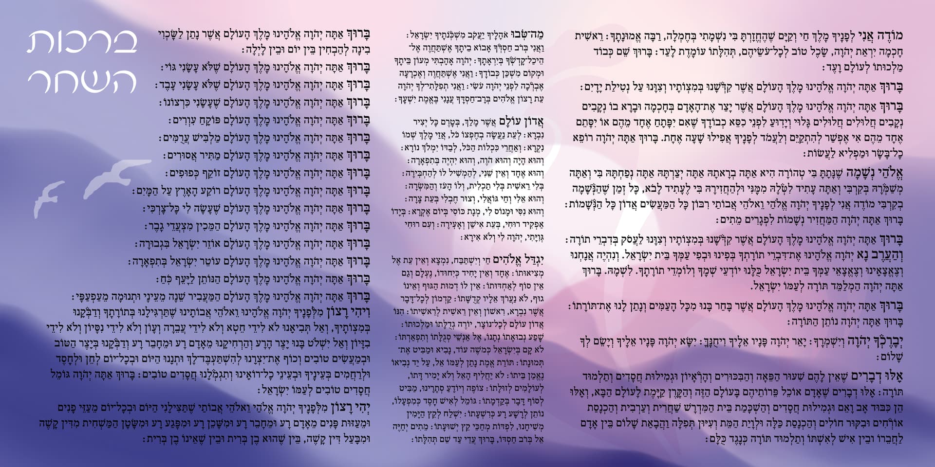
I don’t think it’ll help to do a “registration black” - maybe do every first letter in a color other than black but shouldn’t clash with the poster. (you can possible eyedrop from the center of the poster that white / light pink color but its very possible that it wont look good or that it would clash…)
I like that you moved the two birds away from the text… I think the title looks fine there… It fills up that space nicely…
About the rooster - I totally did not see it until you mentioned something… and its still hard to see a bit… but it might be good like that - like very subtle look - if its more obvious looking, it might make the poster look busier… right now it looks like some sort of sunrise…
Very nice! I’m finding it hard to read the text on the dark purple color. Maybe it’s my monitor, but if there is a way to lighten the background a bit I think it would be more readable especially from far.
Registration should never be used as a color for print
I imagined it being this big lucite banner for the wall which is why I mentioned about the color purple. Is it just a magnet for a fridge?
I think the title should be at the beginning of it… but you’re getting everyones opinions so I guess choose what you think makes sense. I do agree that the background (bottom area) is a drop too dark for the text…
Just catching up on this thread now.
Never use registration black, it is not a pure black rather an equal mixture of CMY and K. When it prints in a dull black. It is only used for printers to mark the printing (as in crop marks etc)
Make sure to use a real black so the color comes out strong.
Really nice poster otherwise and beautiful idea!
Thank you for all of the critique so far!
Ok. No registration:) That’s good to know.
Here is the updated version.
I lighted the darker purple.
I really wanted to make the first letter a different color, but taking a color from the poster doesn’t work because there will be somewhere where it won’t be visible since there are so many colors.
I tried going for a contrasting color, but you still don’t see it… So I went with this…
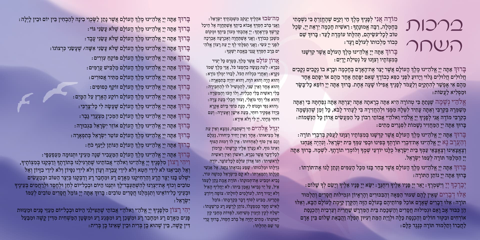
really nice!!!
Yes, love where you put the title now!
I also think the purple for the first words works, you can easily find your way between tefillos now!