Hi. Please see attached.
Any comments or suggestions.
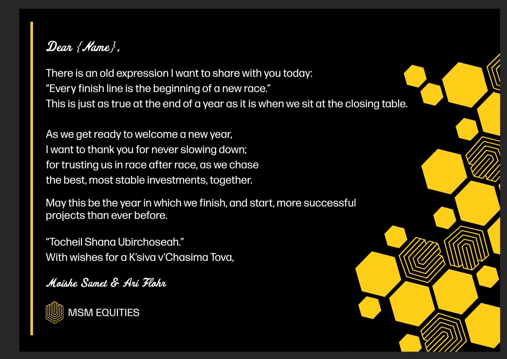
The design on the right is really cool! I think something is a little off with the line spacing. Maybe the first 3 lines should be closer together, then a paragraph space before the poem. Then you can have another small space, and then put “May this be” until till the end closer together.
You’ll also have more room to make the text bigger - it might look nicer if its bigger and comes closer to the design on the right. - Just a suggestion - not sure how it will look.
I love how you incorporated the logo in the honeycomb design! Very professional looking postcard
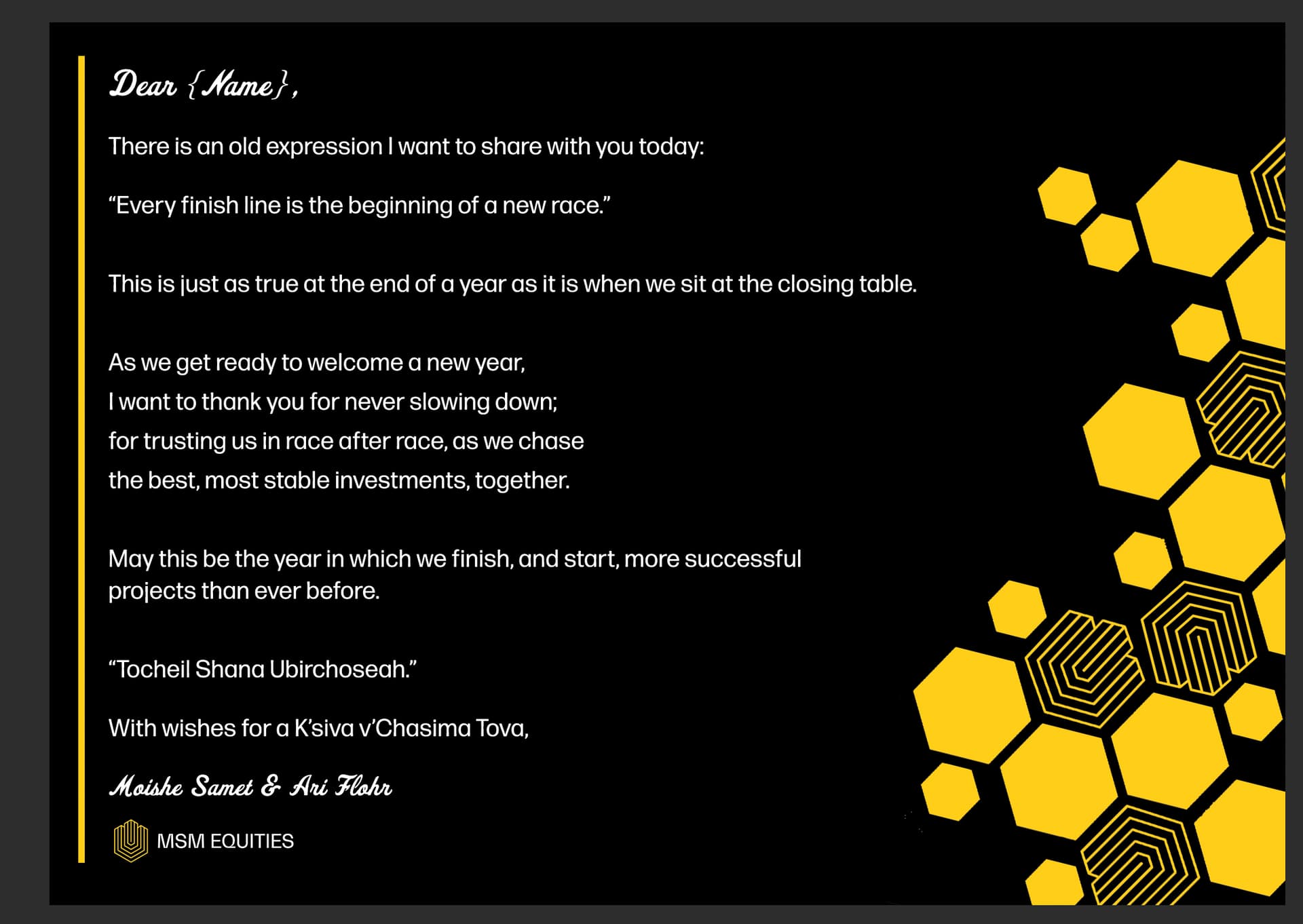
Much better! Really nice.
I like how you added that line on the left to help balance the card:)
Thanks.
Yes! Perfect!
really nice! great job!