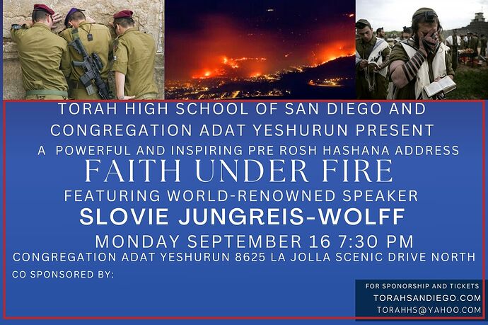
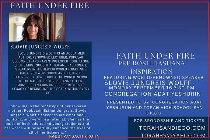
I am trying to create a postcard for an event for some reason it doesn’t look right any feedback or opinions
Is the red stroke part of the design?
Its hard to read all that text. You need to play around with all the text to enhance it and make it easy to read. “Torah high school of san diego and congregation adat yeshurun presents” should be smaller all on one line.
Then have a “powerful and inspiring pre rosh hashana address” align ontop of faith under fire.
Have" featuring world renowned speaker" smaller and starting a new section with date and time, and address.
Gluck!!
Main thing is it needs more spacing between the groups of information, so it doesn’t run together and is easier to follow.

