Hi
I’m so stuck with this postcard!
Would love to get some help to give it a finished look…
TIA!
Beautiful!
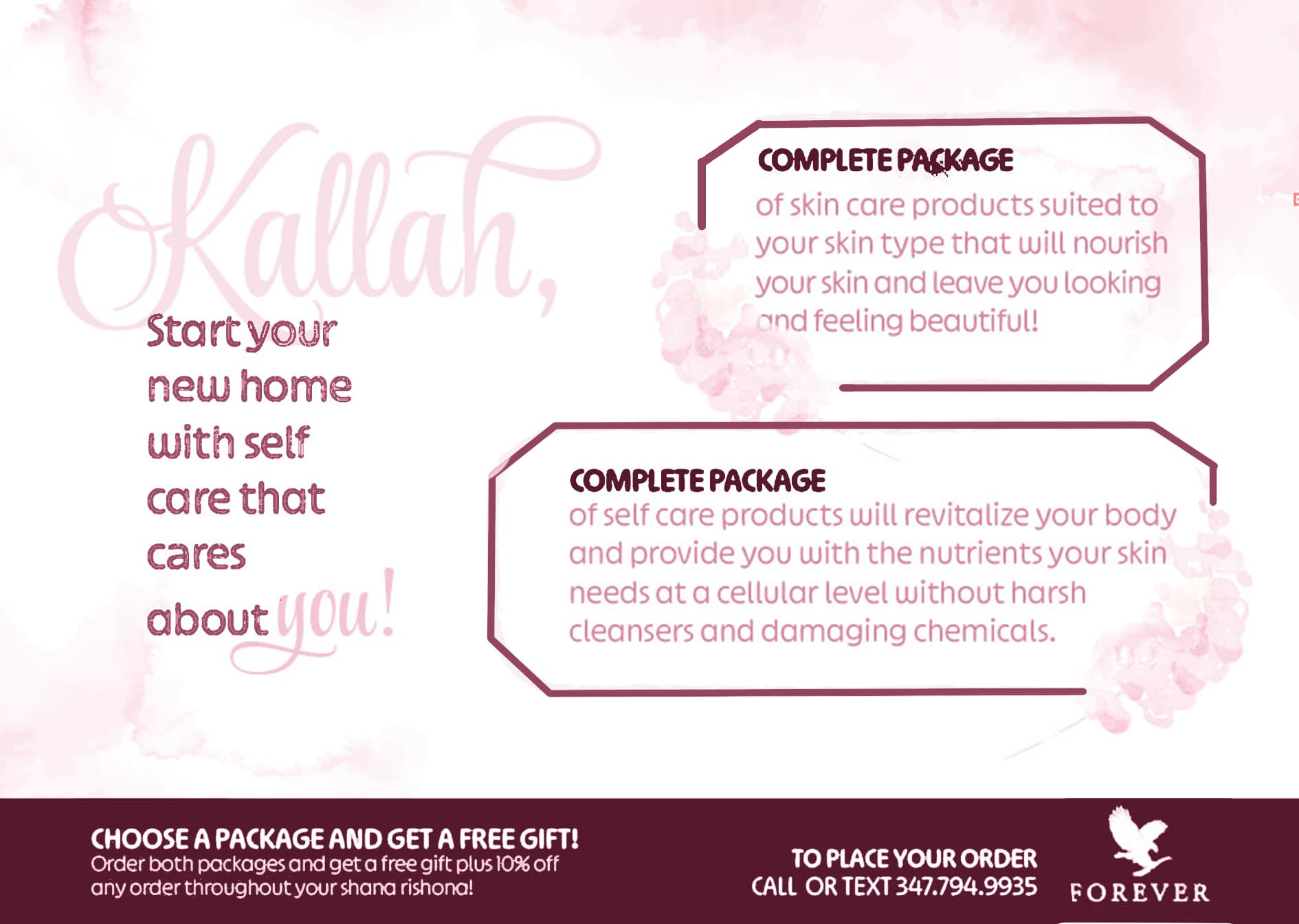
Instead of center aligning it, I would split it into two left aligned columns.
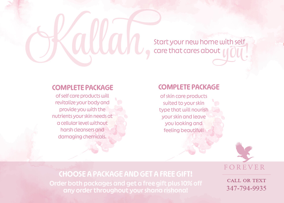
The Kallah, with start you new home on the left.
The two packages on the right.
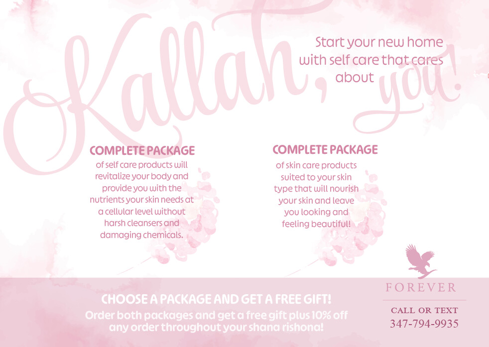
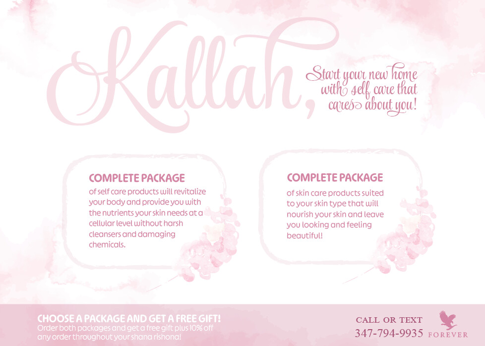
Another idea is to keep it centered, but to take away the box from the bottom, and place the two packages into two boxes.
Maybe give “kallah” and “you” an outline of the darker pink.
Also center the second paragrah with the heading.
I like it! To add some interest, I’d incorporate some of the above ideas, as well as add another colour. Even when keeping the monochromatic look, you can add another darker shade of this colour for contrast - right now it’s all quite light.
Yea I see what you mean, any ideas where I should put that added color?
Thanks!!! I’ll try
Can even be just for the package titles, I’d try changing a few parts and decide what looks best…
Thanks everyone, I really tried to listen to your advice:)!
How is it now? I feel it still needs a big yeshua don’t know with what tho…
I feel like the main thing it’s missing is contrast. The whole thing is light and nothing is quite dark. An idea to check contrast is to convert your design to grayscale and see how it looks like that…
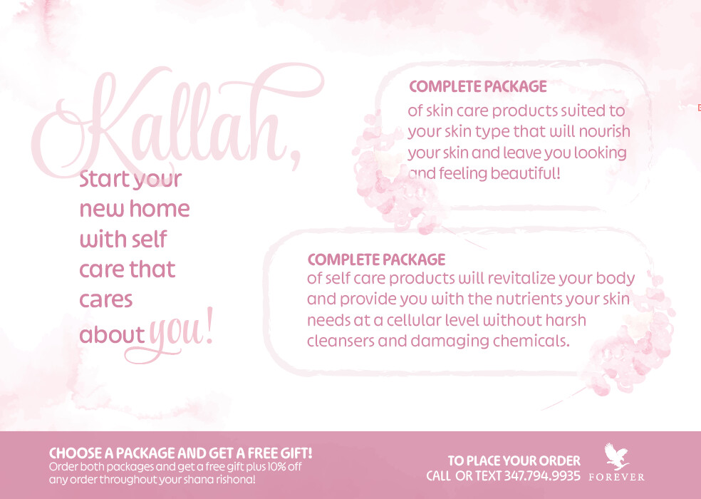
Also, it’s quite confusing to make a distinction between the 2 packages when they are both titled Complete Package…
I also prefer the second option where the subhead is not all script…
I think incorporating another darker shade will help, I’m not sure if you did that already or not…
Okay… lets try once more!
I think try to go much darker, like to maroon.
I meant a colour something like the one I incorporated here…
Feel free to add it to any area (or don’t use it at all ![]() ), I just tried this quickly, but do you get what I mean by the added contrast?
), I just tried this quickly, but do you get what I mean by the added contrast?
Also, use your rounded shape, not specifically the shape I used, it was just easiest to draw fast…
I see what you mean about the contrast, but the client actually asked for a very soft/light look…
What do you say to the placement on the info of bottom strip? Any way to make that better
Love the font you used for Kallah - what is it?
Style Script, I use it A LOT:)
@blimie another minor point about the hierarchy, make the words kallah and you the darker color and the other text the lighter color.
Even if you don’t want to go so dark, I think you should still take all the light pink and change to a bit of a darker shade - there’s very little contrast here. It will still look light and soft…
If you’re working on the copy too, I’d rather name the packages by what they include ie self care package and skin care package, because right now it’s unclear what the difference between the packages are.
Also, though this probably has nothing to do with you as the designer, I wonder if people actually know what exactly is being sold here - is there a way to add some more detail about what this ‘complete’ package includes?