Hi, everyone!
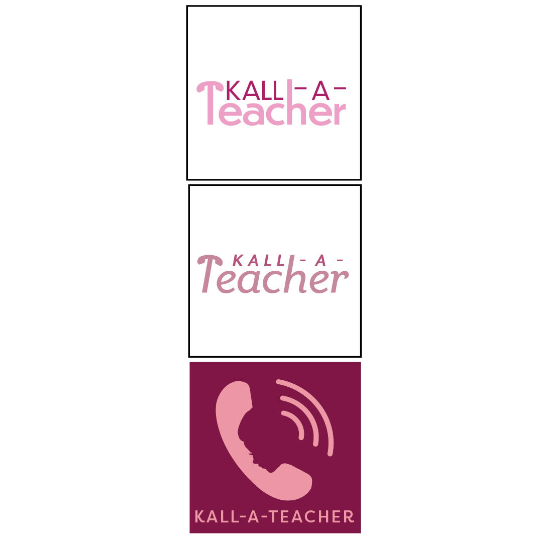
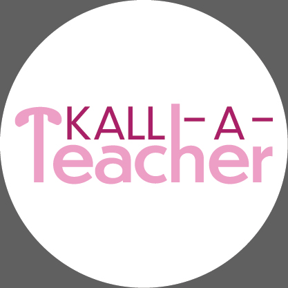
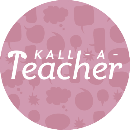
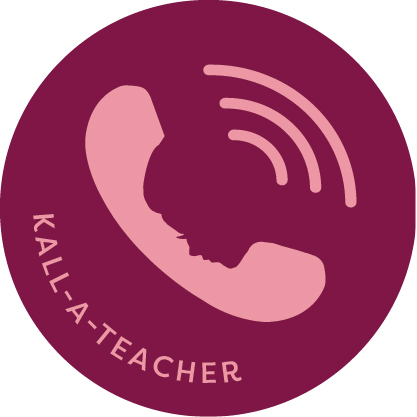
These are logos for a podcast series by kallah teachers for women, with a mission of inspiring women to establish a connection with a teacher/rav/rebitzin- “Call a Teacher”.
Love to hear suggestions and ideas!
TIA!
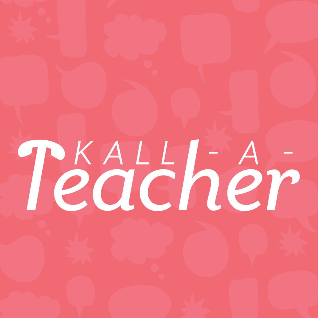
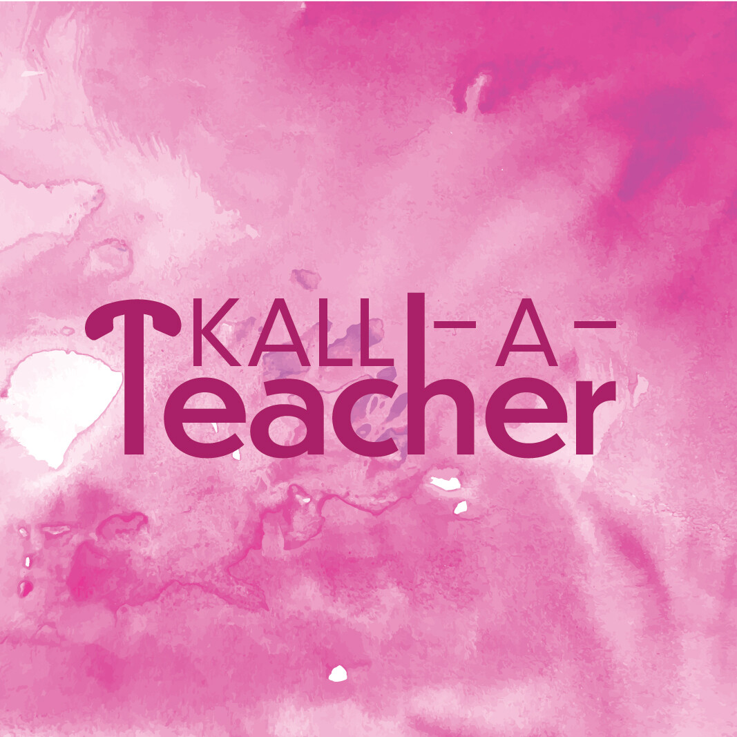
Seems like it’s the background changing more than the actual logo… Is there a reason they’re on busy backgrounds as part of the “logo”?
I’m a little confused… are these different options?
I really like the first one! Maybe try a softer color like mauve to make it look more sophisticated.
Yes, it is a bit confusing as to what you intend to be the actual logo, as the backgrounds with patterns wouldn’t typically be part of the logo, but rather a particular use of the logo. I think the first/second concept is the best option-cleanest and interesting play on words. Of the first two, I think the the second typography option works better-bolder and more “confident” in appearance. But if you consider that the logo here would really be just the text, might want to experiment with other colors or an accent of another color. BTW, a logo does sometimes include a background such as a circle or square, but is typically a solid area used to enhance the typography, you wouldn’t want it to compete with the type. And it would be tight in against the text as part of the logo, here it is shown more as a general bg.
She put them on backgrounds because this is how podcast icons look 
@Chani_Wolpin, I listen to podcasts. The icons are TINY in the podcast app/player. (They’re bigger when you open them, but tiny in your library/searches.) I like the first for that reason, the contrast is high and the words are big.
Thanks everyone for your comments!
Thanks @peninah_adler - I am totally unfamiliar with podcasts and never saw a logo for one until this client showed me some…
Thought I saw many logos with backgrounds once I looked at more!
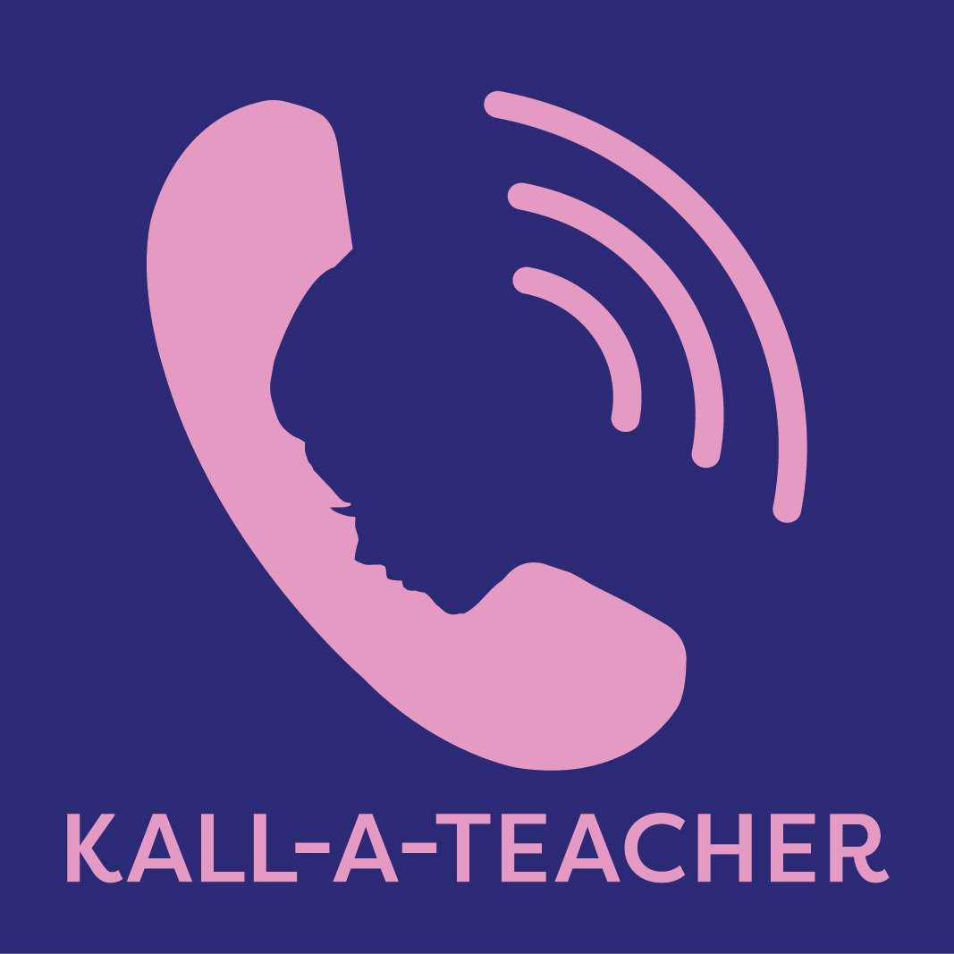
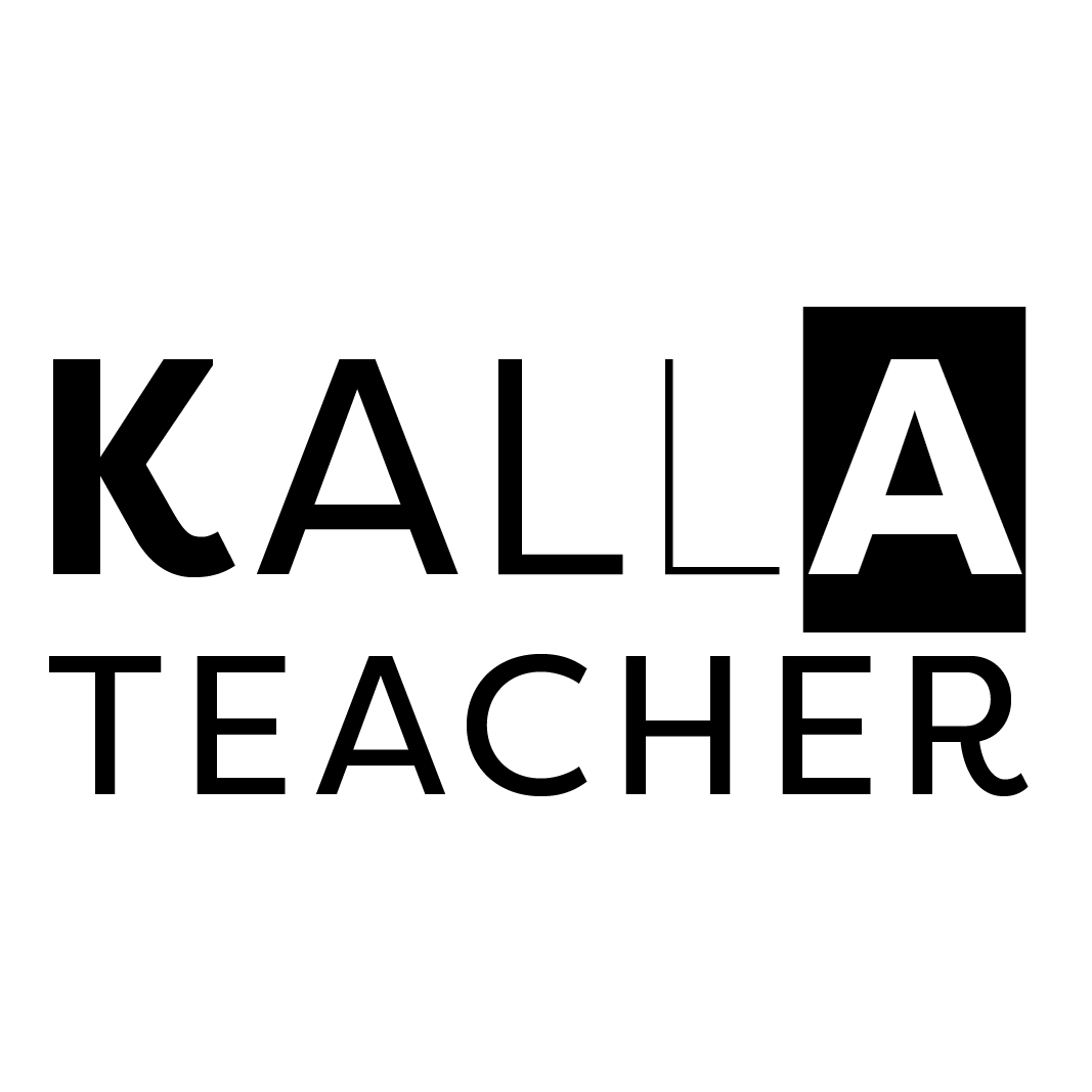
Client mentioned including a woman’s profile in the logo.
Ideas of how to do that?
Or ideas on how to improve the third option?
I greatly appreciate all of the feedback! Thank you!
Oh, ok, thanks for clarifying! Yes, would probably need bolder lettering and strong contrast, maybe typography from the second in the coloring from the first?
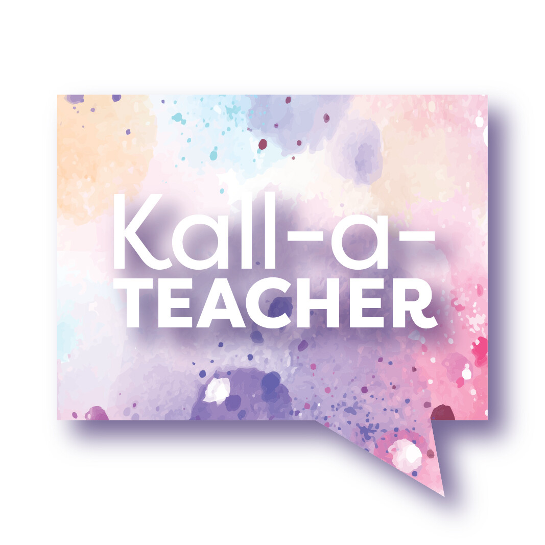
Any critique now that I’m showing them without backgrounds?
I also made them small now:
Thanks and a gmar chasimah tova to all!
between the first and second I like the second better, and I like the negative space idea of the third.
I like the first!
i like the first but the concept of the third is cool ,. if they like the idea of an icon rather than txt then this is a good one
1 and 2 are pretty similar in concept though I feel like 2 has a stronger feel to it.
3 is also nice but I feel like it looks like “self help” - if that is the message you want to portray, then it is also fine and very clever!
Thanks everyone for your opinions!
Trying to play around and think of more options…
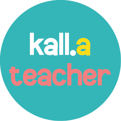
Any of these readable as Kall-A-Teacher?

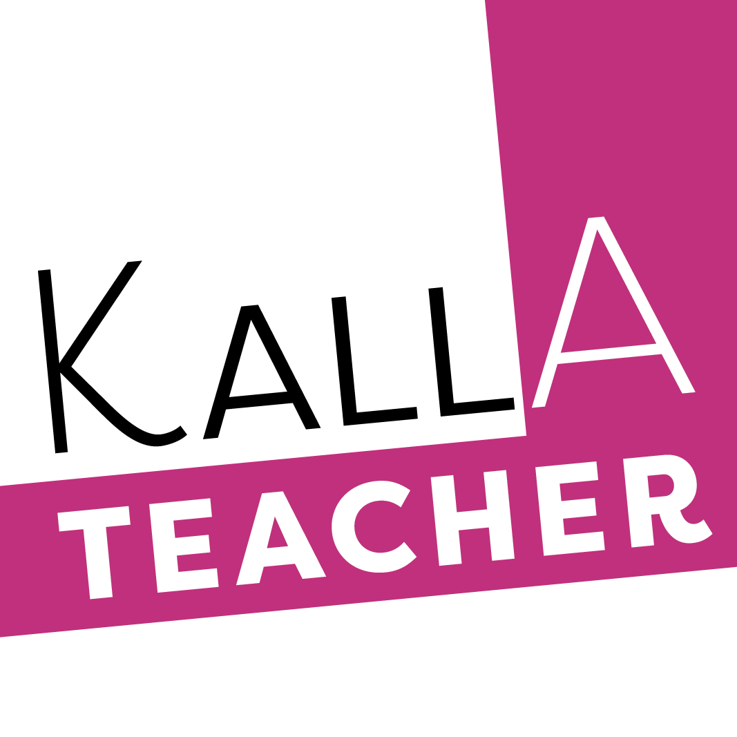
I like the last one! Not sure about the colors though…
Did the client not like the first options?
I still like 1 and 2 of the first option.
From these, I guess I like #2 (it’s labeled KallATeacher Logo- 03)
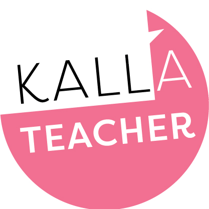
Of these I like the angled one the best, though not sure the A needs to be bigger.
angle one is the best of those four
I really appreciate this group - you’re feedback is incredibly helpful! Thanks so much!
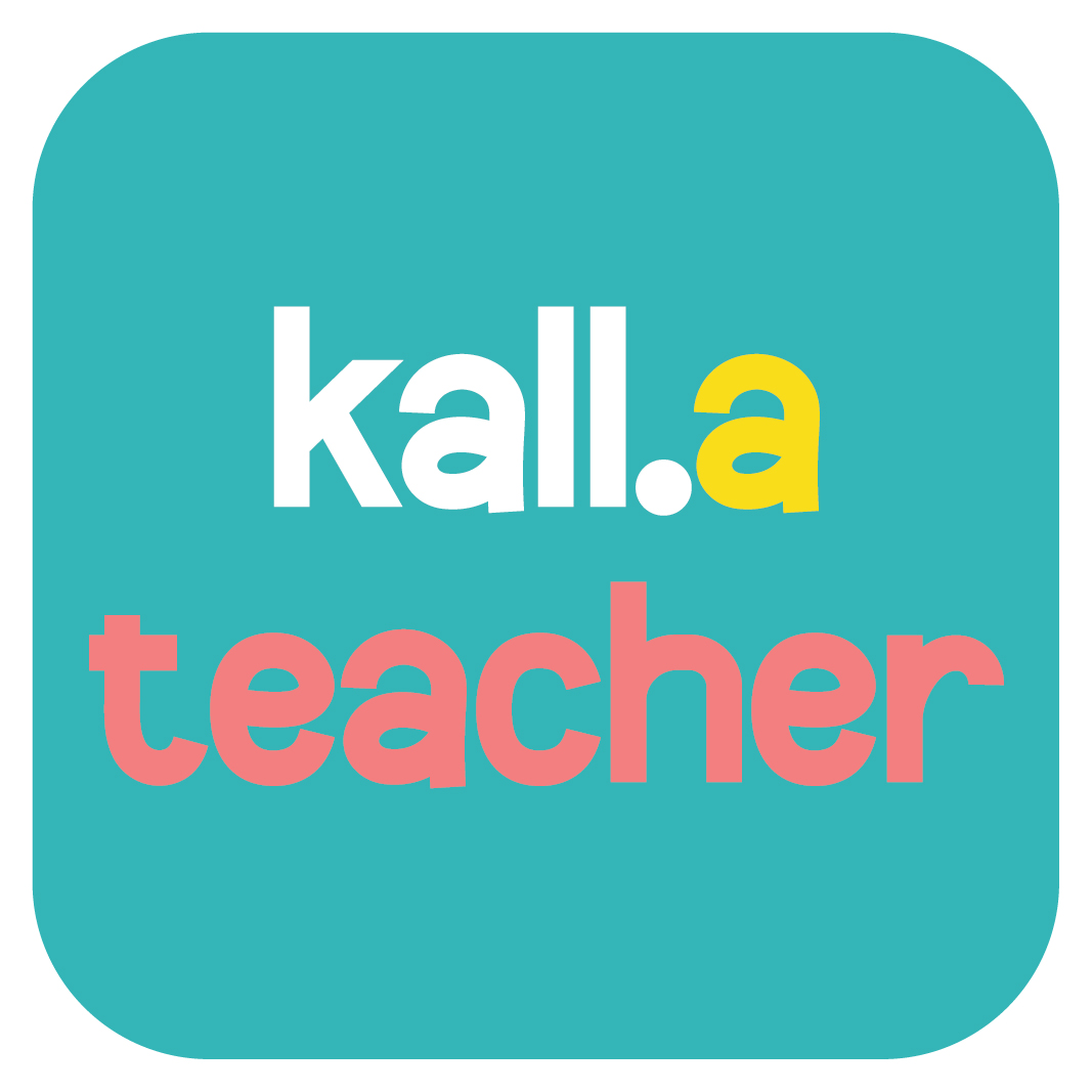
Turns out that the podcast website will be showing a round cutout of the logo.
Here are the options that I’m sending to the client:
Good assortment-keep us posted!