Hi everyone!
I’m making a quick logo for a small playgroup, and i need help narrowing down the options to send her.
The coloring she’ll decide on after, but for now i need to know which arent worth sending and which you think has potential…
Any feedback will be greatly appreciated. She needs this by sunday so im a little pressured… Which fonts, positions etc.
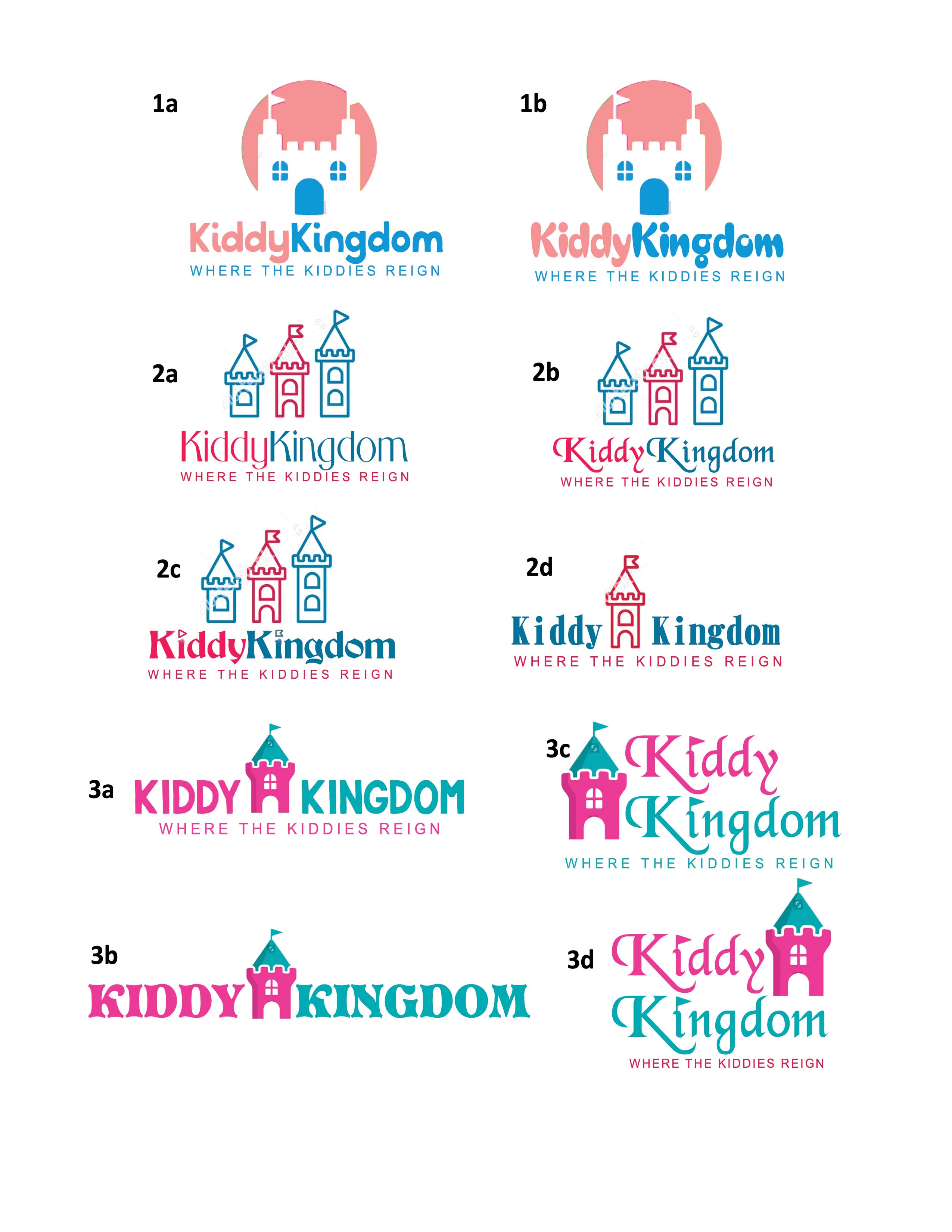
1b
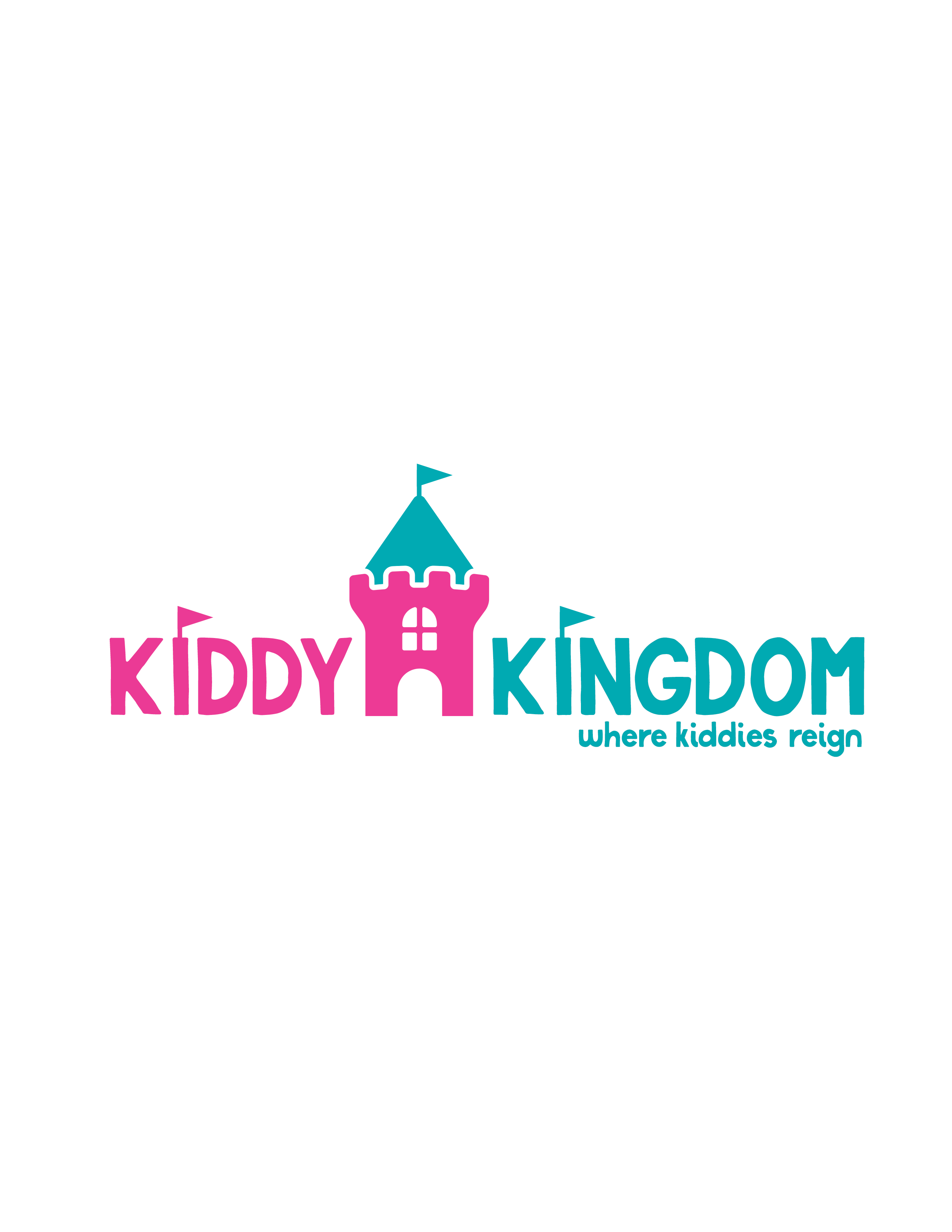
3a
Thanks! im also open to hearing if anyone has another idea, something more simplistic and modern
these are really cute! i also always have that dilemma of how to narrow down options before sending!!
Depending on type of client, you could probably send her all the options as long as you organise them into 1,2 and 3 as then it’s really only 3 to choose from.
But if u want to make it simpler for them, i’d say you dont really need 1b, 2a, 2b, 2d and 3b.
Really nice!
I would narrow it down to 1a, 2a, and 3a
My favorite is 1a 
Love 1a and 3a!
Just an idea to try - use only lowercase font for either name or tagline to add to the kiddie-ish look…
Amazing options so far!
So cute!
The little flags add so much personality:)
Adorable! Fun, playful and still character!
Adorable!
great job!
Love it!! Did you get inspiration from somewhere?
not really… i just looked for icons related to “kingdom” on shutterstock, and then worked around that. i didnt really come up with anything major here, the icon is from shutterstock, and then i played around with the text and added the flags.
it is adorable! Clean and modern rly rly nice!