Hi,
I’m designing this for a high school play… any feedback or critique?
btw, the background is supposed to look like a diamond mine - does it look like that (even though it is so faded)?
Thanks!
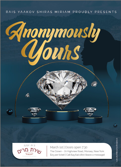
<Looking good! I would make the girl more faded out so it’s more subtle.
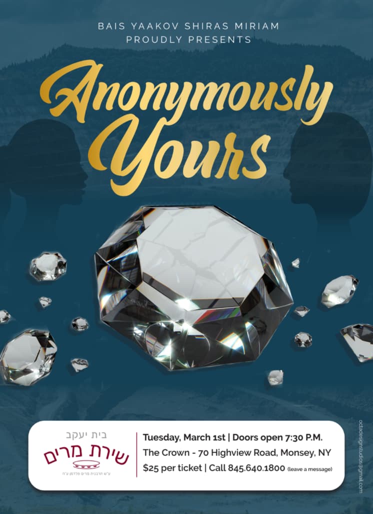
Looks really neat!
Maybe make the the school logo in the white box smaller so that it aligns with the text on the other side
Very nice ad!! I can’t really see the diamond mine. Maybe you can make a little less faded or just keep the top part of it cause that looks good like mountains and then move title, girl and diamond a little lower. Hard to see on the bottom, it looks just a pattern… I honestly wasn’t sure how a diamond mine would look (I found a pic online) so could be others wouldn’t either…also would take out or move up that tiny diamond that is attached to the big one on the top left.
Nice! I don’t see the mine…
I would suggest centering the Title text, and lighten the girl like Rivka mentioned
Agree about removing/moving that diamond touching the large one and also making the logo smaller. I think it would be even nicer if that white info box has a bit larger margins around all the info.
Maybe the “BY Shiras Miriam…” text should be a tiny drop smaller so it has more margins on the side
Its really nice!
I would make the girl lighter and make the mine darker.
I like the shape of the white box better on the first one.
Also make sure that the BY symbol is aligned with the first sentence.
Otherwise its beautifully done!
Stunning!!!
hey thats my sisters school:)
really nice.
it cud just be me, but it looks like the face on the right is bigger/closer than the face on the left. unless its supposed to be that way- like a mother and daughter.