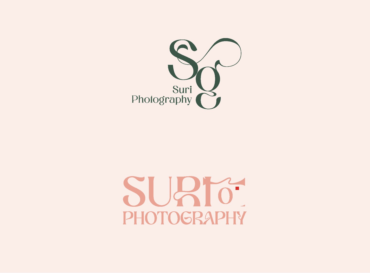
Hey everyone, this is a logo for Photography in Yerushalayim, she’s called Suri G.
I’m sort of going for these colours… The first one is flowy and feminine, the second one has a camera icon to work with. I’m debating between these 2, would love to hear some opinions.
I prefer the top one. Maybe try make the top of the G into the front of a camera? Also the gap between the S and G is super narrow…
The bottom looks like Surto…
I like the colors!
i love the letters in first one - i see you like those ‘g’'s as you have it in your logo too
nice colors and both logos look well-balanced
in second one, I would not have realised that was a camera - i read it as ‘Suri I O’ (even though there is only one i…). and i’m not sure why the R is like that… is it just the font or is it part of the camera?
But also why cant you show client more than one option?
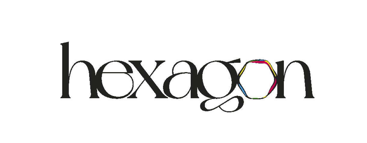
so cute that your brand name has your intials in - i guess that was intentional! lovely font…and that hexagon is so well incorporated yet unique and memorable
back to your client logo, that’s tough client cant decide… shame to work on two avenues… is she planning to use these as a watermark on photos or will you make her a variation for that? i think it may be helpful to already see that if so. just from experience when doing a photographer’s logo as i know that was important to her.
I love your logo! That’s an original one!
Do you have a portfolio? Would love to see the rest of your work
I wouldn’t work on both for the client - I would choose one that is pulling you more and develop it and develop it until you are 100% happy with and then hopefully client will like it too. Then if they dont like it, I would go back to the other one.
I’m in middle of logo and I gave client 6 options, I told him choose 3 which he likes - obviously he chose the 3 similar ones and I told him I am going to perfect it and narrow it down to one, max 2 options.