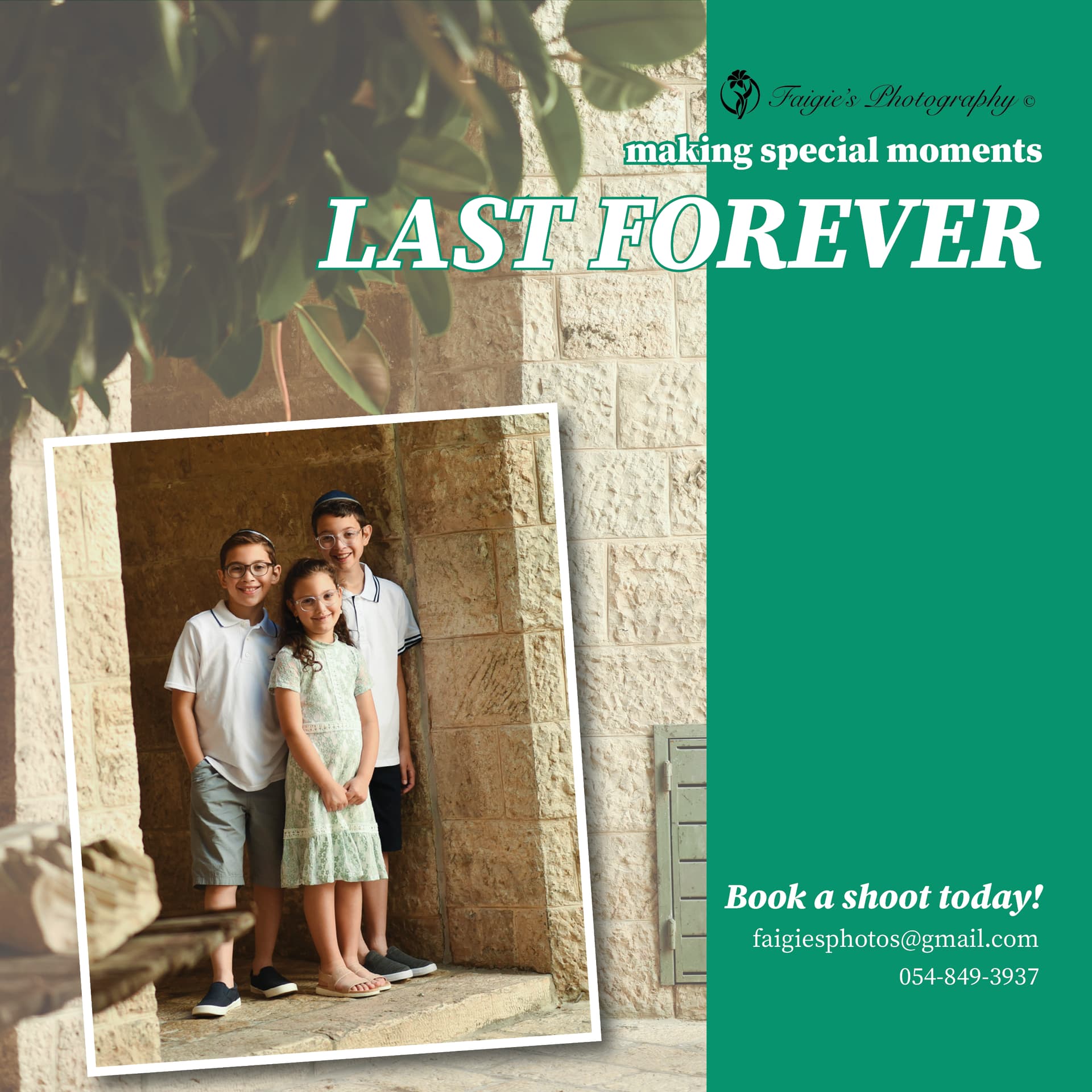
I would love feedback for this advertisement.
Is the typography nice?
Does the ad bring out the beauty of the pic?
thanks:)

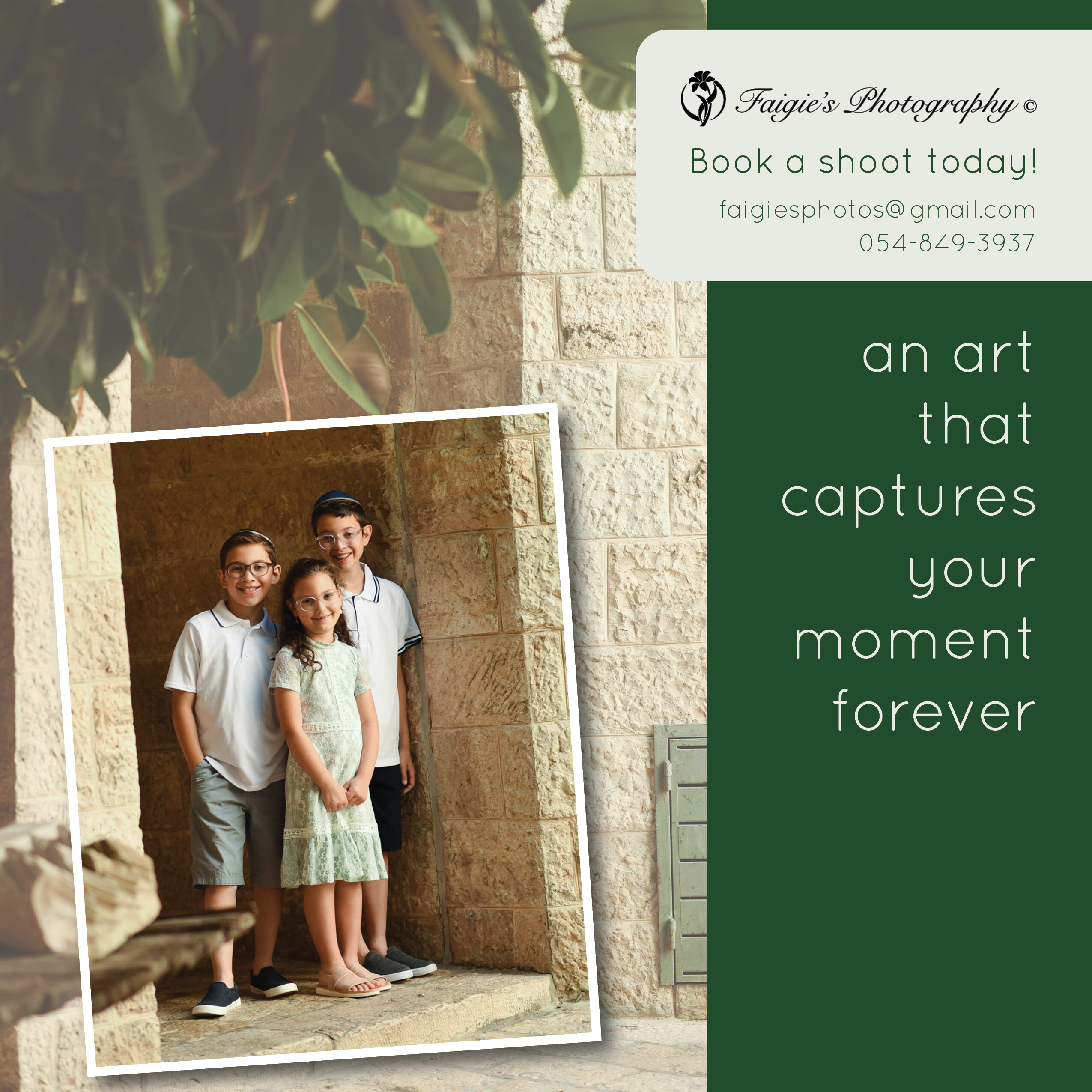
I like the second one
The typography could be stronger. What about using a darker green? more of a hunter green so the white text stands out?
The logo is hard to read
the darker does look much better. thanks!
Is the green looking a bit holiday-ish though?
Is the text better?
(She didnt give me the words. I made them up.)
I think the green is a bit holiday looking. maybe try brown/beige
I love the second one! But maybe make the background picture a continuation from the front picture ( also slanted)
I would take the logo out of the box and put it either on top or on the right hand bottom.
I agree with Miriam - the logo should be separate from the contact info, so that the contact info should be more of a call to action
Also tighten the line spacing between the caption, and maybe add an effect like a gold foil or something to give it personality
Thank you for all of your advice! It was really helpful.
In the end, I landed in this direction.
Any critique before I send it?
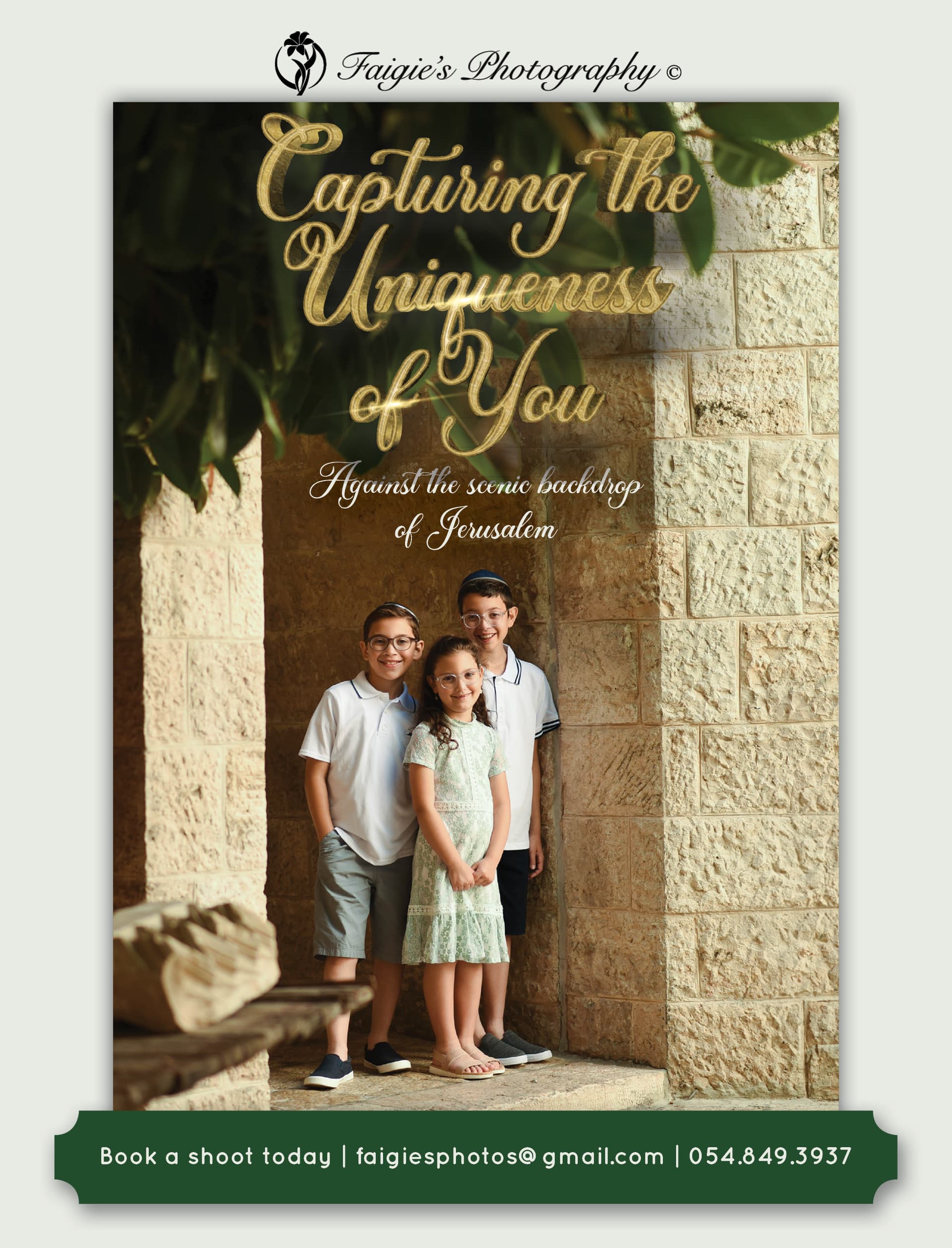
This is much more striking than the first two options you originally had.
really nice!!

Really nice!
Oh wow it looks really good!
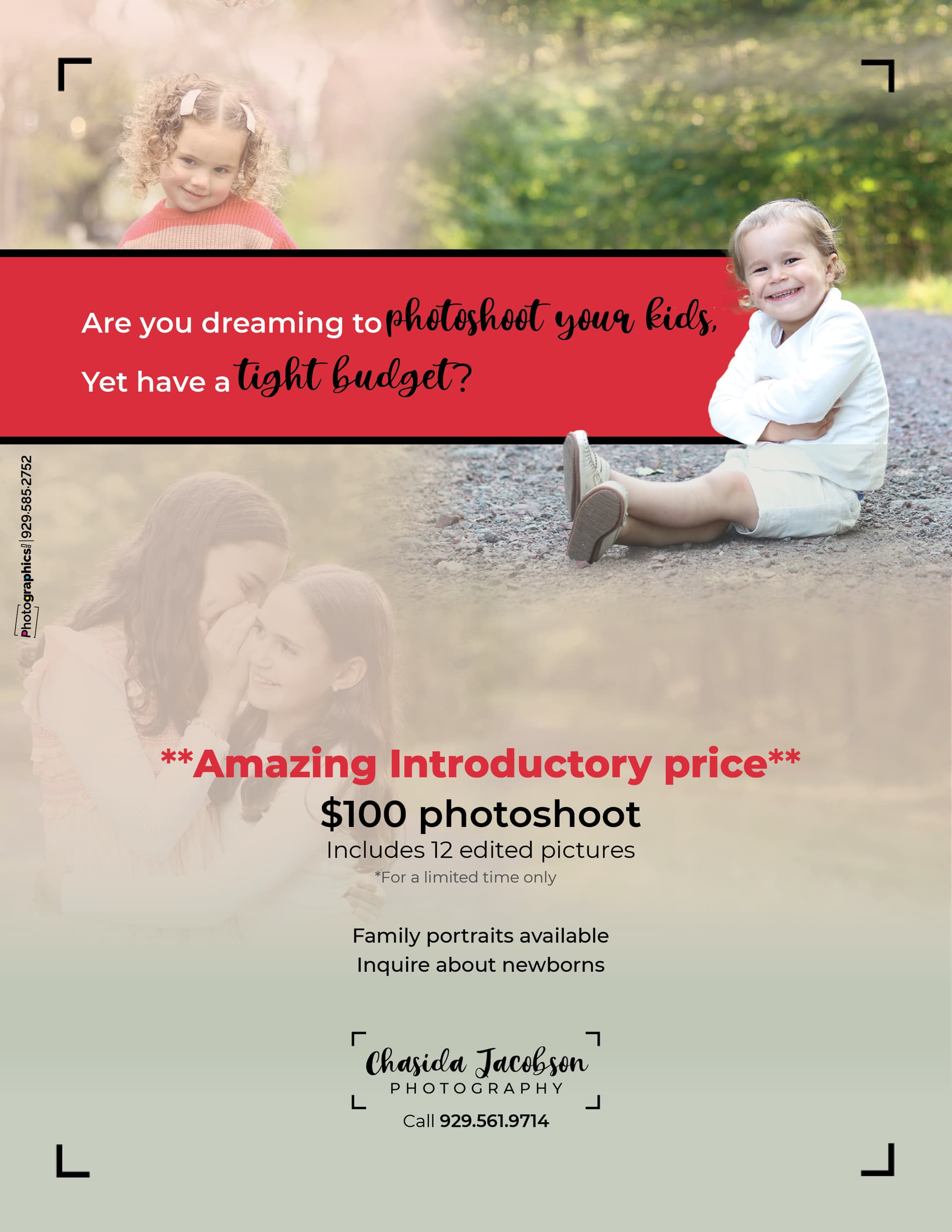
Really nice!
I’d move down the black text in the red box so it’s more aligned with the white and maybe move it a drop to the right.
It’s really nice!
I think the word photoshoot is a noun, I don’t think you can write ‘photoshoot your kids’.
Thanks! The client wants to add more of her pictures and would rather not have any pictures faded. How can I do this in a way that it won’t feel too busy and that they won’t all be competing for the viewers’ attention?
Maybe you can convince her to go with just 1 picture?
I think its the most powerfull
Agree, I find one pic most powerful. And it’s easy to do a series of a few pics with same ad style and layout, just changing the main focal pic.