Hi I’m making a logo for a local photographer. Looking for advice/critique on these!
Thanks so much!
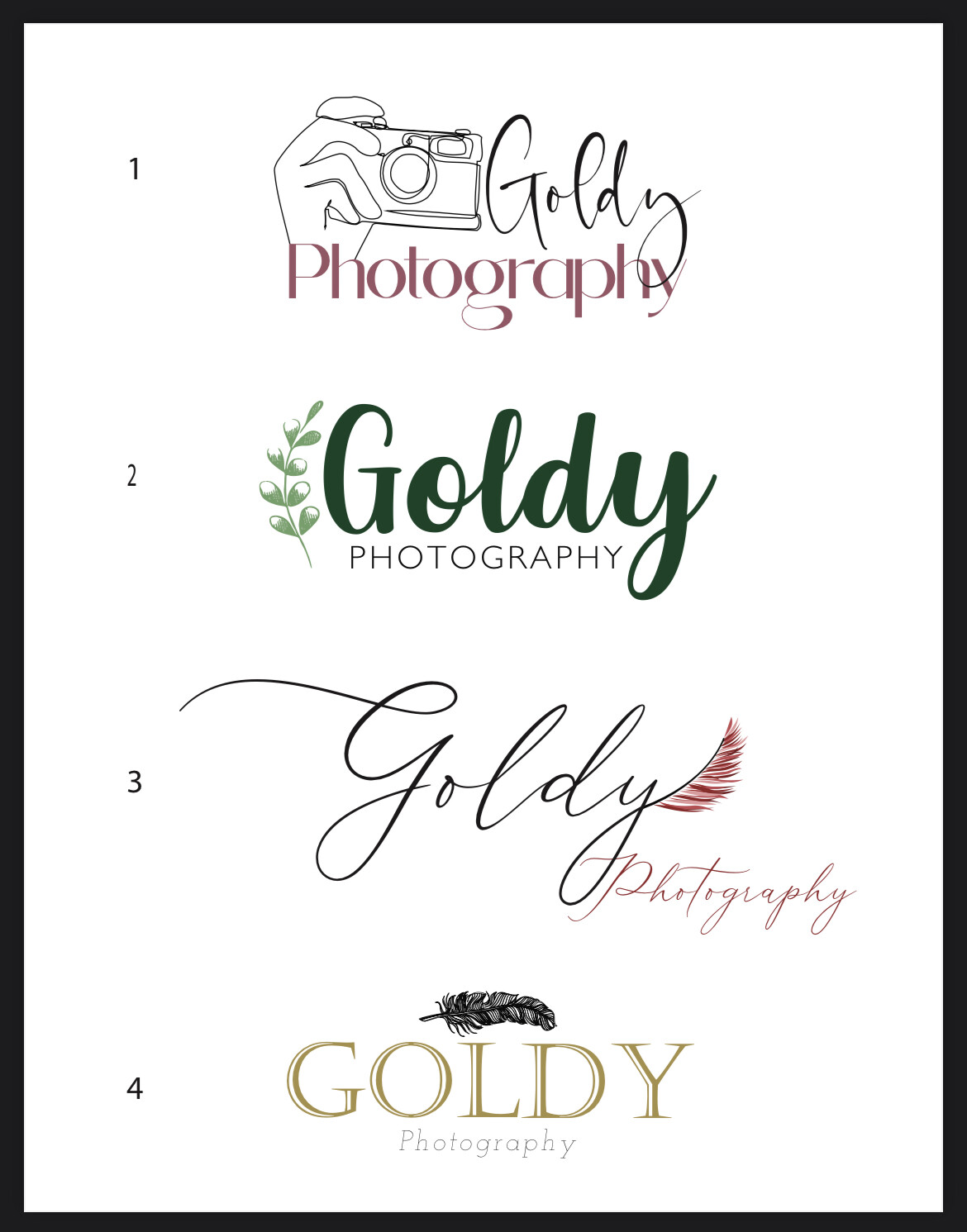
I like the first and third but the other 2 aren’t feeling right for a photographer to me. Feels like the wrong industry somehow.
Also, I’m assuming she wants a feather in there? I like it better than the camera cuz the camera is a little too generic
I actually like #2 but I don’t like the leaf near the G - how about keeping it really simple and just writing Goldy PHOTOGRAPHY like you have it - maybe take the O and turn it into the lens of a camera…
Ye I get what you mean about the wrong industry lol.
i really like no 3 and also i think it’ll be good as a watermark on photos (if she requires that) coz not too complex…and you can also use it without the ‘photography’ in theory…
you can still send her this range though…
First of all, great job on all of them! I like 1 and 3 (@rivkah, good point about the watermark).
Re #1, how would it look with her name and the camera switched (name on right, camera on left)? It might make it a drop smoother to the eye