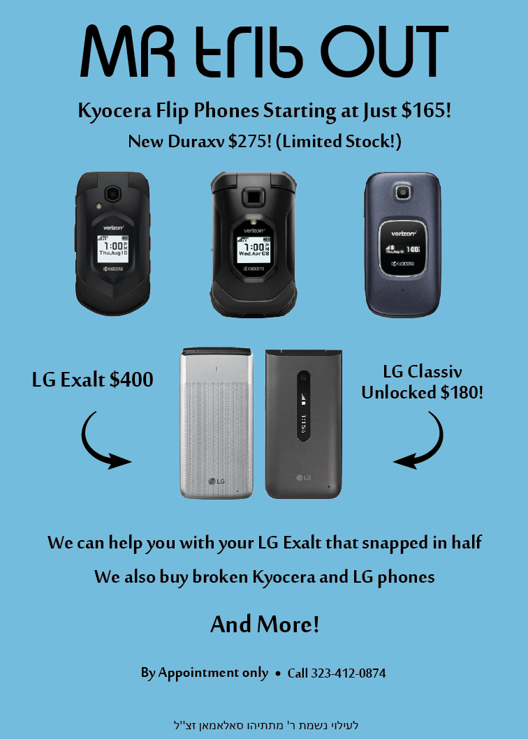
Can someone help me out here a bit???
This is going to be a 1/4 page in a magazine. the client liked it, I still have to move things around, but he wants me to “spice it up” Im stuck here. Because i dont want it to look to squashy being that its being a 1/4 size ad… how can i make it a bit more exciting??
ANY ideas pls?? its going to print tomorrow so I would love help asap!!
‘Mr trib out’ font is hard to read. Is that his name/logo?
I don’t really like the body text fonts, maybe try a sans serif font
And try some sort of patterned background, but nothing too dramatic that it’ll interfere with the phones and text
so its supposed to say “my flip out”… he wanted the word “flip” to be flipped… so what kind of background can I do that wont be too heavy on the ad??
Oh lol I totally read that wrong 
I’d prob try a ‘bokeh’ style background
Also on bottom I think it should say לע"נ הרב מתתיהו חיים בן יעקב סאלאמאן זצוק"ל, but ask someone else to confirm how to word that…
If the word flip is going to be upside down you need to change the text to be very clear that its an f and not a t, just that its upside down.
You can also do a gradient background so there is something going on in the ad.
kk will cont working with these ideas thanks so much for all ur help!!!
@Shevi_Kramer thanks for pointing out the proper way to say the bottom text= לע"נ הרב מתתיהו חיים בן יעקב סאלאמאן זצוק"ל
Hatzlacha! Show us the final ad!
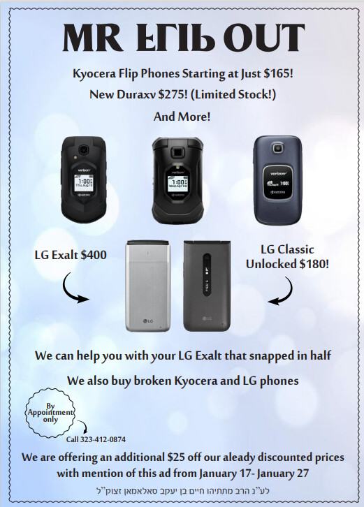
wow!! it came a long way!!