
Hi! I would love it if someone could give feedback on these ads I made. it’s for a personal trainer who offers many classes and services. thanks!
1 Like
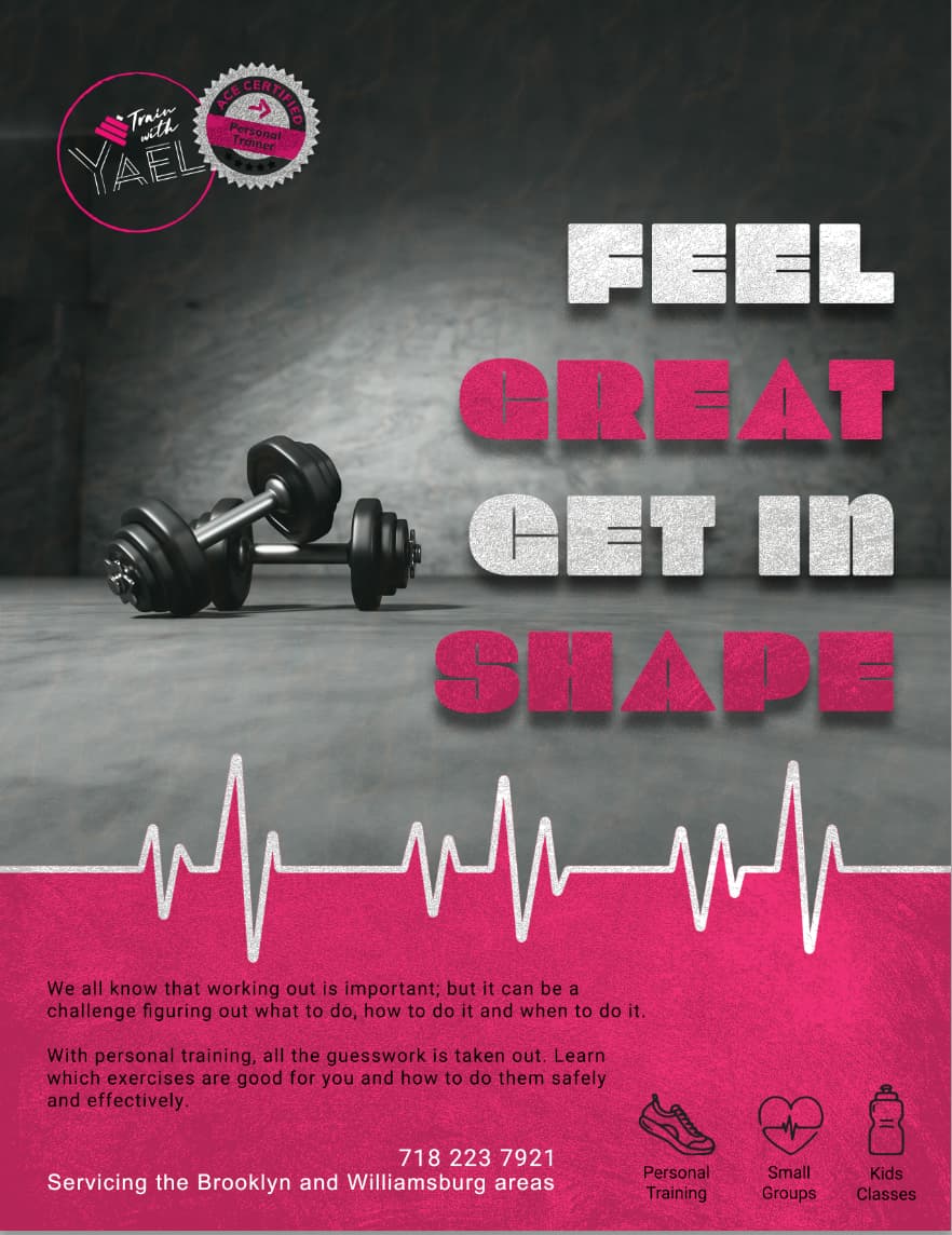
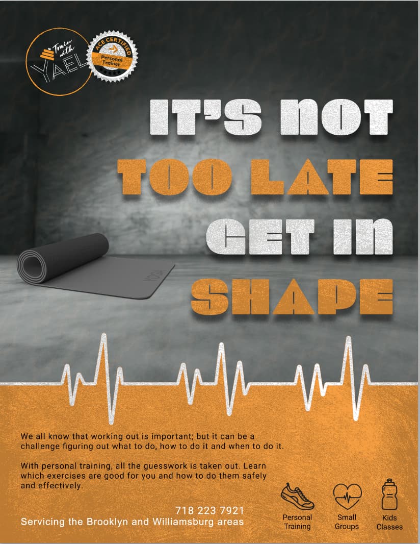
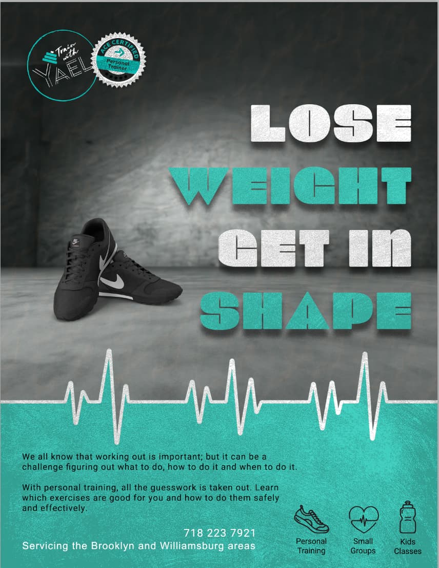
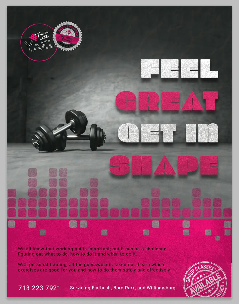
does it look a little bit like a medical ad?
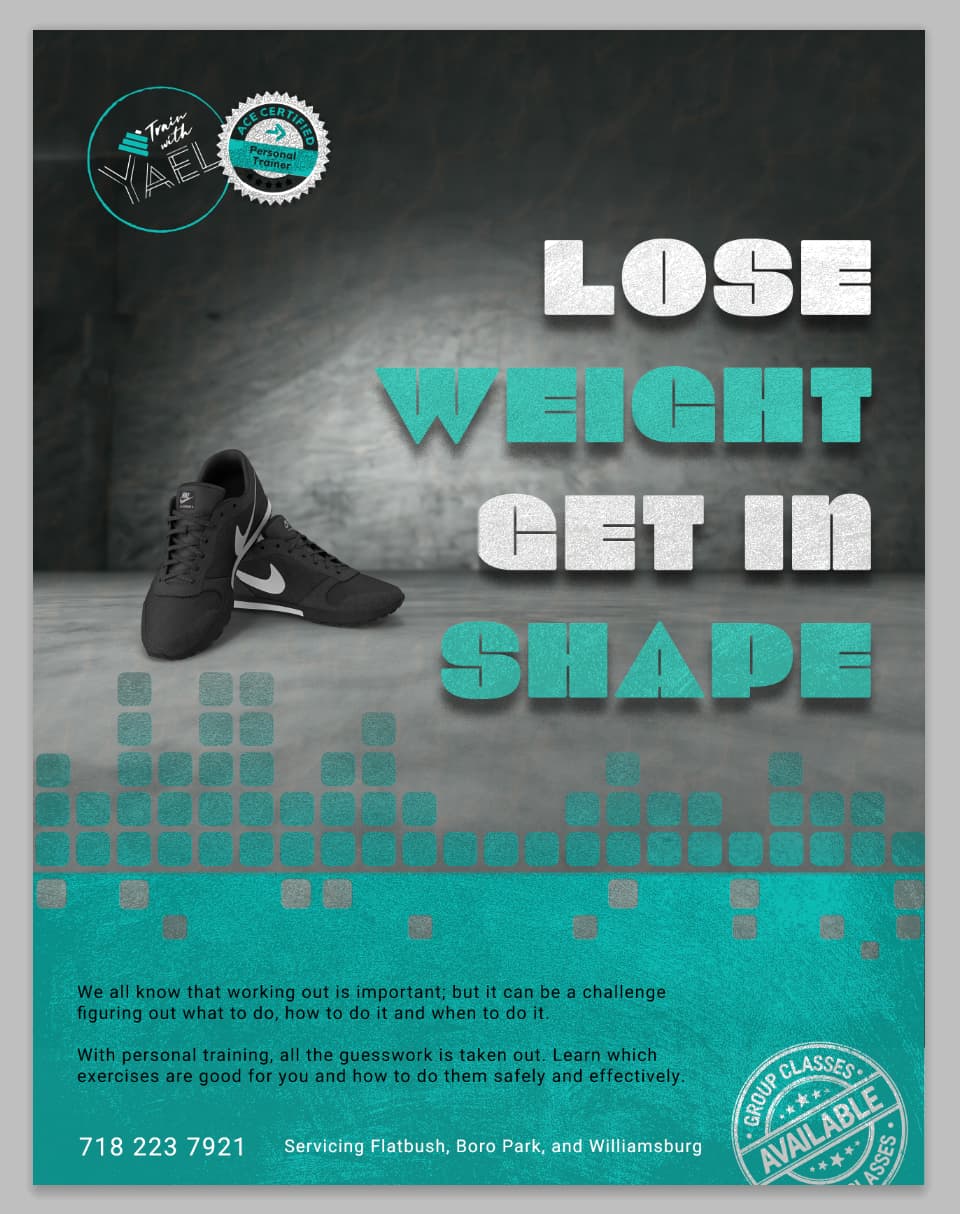
I love the colors and the different pictures you have on each ad…
I feel like the drop shadow on the words might be taking away from the readability - not sure - maybe make the drop shadow tighter behind the words.
yeah I see what you’re saying about that part near the bottom looking like a medical ad - maybe do a different shape as a pattern for each color something like this… You can do triangle, circle and square - I thought of it because your slogan is get in shape
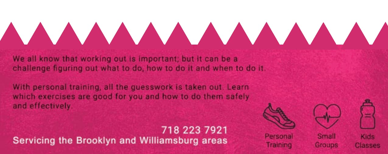
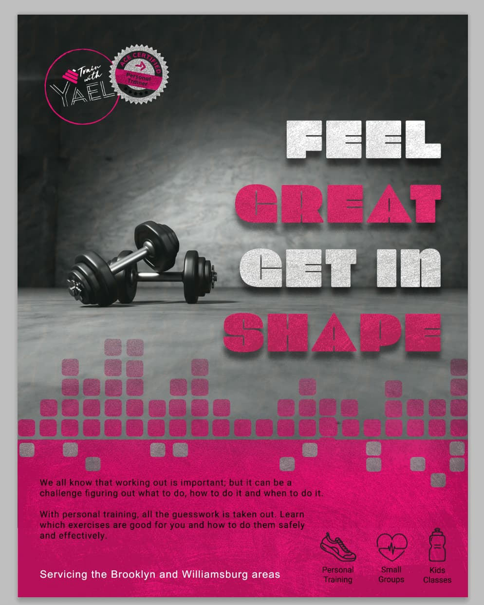
yes that is a great idea - i also loved it all apart from the heart beat thing - was making me nervous! this one reminds me of music and has that feeling to get into the beat to work out in a fun way…
These ads are so cool! I think that the information at the bottom - the white has a much better contrast than the black…
Love it!!
I would make the text “lose weight get in shape” and “feel great…” a bit higher, more in the center from the top to the boxes design beneath it