Hi I’m making a logo for myself, looking for feedback on the name and design
TIA
(And should it say ‘design’ or ‘designs’?)
Hi I’m making a logo for myself, looking for feedback on the name and design
TIA
(And should it say ‘design’ or ‘designs’?)
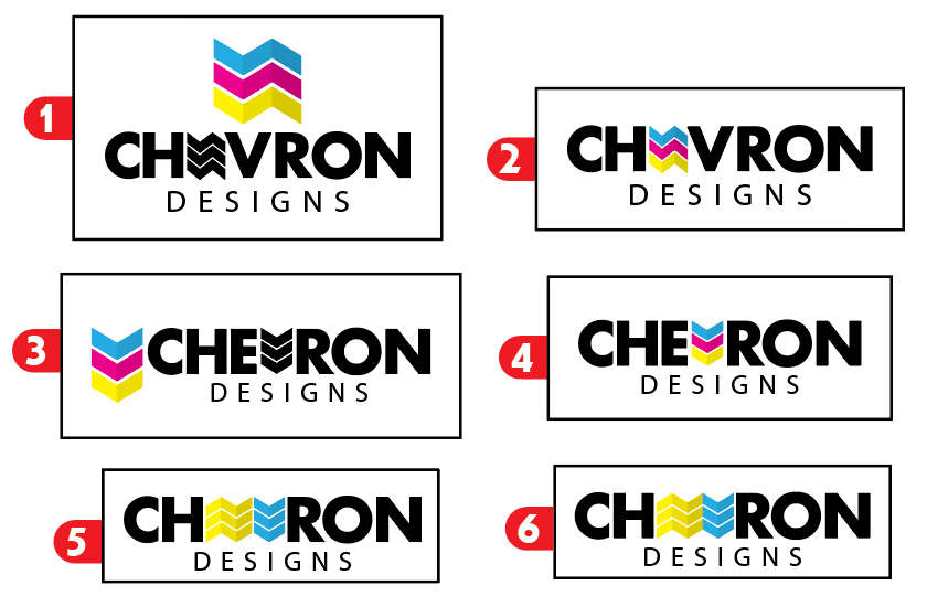
Is the cmyk color scheme overused?
I like #4 the best.
I like #4 the most as well.
same #4
ditto #4
Someone just told me that there is a gas company called Chevron (I never heard of it)
Is that #4 logo different enough? We both have the same design because the name of the zig-zag pattern is chevron (I’m not naming myself after Chevron in EY!)
LOL, that took me a second! I wonder if your clients will get it right away? Did anyone else think that it’s Chevron in EY?
Logo looks great… I do think the CMYK scheme is a bit overused… Maybe use a tone of each?
I like #2.
I was a bit confused!..
Ok-e-doke so basically it’s a good logo but bad name.
(Chevron the pattern is pronounced Sheh-vron and my sister sometimes calls me that lol so she decided it would be a good name for a business but I don’t want to have name that sounds confusing to most people just cuz I think it’s cool)
oh lol! 
It is cool! What can we do that the spelling is slightly confusing! 
Such a shame that English is not phonetic! If we’d spell it Shevron everyone would get it… and the pun!