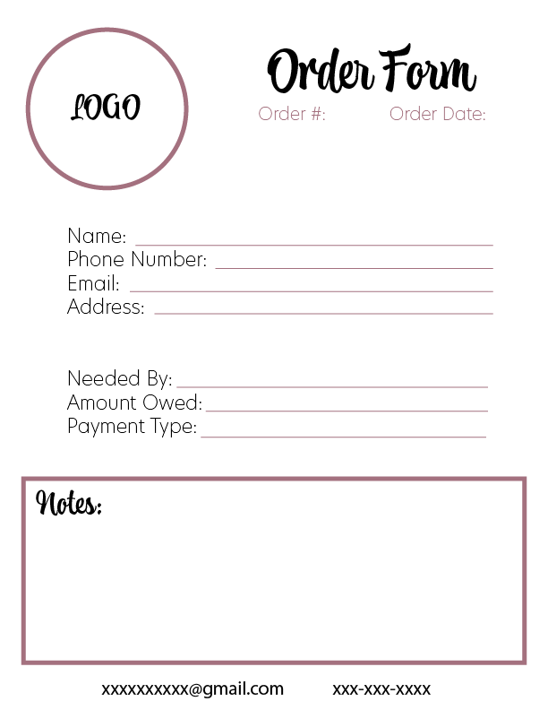
Nice! Would work on the proximity/grouping a little bit more so there doesn’t seem to be so many different elements and the whole page unifies more. For the first one, would join the logo with the large main top title to create one visual unit which will be the focal point here, you can move the title to the left closer to the logo, togehter with smaller text below. Would move the two middle sections a little closer together so they read more the subgroups of the same groups (still some space between), so you would have a total of three visual groups, the top logo and title and text, the middle text area divided into two subgroups, and the bottom notes area.
Same for the second design, too many boxes. The word description should touch the box below it, move it down together with its background until it touches the below box. Then it might be fine with the top section, middle and bottom, but you may try also moving up the total box on the bottom the same way to touch the middle framed box and make one unit. If you can gain a bit more space you can move the Thank you to the right to balance the top heading on the left, and add the logo small next to it, probably before the words Thank you., or it could be grouped with the word invoice on the top to the left corner, just need a little more space which you would get with the changes above and possibly shrinking everything just a percentage point or two.


