
Hi. I designed this logo for an online grocery.
Any ideas/suggestions which colors would be nice for this logo?
2 Likes
I have only 1 thing to say:
WOW!
wow love it!
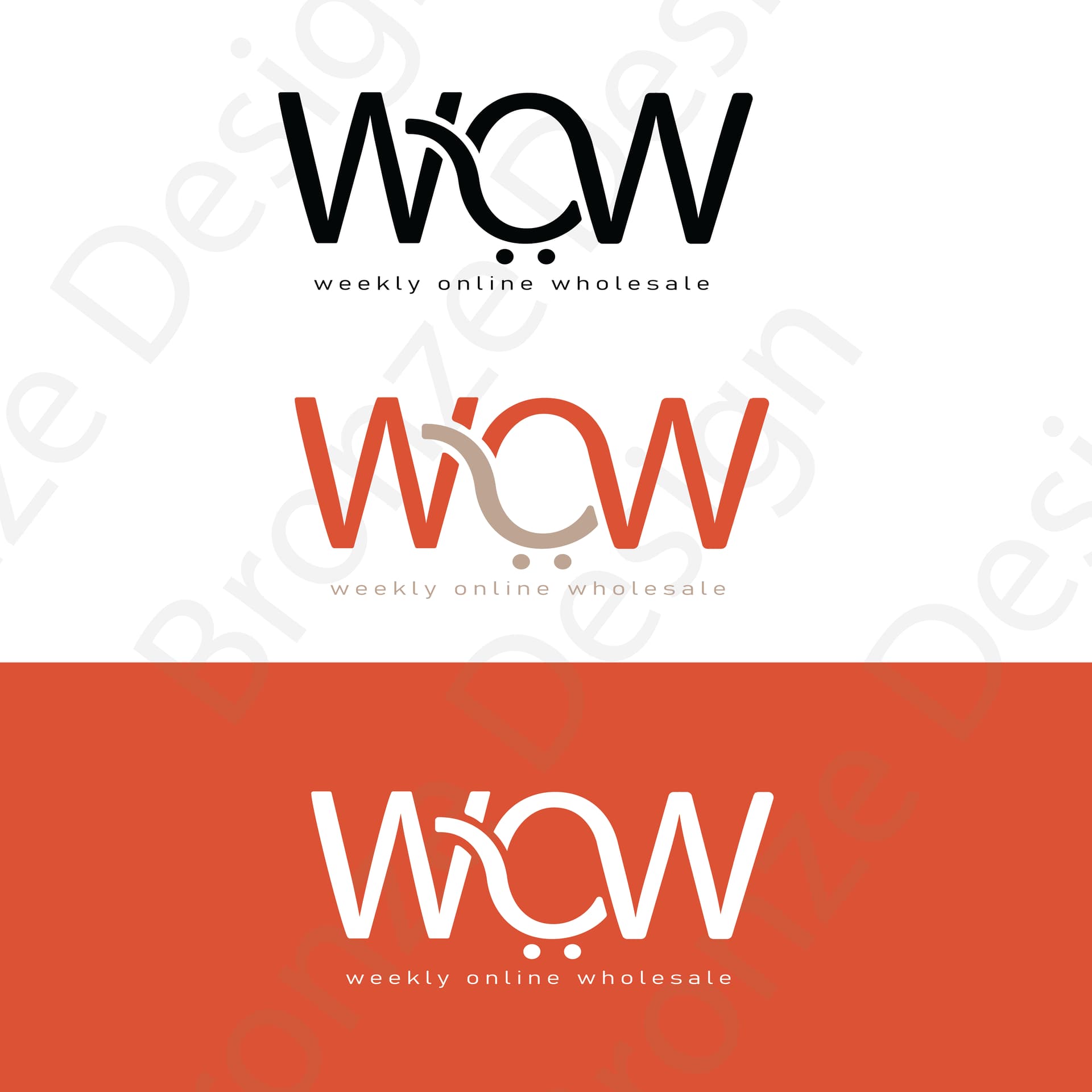
I like the orange block best
Oh wow! Love it! I prefer the last one
I think maybe the tracking by the slogan is a bit too much…
the cart looks a bit like a frown 
really nice!
maybe try some greens, they often associated with supermarkets…
only when its in another color
Love the block orange one as well. I think it is absolutely amazing
Brilliant! I love how you took a “regular” idea and gave it that pop!!
This is amazing!
I love it! They can use all 3 depending on the situation
Cool! Something to think about - since it’s an online thing, you can use colors that wont necessarily look good in print. Unless they plan on doing custom packaging