Hi! Made these two options for a client, its time sensitive project, so would appreciate any feedback/critique asap…
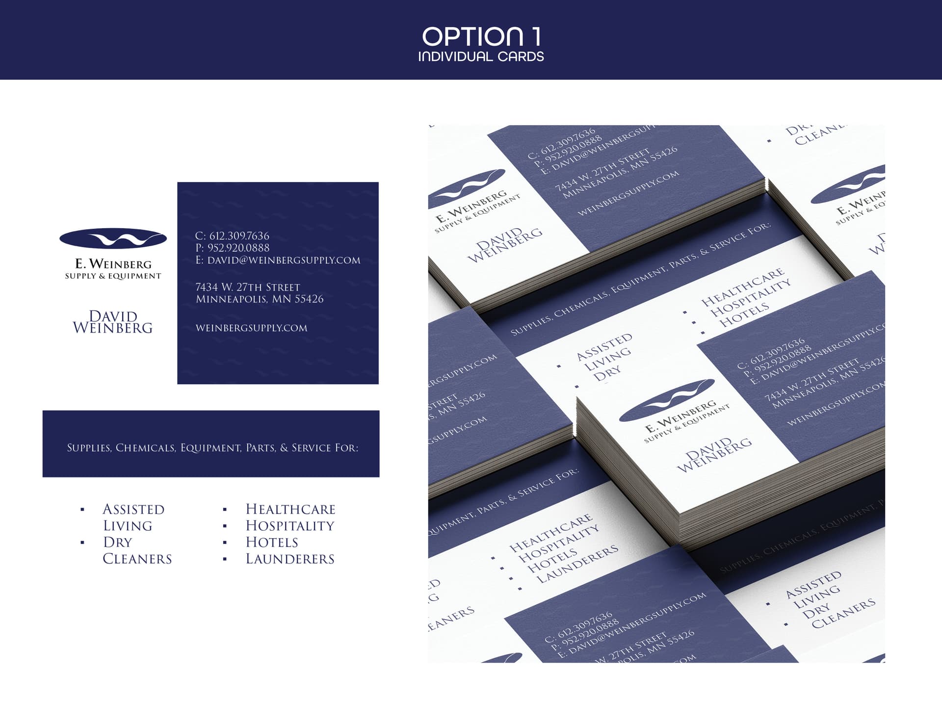
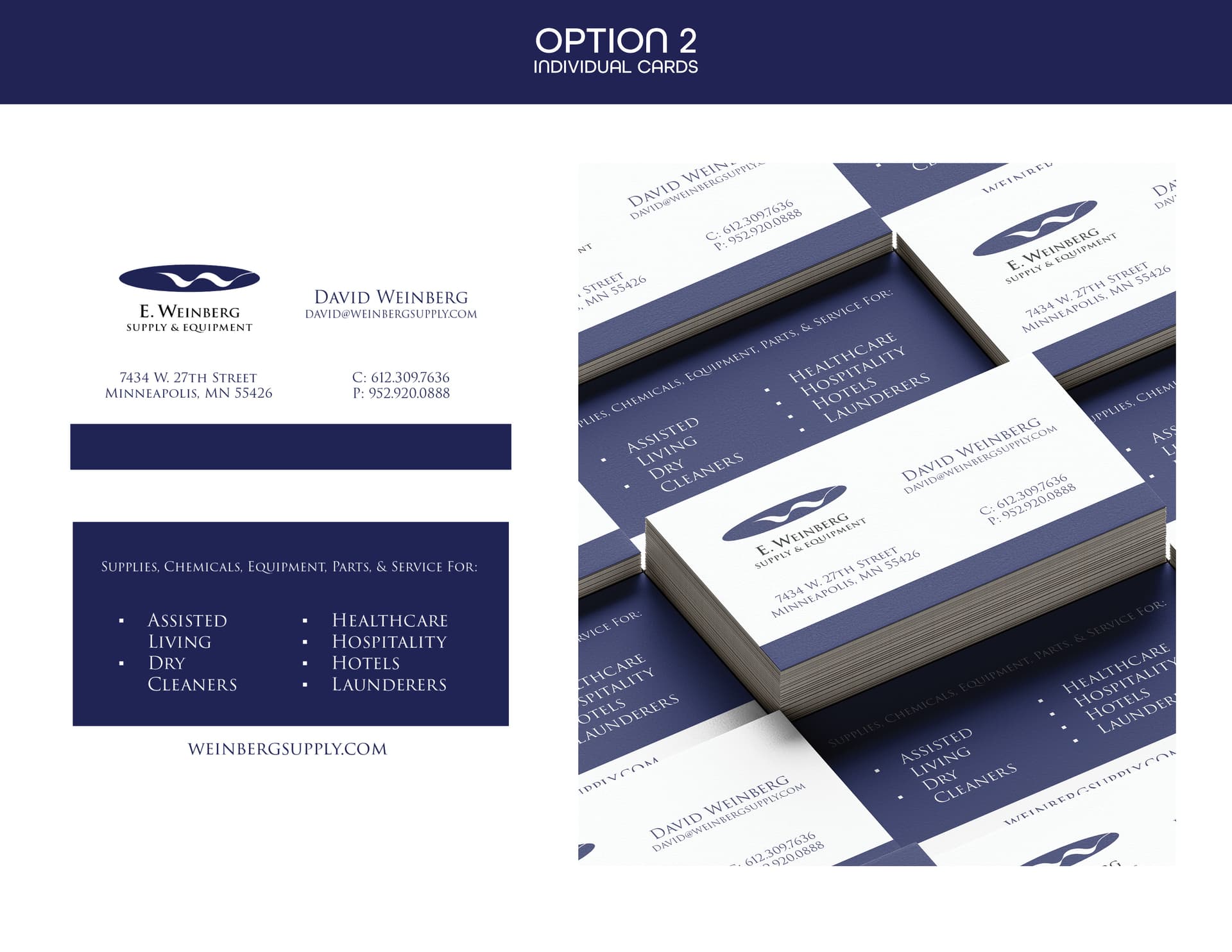
They look really nice! Not sure if I’m too late… the differences are subtle so maybe you want to write out the differences somehow? I also think it would be easier to see the flat cards if you put a drop shadow underneath
So nice and official looking!
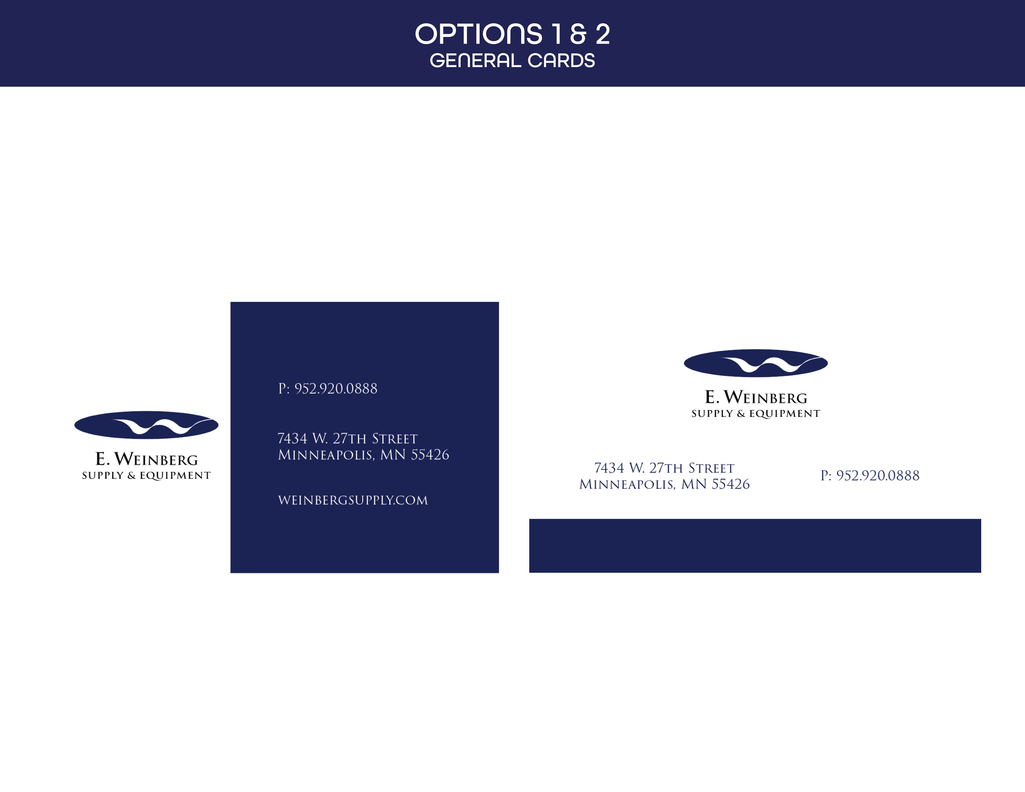
I like option 1 the better.
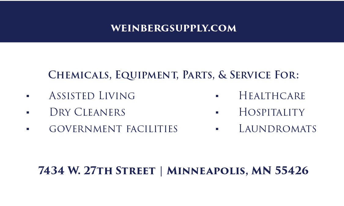
You can try making the bulleted text on the back a little smaller. Both words of “Assisted Living” and “Dry Cleaners” should be on one line.
Hope I’m not too late!