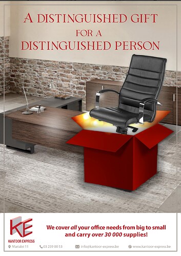
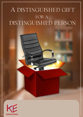
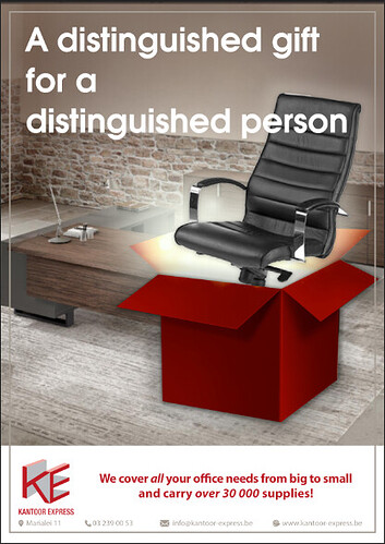
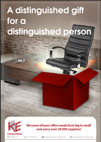
Hi, any ideas on how to improve this ad? Not loving it… I first did the brown version but the client wanted a different background and gave me the second one to work with. Thanks!
They’re both brown I guess  To clarify, my first version (which I like) is the image named ke. image ke3 is with the background the client wanted.
I like the second background better. Can you make the text ontop bigger bolder text.
The light in the box is distracting me, are you able to fix that up, maybe lighten or make it more of a pop of white coming out of the box.
I feel like a few small changes and the bottom one would look great!
Cool concept!
To fix the perspective and style of the box, I would bring the picture into photoshop and generate a big open box on the floor. It may look more realistic then.
You can then try to add an office chair inside.
I meant I like the one you did better than the office background 
your background is way better than the clients. shame


