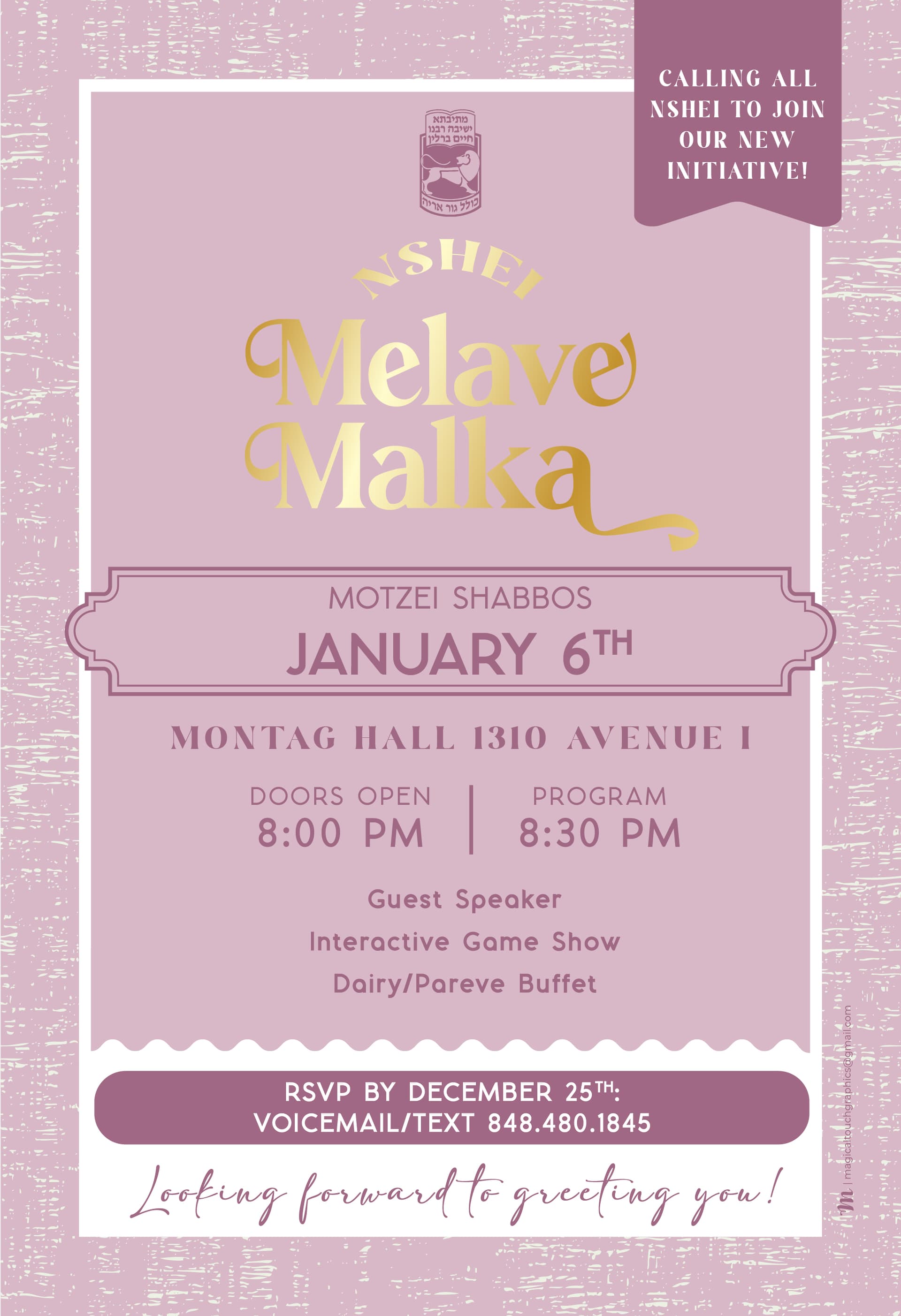
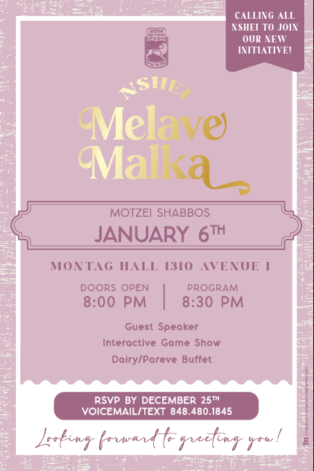
Hi Everyone,
So I am the head of a new program and also happen to be a designer, so I am at the advantage of being able to design the following postcard however I want without any extra expenses.
The goal for the Melava Malka is to get as many of our Nshei as possible (out of our Kollel of 230 couples b"h) to come to the event and hear about our new initiative that we are starting and hope to create warm feelings of the yeshiva nshei and the community to these women.
- Is that feeling portraited in this postcard?
- Are there any changes that should be made?
- Is there anything that should be added to the postcard?
Looking forward to hearing everyone’s input!!
Invite Side:
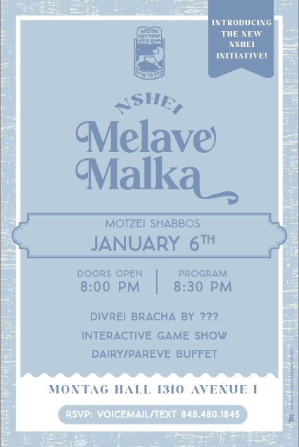
Mailing Side: