Hi,
Is the graphic mark or text too big on this logo?
Any other additional critique or feedback please let me know.
Thanks!

Really nice!! I would make the icon a bit smaller and higher up I think, and I would move the gold text down too… looks great!

Yeah, would you move all elements even further away from each other?
It’s beautiful like this I just wonder if having it airier will finish the look!
I can try that…but aren’t logos supposed to be “tight”?
Really nice logo! Maybe to keep it airy and also tight, make the black text a little smaller but with more kerning. Not sure how it’ll look. Great job!!!
I don’t think they have to be tight… It should look like a unit of course, but I think how “tight” vs how I guess we’ll say “loose” depends on what the logo is for
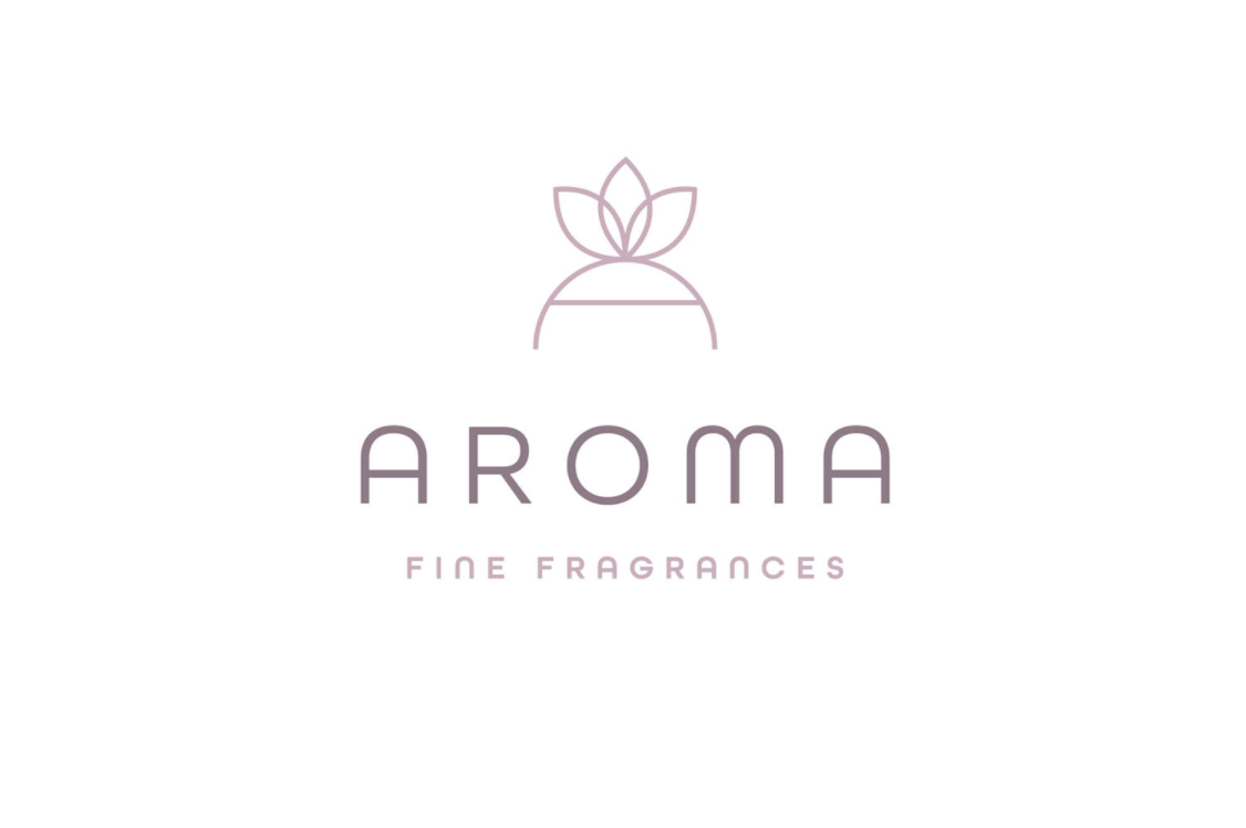
Here’s a loose ![]() one I did a while ago just to give you the idea
one I did a while ago just to give you the idea
okay I chap. I guess I’ll make two versions - one tight and one loose and see which one the client likes better.
Thanks for the loose logo  you attached. It made it clearer for me to see what you’re talking about (and it happens to be really nice btw!)
Good idea! Sure, thanks 
Maybe you’re right about the airiness… #1 is my original one and #2 and 3 are the looser ones…
What do people think?
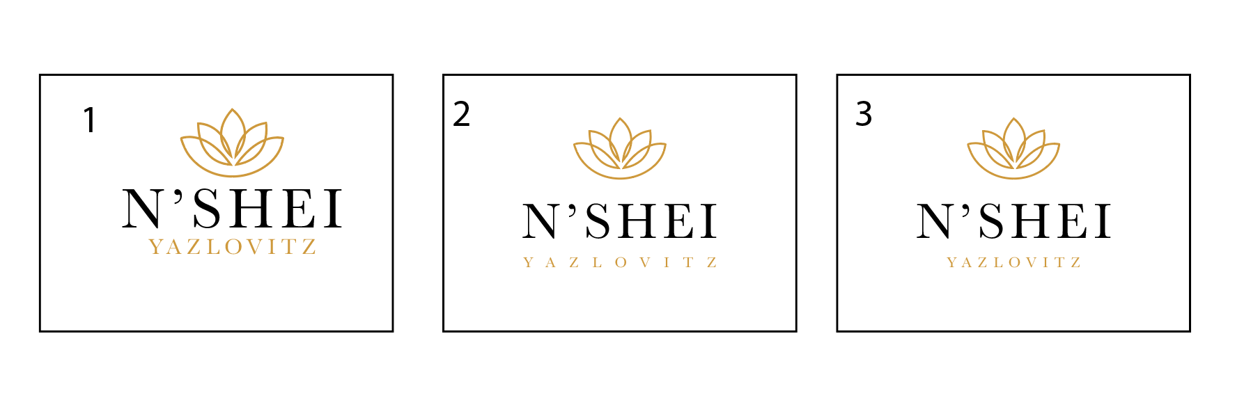
#3!!!
Thanks
Love the logo!!!
i agree about #3 looking the nicest 
Love it! I think #3 is the best of all!
#3 good luck!
Gorgeous! I also like #3
Beautiful!!
Nice to learn about what space can add to a logo through your work!!
Thanks everyone!!