Hi!
I am designing a newsletter and was wondering if I can have some help. All suggestions are appreciated.
Thank you in advance
Hi!
I am designing a newsletter and was wondering if I can have some help. All suggestions are appreciated.
Thank you in advance
Great start!!!
I feel like there should be an overall theme. I’m not loving that the first spread has a lot of different shades of color.
To make the text more inviting for ppl to read I would bold the first 3 words or so in each new paragraph or chapter. Maybe you can even do a different color for the start of the paragraph.
The layout of the images I would see if you can move them around and put a small boarder around each image to spruce it up. Maybe line them up at the bottom or on the right side…
On the second spread i would center did you know.
Hope this helps and isnt to much info. Gluck. cant wait to see the final one you go with!
I agree with all the comments above that @chavi mentioned…
Some more comments from me:
Looks nice! I agree with all above comments.
If you want some more real technical critique, here are some:
Hope i didnt overwhelm you with all my comments - i did magazine layout for a couple of years, so these things really scream out to me!  good luck!
whoops! sorry - meant to reply to Shayna. i see it went on what Chavy said…
In general I think sans serif fonts are hard to read as body text… I would switch the body text font to a serif one.
Also it looks like the pictures are very big for the size of the paper- the pictures on the left side of the first spread take up most of the page. I would make them much smaller.
Thank you for all the feedback. Here are the changes and some concerns…
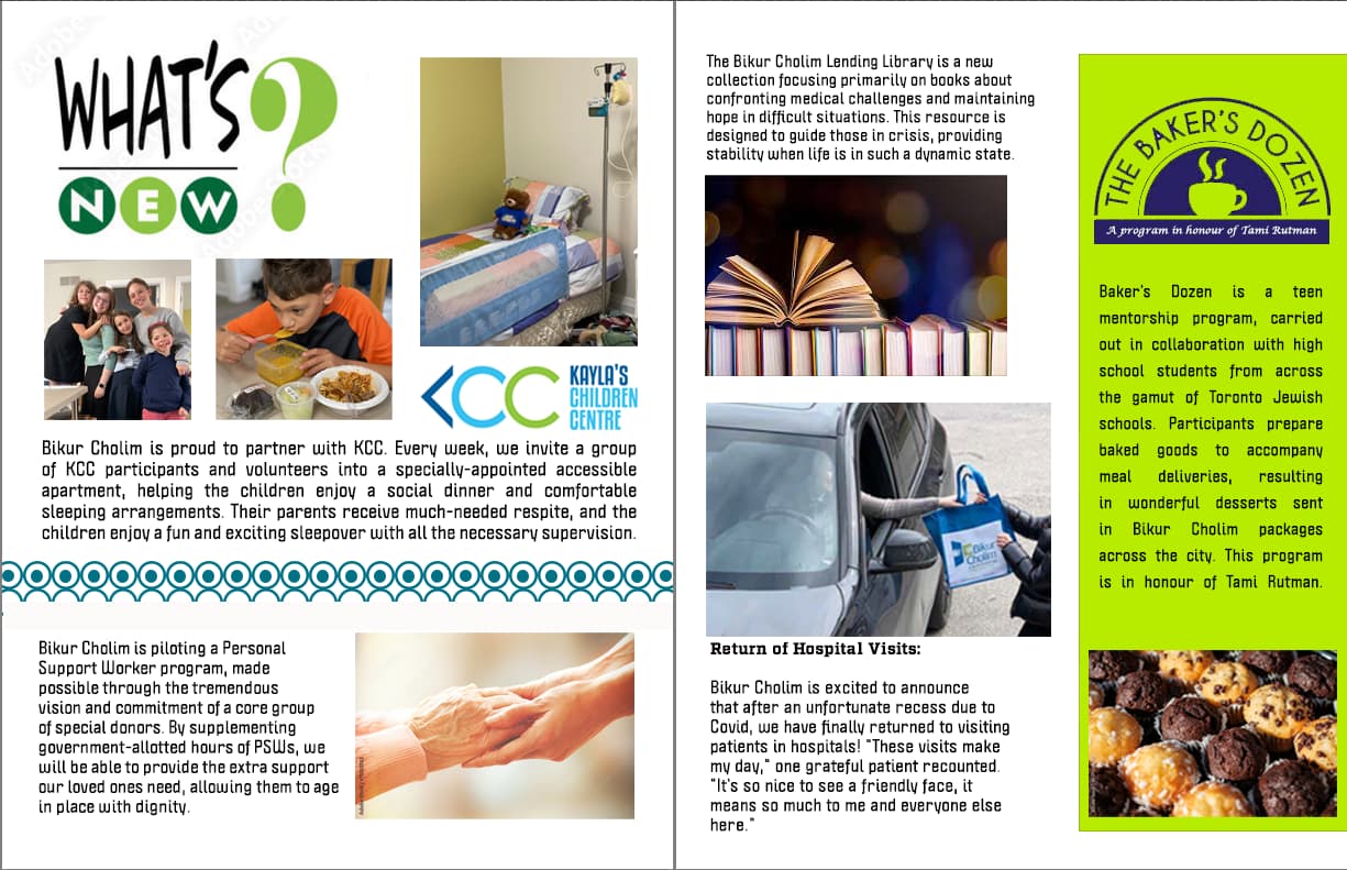
She would like me to shorten the text and use more graphics (like the pot in the background of the first one)
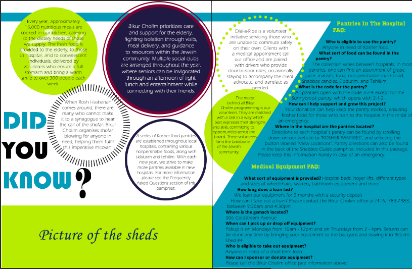
The many balls seem a bit busy.
Is there concern that the pages won’t match up seamlessly ?
Any suggestions?
Thank you!