would appreciate any feedback
Well done! Love the logo
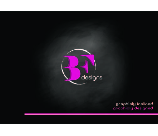
Logo and tagline is nice! I’m not loving the “chalkboard faded circle” behind it. I feel like it would look sharper without it but it’s fine to leave it if you like it…
Nice. I agree with Breindy.
Very sharp!
Love the tagline!
Spelling error there - graphically?
I liked your first logo with the circle behind the B,F. I think it’ll look sharper if you took away the “faded” circle that’s behind the logo…
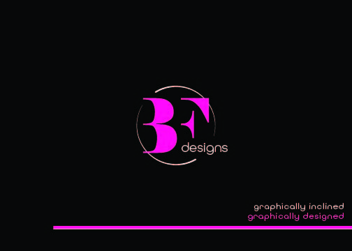
I actually prefer this one! Its bold enough without the circle

I like this one better, prefer it without the glow.
Yeah, I also like this one better!
k thanks so much!
id prefer it straight not slightly angled (unless its my eyes acting up) and withouth the 3d effect.
Very sharp look!
I would use a sharper circle instead of a grungy one to match the rest, maybe more like the style of the line on the bottom?
Nice! Would tone down the hot pink just a bit, especially on the bottom line as the color draws your eye there too much.
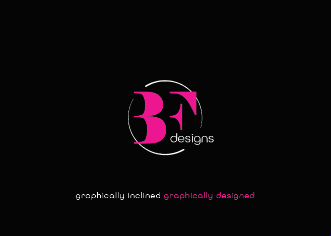
Love this last one!
Amazing job!
Are the two pinks the same color? I would make the pink in the letters “BF” the same color as “graphically designed.” It somehow looks like two different shades of pink… (but maybe it looks different because BF is way bigger so see more of the color)
Last one looks great!