Posting on behalf of a student:
The details are very obviously all off- kind of just placeholder text waiting for when I will have all the true info.
I sent them quite a few sketches, and they chose this one.
They don’t like the font or that the date is big…
They want a more sleek, thin, modern font (that they saw on another sample I made them-, but I told them that works better on a solid background and with this back I think we need a clear, easy to read font.
I would love to hear feedback on how I can take this sketch and bring it up…
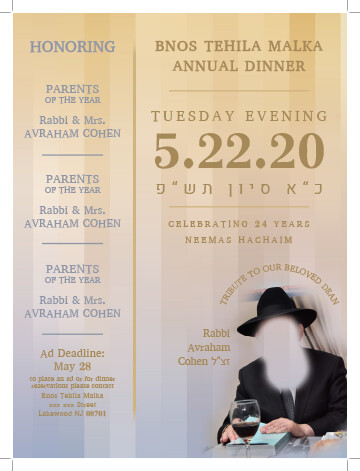
Overall I think this looks nice, and I agree that you probably need an easy to read font. I also agree that the date probably shouldn’t be so big, though it is a good way to get people to save the date! Perhaps you can swap the title of the event with the date etc., having the title bigger in the middle and the date etc. smaller on top. But one thing that bothers me a bit is the symmetry between the two sides, i.e. the word Honoring on one side, and the event title on the other side, the same. So one possibility would be on the right side having the bigger text on the top. But the positioning of the bigger text actually looks good where it is, so I think the better option is to make the text on the left side overall smaller. I think the word Honoring should be smaller, and the parents names etc staying about how they are, but the difference in size between the parents text and the ad deadline text should be more prominent, so maybe the parents text can be a bit bigger and the ad deadline text a bit smaller. I also think there should be more of a visual difference between the left and right sides. Perhaps you can make the left side background dark, for example, and the text lighter, or maybe not have the stripes in the back on the left side, and have something solid, and possibly darker, instead. There is also a bit of a contrast/readability issue with the bottom of the ad deadline text against that background. I would also try making the image a little bigger, and the caption text a little smaller and somewhat different shade from the other text.
And, of course, font choices make a huge difference, so you might want to browse fonts on the cloud, for example, to see if there are some sleeker options that are still readable. Or perhaps pairing two fonts, one for headings, such as the name of the Parent Award, and other important heading text, which could be your more decorative/sleeker font, and one plainer font that could be for the parent names, contact info, etc.
Hatzlacha! Nice work!
Thank you so much for the critique. I followed lots of the advice, and here it is. If you have any thoughts, I’d love to hear
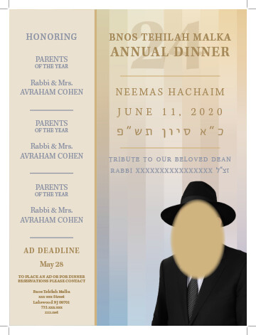
I think it looks better with the color change on the left, and the change in text size. It might look nice with a realtovely small drop shadow behind the strip on the left to raise it up a bit from the background.
Not loving the very loose tracking the date, maybe just enlarge it, or keep it centered. On bottom left date text, I would move the date closer to the Ad Deadline text, as it is one phrase. Then a space, and then the contact info closer to the text above since it is also one phrase or sentence. So it is more clearly two groups of info. Also would semibold Bnos…Malka. I had suggest before making the caption by the photo a little smaller, but I think it looked good curved around the image as you had it. Ads some variety and fills that space to the left of the photo. Perhaps try some variations of that, but possibly with that text in black or gray to relate it more to the photo than to the rest of the text.
Nice work.