
Hey guys- it’s me again:)
Trying to (finally) crack down and design a logo for myself! For some reason I struggle with my own stuff the most! Please lmk your thoughts/ideas!
Want to keep it a bit generic as i do graphic/ web/illustration…
I’m calling myself SNIP design (totally random name:)
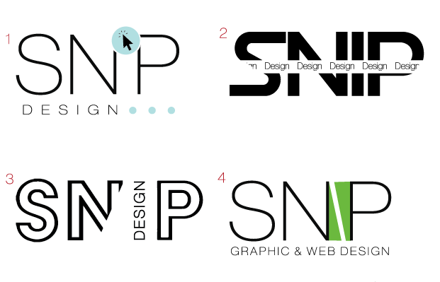
I think number 1 Is pretty cool but it doesnt resemble graphics to me. Number 3 could really work, maybe add a little more of the N back.
I think everyone has a really hard time with their own! For one, there’s no deadline… Even when I make myself a deadline, it still doesn’t materialize like it does when I have a deadline from a client!
Regarding the designs, I really like #3. I like #1 as well, its just not so readable as snip - it looks like SNP. Looking forward to seeing what you come up with further!
i like the concept of #3 but i would fill in the letters - not outline and maybe even keep the i regular and have design at the bottom i think the cut off N is enough
I love the style and coloring of number 1. Maybe I would add the i to make it easier to read…
I like #4
I also like #1 but it’s not as readable
I know this isn’t what you originally said but would you consider snap design? Cuz #3 looks like it should have negative space between the n and p. You can put design underneath in small, and use a shape to make the negative space for the a.
Thanks so much e1!
Not worked on coloring yet but whats your thought on this?
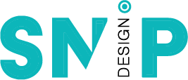
Looking good although I must say I read it as SNP until I read your first post that said you are calling it snip so would relook at the i here
Very nice!
Maybe try how it looks with the dot underneath the word design instead of on top
IMO, the dot helps me read it as an I… so I’m not sure about moving to the bottom… Maybe you can make the word design heavier so it looks more rectangular to fill in that its an I.
What about putting the I back in and doing the word design in white…
Not sure what would be with the dot though! I like it…
I agree, leave the dot on top to help it be read as snip.
Sorry for being a killjoy, and thanks to all for the great feedback here, AND I know youve invested time into this but since you said your name is totally random, why not choose a name that inspires or at least represents what you do. I dont find that Snip is so great or positive… not sure if its only me that feels that way…(if you would have an amazing logo already or the name came from a cool idea then i may say go with it…)