What do you think of this?
Do I need info?
Thanks
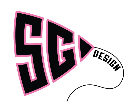
The idea is cute but I don’t think it is coming off as professional.
picture your logo in very small on a page or elsewhere, its going to be too distracting and small not noticeable.
Thats why I asked, thanks for the feedback.
I think the hardest to brand us yourself!! Good for you for starting the process. I’m looking forward to seeing the next round ![]()

That sg is so creative!
I like the SG! I would take off the stroke though. can you put the Design in a regular sans font below the SG?

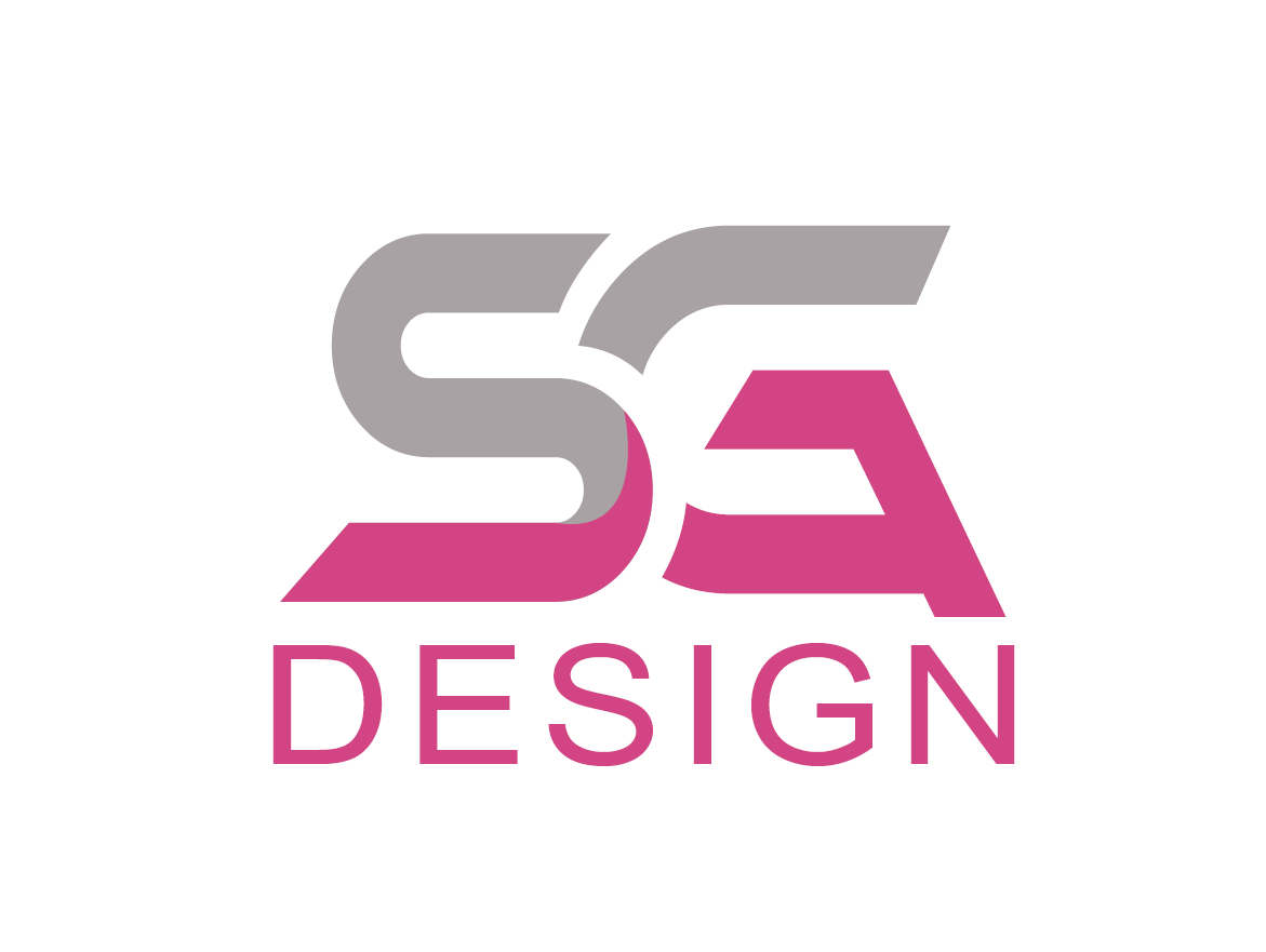
I vote for bottom left!
Bottom left is nice. Do you want to try to keep the ends of the letters in a square. There is something unsteady about it te way its now. Curious to hear if others see that or its just me
What do you mean?
I prefer the font of the bottom right for the word Design, with the pink color, though. Try making it a little bolder though, and tweaking it so it aligns with the right and left of the SG.It overall has a bit of a sports-team feel to me, maybe because of the style of. the SG. If you change the gray color to an actual other color it might have less of that sporty vibe.
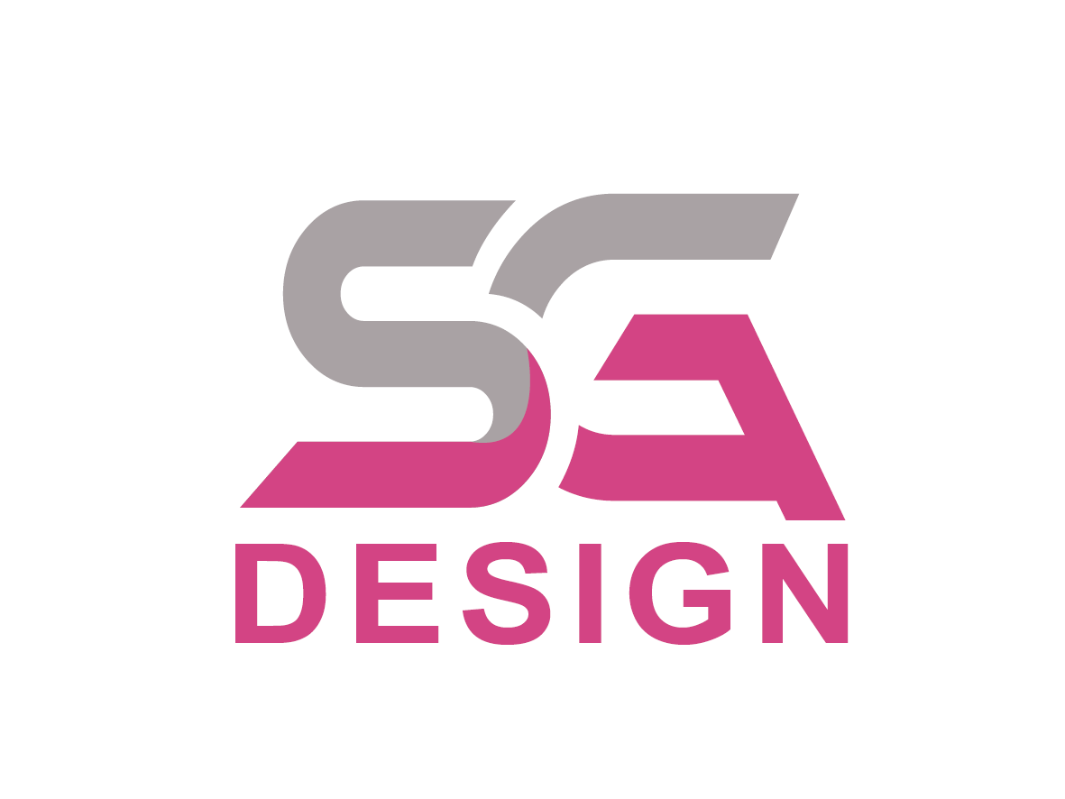
I’m not likeing to “design” font any ideas?