Hi, would love some feedback on this menu flyer!
Looks great!
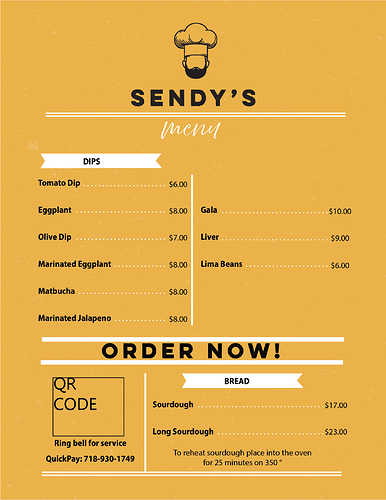
Are those dips on the right also? If yes I would probably even those out, 5 on the left and 4 on the other which will then give you a bit more room so you can increase the spacing between the lines and order now
Also the lines by order now, I don’t think the lines by order now are aligned
They’re not dips… Maybe you can add a similar ribbon on top of those saying Add ons or something similar?
