I really want to touch this up before sending to client. I feel it is missing something but not sure what. Any ideas?
What about adding in some “pop” color
At the moment the colors are very complementary- which is great! but that may give it some extra “spice”
Which color do you suggest? Orange?
I like the design concept but the hierarchy is confusing. I’m not sure what’s meant to be read first, second, etc…
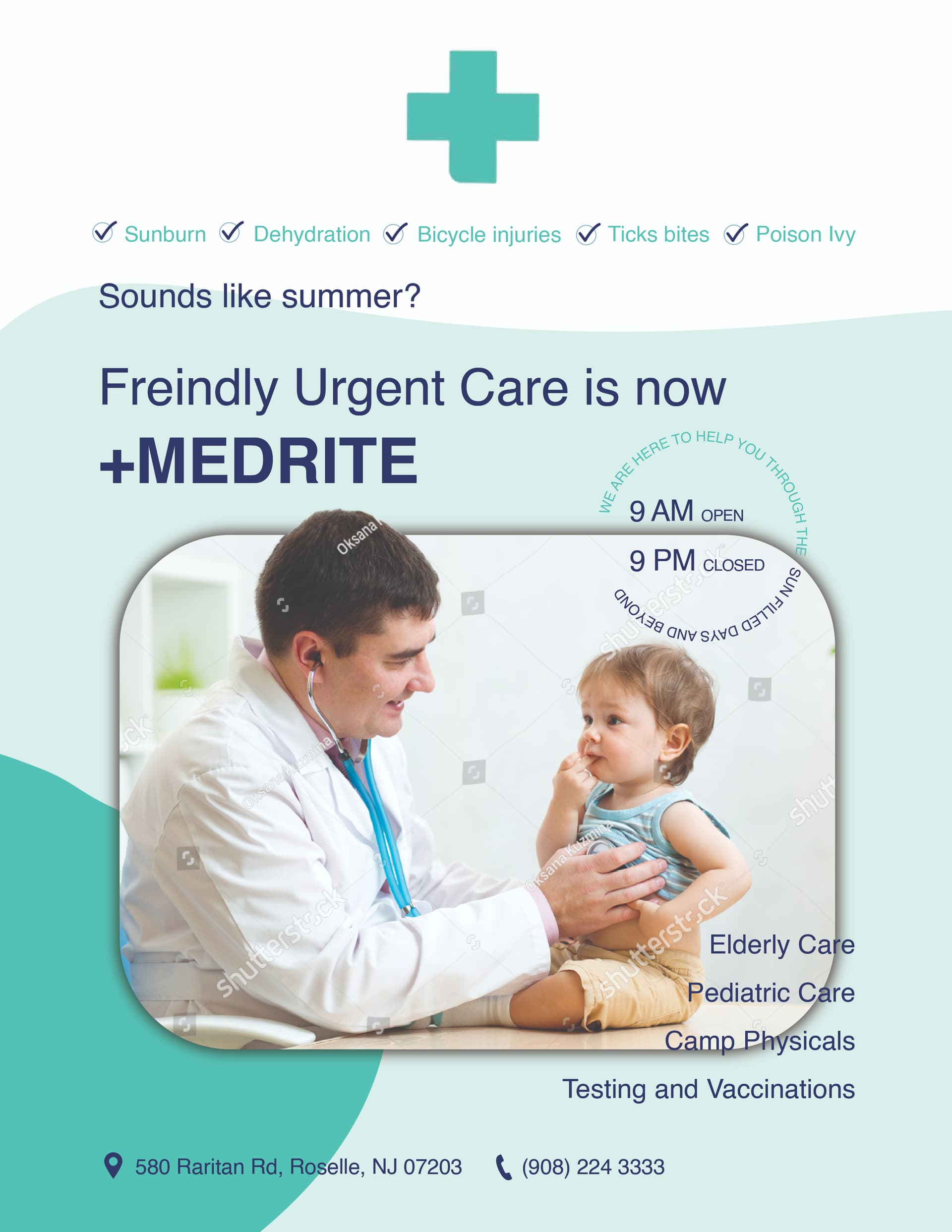
Make the large header and pic on top and the checklist on the bottom - but you may have to rearrange what’s the large text based on the message you want to give.
Now it’s a bit confusing
Who have you the copy for the ad?
i also think the big header should come first. i would also change the bullets all the way on the bottom. the bullets give a feel of having to be a downward list, make you can use some other symbol to divide it.
maybe make it a bit bigger also, and put 2 on a line instead of all 4 on one line?
The hierarchy is confusing, but it looks very complicated to fix!
If you end up using an accent colour, maybe try putting the top checklist and summer line in that colour so it might draw the eye there first
I don’t think it’s complicated to fix - first things first - the copy needs help. If the client gave it to you - maybe suggest a copywriter review and fix it up. It’s not your job as the designer to write the words, although if you like to you could.
Once you have the messaging worked out - you could work on the visual hierarchy.
But the messaging here is confusing. Are they saying they changed their name?
Or are they saying they are here for all your summer emergencies.
They shouldn’t be saying both messages in one ad. I’m they have two messages they should do a series each with one message.
They gave me the text and the layout in which it should be written… Will try speak to them.
Great concept, just saying that they do not have any contact info or address on it.
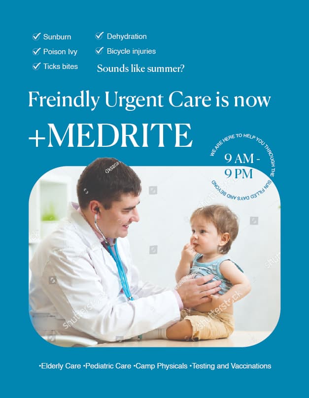
typo on Freindly → should be Friendly
i agree about wording needs help - do they have company logo as that may also clarify if the name is ‘friendly urgent care’ or ‘medrite’…
i think instead of check boxes i would do bullets and 3 dots like sunburn…? poison ivy…? coz not everyone is gonna check off all the boxes
also why not use an image more to do with suburn/pain to start and then you can have that happy doctor image… to show problem/solution more clearly
hatzlacha!
design is lovely
The client was very specific. They wanted the tick marks and an image where a dr is smiling at a patient. I contacted them though about the copy and am waiting to hear back from them.
Like the layout. I would also agree on adding a pop of color, especially to the top half of the page.
It’s a little bottom heavy because of the little text on top and then thee large heading and picture.
Can’t wait to see how it comes out!
Does anyone have a subscription with Shutterstock and an option to download this image for me, I would be happy to hear how much it is as am happy to pay if it is within my range.

The sounds like summer is cut wrong with the wave underneath
Text on bottom right also doesnt look right with the rounded corner of the picture
Friendly is spelled wrong?
Forgot about the friendly, that was mentioned before-will fix
What do you suggest about text at the bottom, how could i try fit it in?
I like this design as well (I wouldn’t use a shadow on the box) but it’s really the copy that need help here - when you have the right copy the design will fall into place.
Sometimes client’s think they want something because they don’t know of an alternative solution. But when they see something better - which is clearer and makes more sense they will like it.
I agree that it doesn’t make sense to have check marks - you’re not checking off a list here…i think that whole piece needs to be reworded and figured out.
More like -
We love summer. But those sun-filled days can be clouded by “fill in this blank with one thing - ‘sports injuries’”
Medrite is here to treat you. From 9 am to 9 pm.
On the bottom you could have information and over there you could write - friendly urgent care is now - medrite - use logo.
Check out how sr play rebranded as whee - you could look online at bpweekly
Sometimes clients need to be educated about marketing - how to rebrand, the rule of one, etc. I would say - listen - there’s a lot of info here, maybe we should break it up into a 3 part series. And show what you mean.