Hi!
Any critique on this ad would be appreciated!
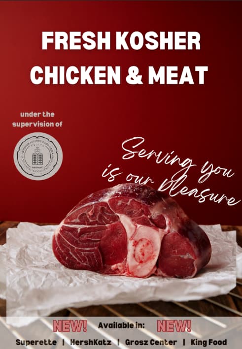
Hi, a few suggestions!
The title font could be a bit more exicitng…
Also would use a thinner font in the bottom bar. I would propbably remove completely the words: New! Available in: New! - and just put NEW somewhere else.
Maybe make the bar at the bottom a solid colour either black or white.
@Esther_R Thank you!
Are these fonts better?
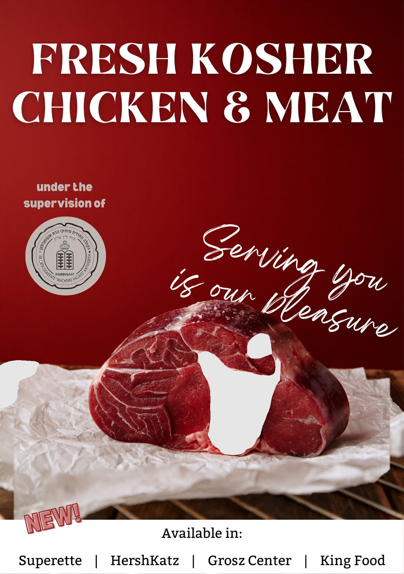
It looks so good now! 2 small changes, can you make the top text a drop smaller so you have a bigger margin. the new on the bottom can be made bigger and more exciting.
Much better now!
Ok will do! Thank you!