A client asked for a logo for their Matzah Bakery.
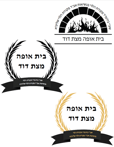
I started with this.
I need some help…
Both are a great start! I think both still need tweaking to make them actually look more like the objects they are representing. The oven one, the bricks can come slightly more rounded and imperfect…
And the wheat one, maybe try some other kinds of stalks of wheat? I like the idea but I’m not loving these stalks.
Also, try some more interesting fonts…
I like the one on the top right.
I would change the font to something more different and bold.
Same here - I like the idea of the first one, but would play around with some more unique fonts.
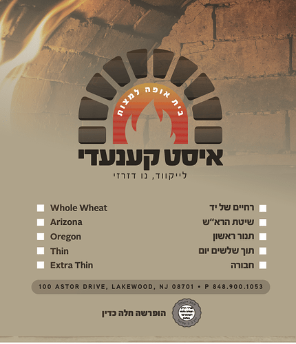
Here’s a matzah bakery logo I worked on a while ago… it’s hard because they all want to look the same, but they all need to be different!
Thanks all!
Yes, there isn’t so much room for out-of-the-box ideas, but at the same time I’m thinking something nice with just creative typography and not necessarily an image/icon can work well too.
Totally. Working within the white space of the typography is also a good idea here…
I like the black and white more, dont know why…
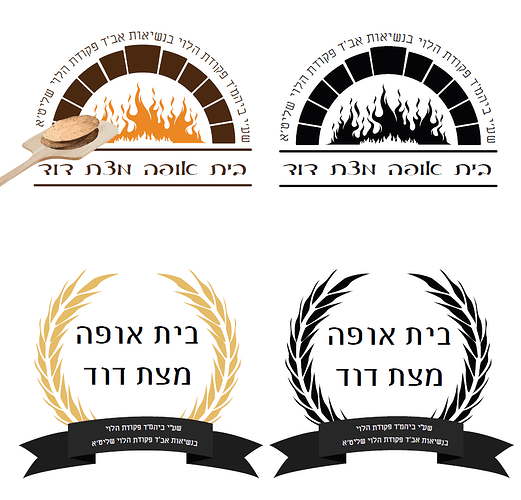
Which option makes more sense?
Can you try some other fonts? I don’t feel that a script is the best choice, it feels more informal. Also, I think the flame is too detailed. Can you simplify?
Another idea, going with the neg space typography mentioned here, can you stack the words in 2 rows like this:
בית אופה
מצת דוד
and the Beis can become the oven shape?


