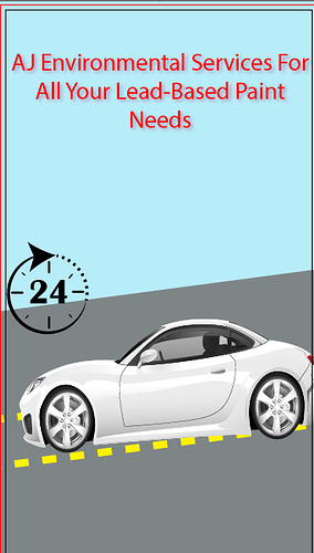
I’m making one of my first ads here… I want some help with making it look a bit more exciting!
now its so blaaaaaa and boring! Someone sent me a logo and said he wants me to put it on a white car. Hes company does Lead Based paint inspections. I need ideas how to make this ad more exciting pls!!
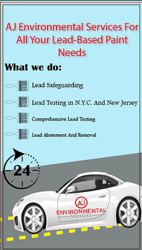
What do you ppl think of this? How can I perfect it before sending it over to the client?? its still not soooo exciting… also is this the right size for a whatapp status kind of thing…??
Im trying to understand what the car scene has to do with lead testing and safeguarding? but I see in your first post that the client wanted the car so my only comment is that the car looks stretched to fit the space - I think you should re-place it onto the ad and dont stretch it…
1, to make this more clean - give much much more margin space (Space all around the edges of the ad…)
2, maybe take the logo and move it up to the top of the page so your heading isn’t so long - it should say “All your lead-based paint needs”
3, “What we do” should be lower - not so close to the slogan but it should be closer to the bullet points…
4 - The paintbrushes are a drop too big - I would make them significantly smaller and make all the text the same size
5 - it’s missing contact info - number, email, website…
6 - What’s the 24 about - what does it mean?
7. maybe give another option - have a paint bucket with paint spilling out or something more visual than a car - I still don’t chap what the car is for (Is it the idea like we come to you?)
Make the font a bolder font and then maybe you can take off the drops Shaddow. Im finding it hard to read now.
thanks pointing that out to me… He very much wants the white car with the log on it. I’m still working with it but thanks for all your help!
Try looking up free backgrounds on freepik or something. Nice backgrounds often help things look more exciting.
Have the logo look more like its placed on, does the whole car need to be on or can you just put 2/3
Text needs more work.
Find a bolder font- bebas, roboto black something that will stand out more
paintbrushes could be on a slant for more personality
too many fonts going on here

