Hi everyone! I made this logo as a rough draft for a client who’s going into makeup…
I personally don’t like it but when i sent her the rough draft she loved it and she wants to keep it like this…any ideas on how i can make it look more interesting or using better design but still looking similar as she likes it this way?
Thanks!
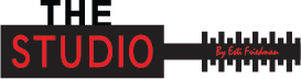
I would maybe change the colors to be softer…at first glance I thought it was a music studio and the lines were imitating voice waves going up and down. Maybe soft pinks would help?
I agree with @gila-garber - it looks like a mike or a comb… Maybe make it a little more feminine looking with softer colors and a script font for the word “studio” I also would make the main line (It says her name on it) smaller and the other lines a little thinner.
nice start! and I also like that it’s not so typical looking
I can see what it is, but I agree that the whole logo needs a more feminine flair. Also, the shape of the mascara brush doesn’t work so well because it ends up with a logo that is very spread out, a logo should be more confined, and also the script text is so tiny, and will be even tinier when the logo has to be shrunk. Maybe another type or makeup would be a better option?
I agree with the above. Make a softer brush and softer colors.
You can also try using a circle (eye shadow or blush) with a soft brush or paint brush.
For the font I would choose a soft feminine font. Not so hard and bold.
Good luck!