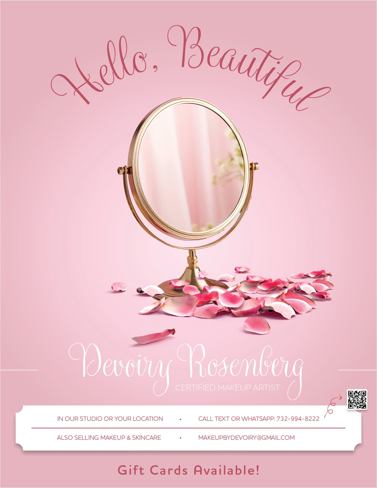
Hi! Critique on how to improve this ad?
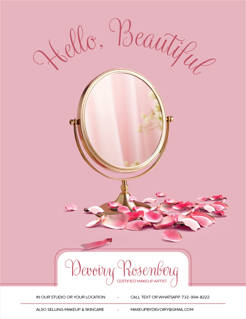
Its really nice! I feel like there is to much weight at the bottom with the top being very clean and empty.
Love!
Agree, I think either have the info directly on the image background, or even just a rectangle for all the info but not cropped off the page. It’ll just stay consistent with that fresh, airy, beautiful look. Amazing job!
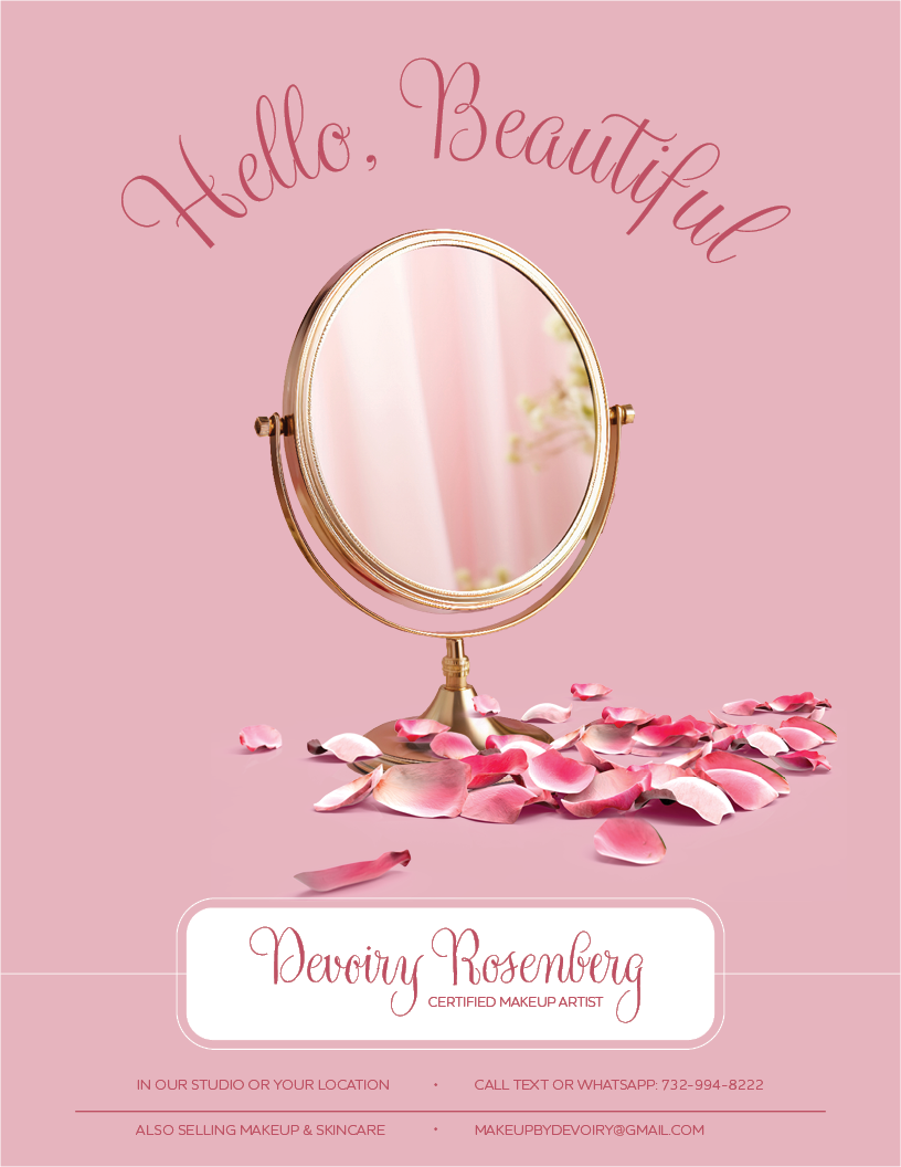
I really like the last one!
Thank you!
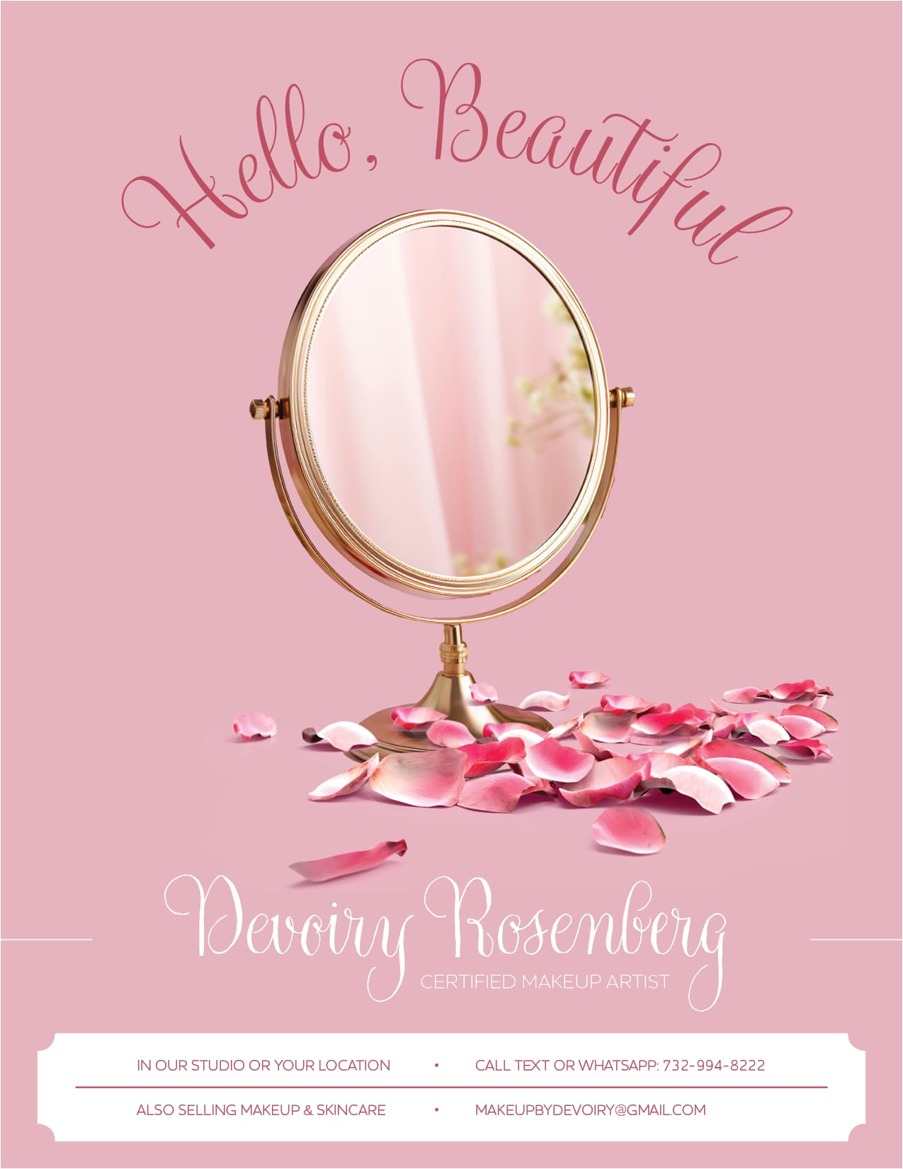
Something about this one I like, I think that its less heavy on the bottom. can you make the dividing pink line shorter on both sides so it doesnt stick out as much?
Thanks everyone for your help!
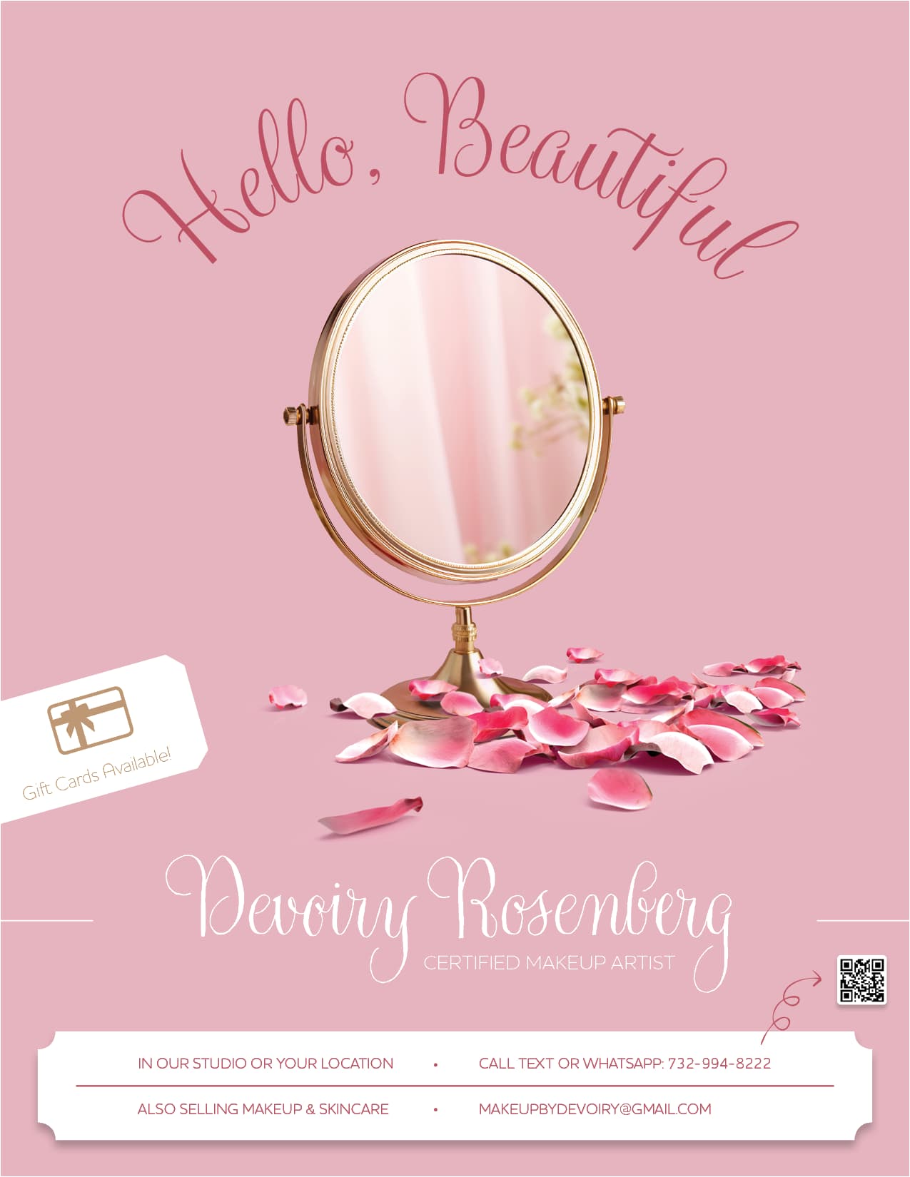
She now also wanted to add that there are gift cards available and a QR code that links straight to her WhatsApp - Any ideas about placement?
,
1 Like
Can you make the bottom bar less wide to fit the top design elements? You have enough room to make it taller.
i would not cut the the gift card like that, but keep it on the page.
I would try a soft gradient background for the whole ad
2 Likes
I like how you did the qr code its really cute, another option for the gift card, you can put a bar on the top right side to balance out the top and bottom.
Great job 
Has anyone else designed makeup artist ads that they are happy to share?
(I’m designing one for someone and I’m looking for inspiration!)
did you search online for inspiration?
Not yet.
Figured I’d ask here first…
Any specific places I could look?
start with google (images), pinterest and just general google and see what you come up with.
Thanks