Hi,
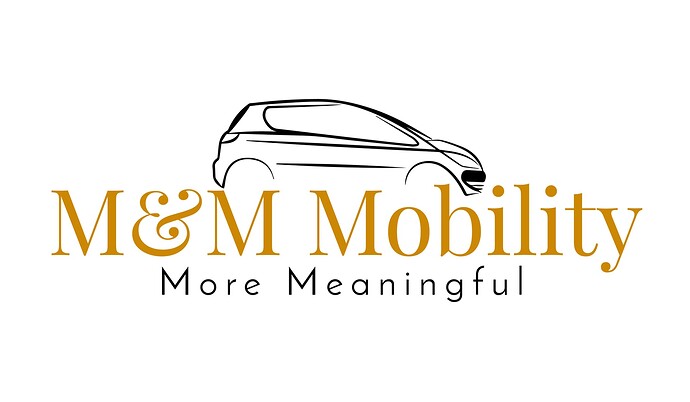
Here is a logo that was designed a few years ago.
They are looking for me to refresh it and modernize it.
I was wondering if anyone can pitch in some advice.
I am starting to really get into branding and logos and it’s just taking me time to get into the hang of it.
Thanks!!!
I find that getting more info first is really helpful for giving direction to the design, especially if it’s a redesign.
What does this company offer? What type of brand have they built in the last few years?
What do they want to highlight? Friendliness/professionalism, etc.
Is there something unique/special?
If you have something specific to portray, it sometimes makes it clearer and easier.
Also helps to get some inspo from other brands in the industry
Hatzlacha!!
Thanks @Chani_Wolpin I appreciate your leads.
I was wondering if for this specific one, anyone can start me off?
- They are a chesed organization that provides handicap vehicles to pick up and transport disable people to and from simchos, dr appts, etc.
- They aren’t a company so I’m not sure that they created a brand.
- They are specifically rebranding now, since they want to run a campaign to make money to continue to provide this service. Therefore, I am assuming they want friendliness, professionalism, time-accuracy, etc. to be depicted.
- I don’t know off-hand if there is something unique or special about them.
Maybe someone can direct me by seeing these details.
Thanks again!
This info is great! So they probably need a logo portraying warmth and care, while also keeping it professional, but shouldn’t be too cold and corporate.
I personally start by experimenting with the vibes of different fonts and type layout, just copying the company name in illustrator a bunch of times and trying different fonts, weights, cases, layout (stacked/one line), etc.
Adobe fonts actually has a filter called friendly, I wonder if you can start with some of those?
Once I have a few options i would start playing around with options for the icon.
Just my personal process:)
Hope this helps…
every company or organisation has something unique about them and branding is important for non-profits too 
i love your openness to learn and improve (and e/1 on this forum!) - that’s what makes the best designers!
The current logo looks to me too elegant for what they are. I would go for a more solid but not too harsh/edgy type of a font. Yes, check out the adjectives you are looking for and you’ll get a feel for the vibe and shapes.
Thanks everyone!!
I am going to take a shot at this and see how it progresses.
Keep you posted.


