
Hi. I am working with a client whom I am working with to sell her resin paintings. (Anyone wishing to see samples of resin paintings, please email me at elisheva2222@gmail.com.) I decided to help her with her logo. Since I couldn’t think of anything that has to do with resin besides for resin, I stuck with resin in my logo design. She wants to keep her name as her logo. But she is not sure in which direction to take her logo. I stayed contemporary. If you know of a way I can show her old-fashioned, please share that idea with me! I did some research but couldn’t find inspiration.
Adobe crashed a few times on me and couldn’t recover my last draft, so I redid everything I’d already done. Here is my draft, post-redo. I thought of an ellipses for one logo design just because the three circles made me think of that. The vector came as three circles. I could delete one.
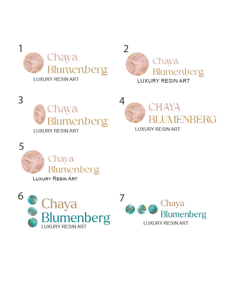
I like number 6 the best
I like that first font you used for her name. Maybe keep her name all in one color and then do the tag line in another color.
You can try an option of her name going in half circle with the ball in the middle and the tagline under going around the other half.
You can also try an option of her name straight across with circle on top and the tagline half arc on top of that.
Gluck!!
Can you send examples of what you mean, re the two ideas?
Do you still need this or she confirmed on a logo?
I’d be interested in seeing what you mean so I can know for future reference. But she confirmed on the logo.