
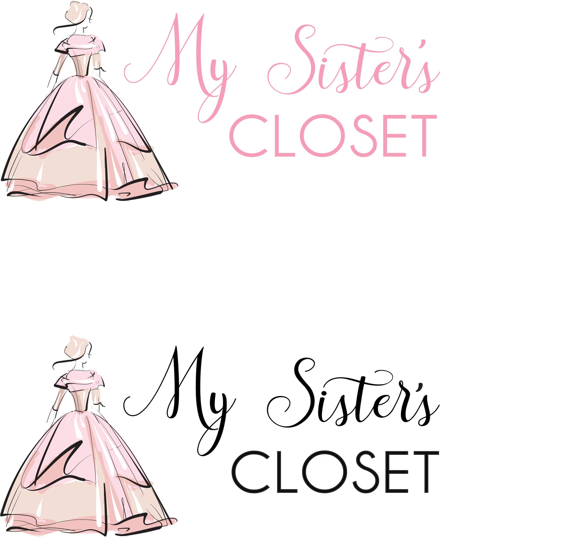
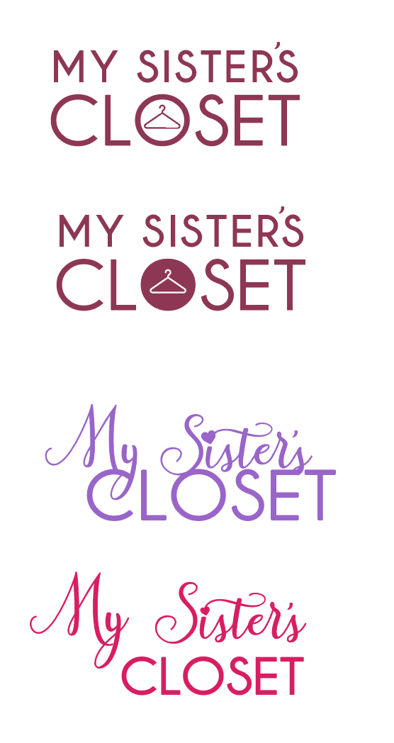
im designing a logo for a vort dress gemach
i think i narrowed it down to these 2
which one do ppl like better - colored words or black?
tia!!
and any corrections?
cute name!
they all give very diff impressions. the big gown one looks like you’re only gonna find super fancy dresses and the one with the hanger is super cute but i think it looks more like will have weekday clothes.
I like the purple heart one
for gown one i prefer black…
thanks rivkah!
its for much fancier outfits (vort dresses for kallahs)
so i ended up using the black words and dress pic
now…
can i have critique on this ad please?
its not fully done (also the logo on top needs to be switched to a higher res version)
and is it clear that its a project of achosi rayosi, or should i maybe write ‘a project of…’ ontop?
thanks!!
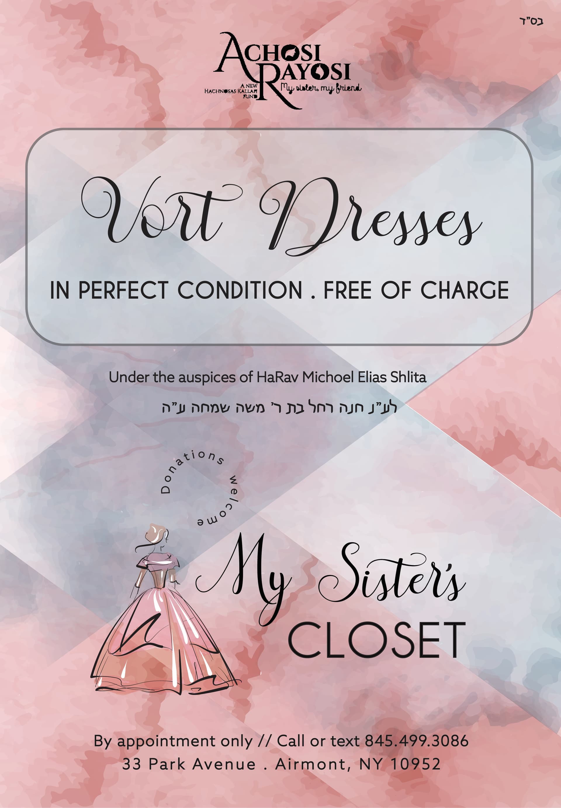
Its looking really nice!! Im not sure why but something about the word closet for some reason doesnt look right to me with the rest of the logo/ ad. Maybe you can try a different font?
Its very nice
totally understandable that its a project of aches rayosi
its bothering me in the logo how the word Sisters is so far from the word My and the world closet should be closer to the dress…
also by in perfect condition . free of charge - move the bullet point up to be in the middle
also move up the L"n closer to “under the auspices…”
I like the circle donations welcome but I think its placed funny - I feel like it should more go near the word sisters
hi!
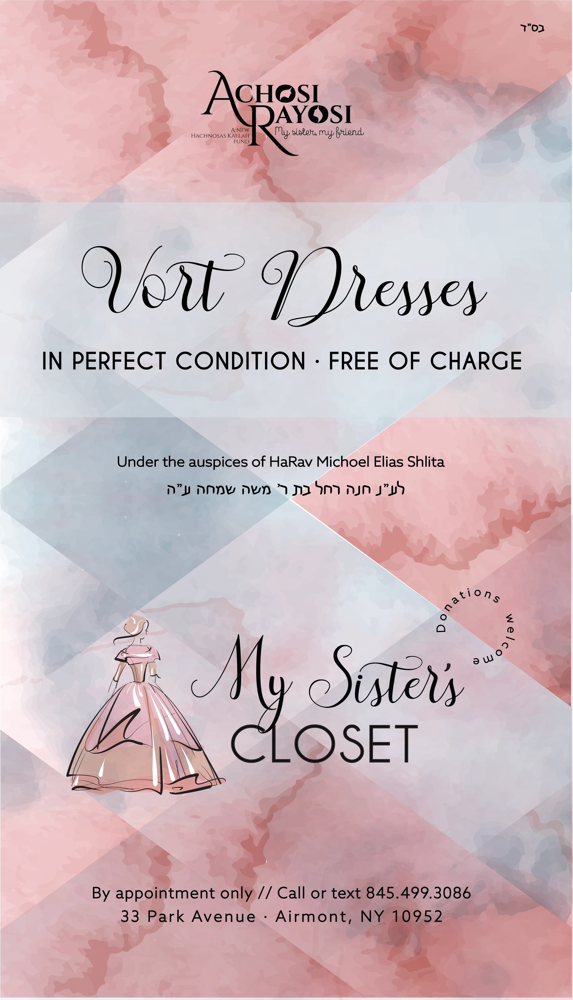
its been a while but finally finished it 
thanks for all your help everyone!
heres the final version!!
3 Likes
I really love the advert. Did you create the background on your own, or did you use a ready image?
thanks! i photoshopped the image to look a little different
really love it. Great job
ty