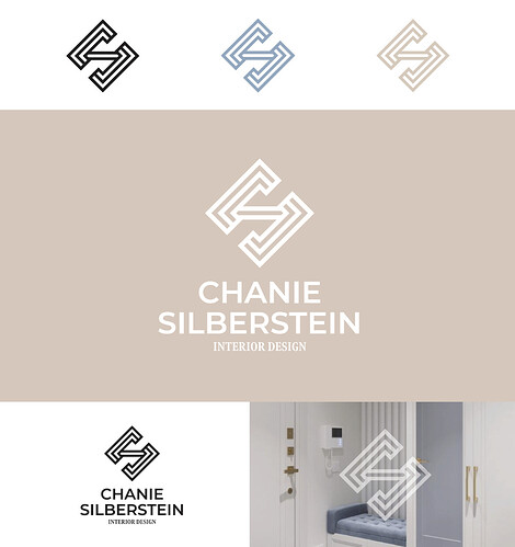
Hi, my client picked this logo (she is an interior designer who focuses on space planning) but she wants it to have a little more elegance and show more of the interior design aspect not just space planning… any ideas?
I tried making the stroke thinner, changing the fonts, but its not coming together. thanks!
Beautiful logo!
I’d love to see the version with the thinner stroke… I could imagine that looking more elegant
Nice! Maybe try rounding the outside corners?
thinner strokes and try a serif font?
beautiful!
Looks pretty classy to me! Would maybe try playing around with the fonts under the icon. That might give it a bit of a lift…
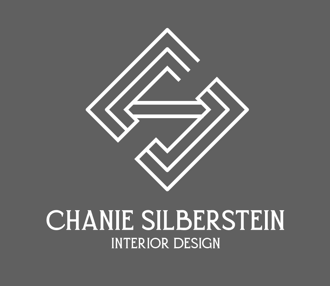
thanks everyone for your replies - heres the icon with thinner strokes.
feedback?
also any ideas for better fonts?
I don’t have ideas but I love the logo!
Love this logo
I think the top font for the name is nice
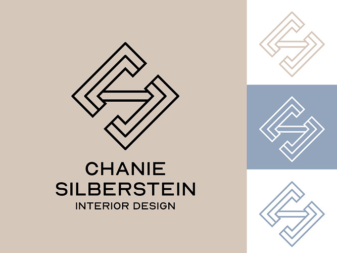
I feel like you should use the same font for the name and interior designer to make it more cohesive and match the modern vibe of the logo.
Don’t love the font
I was saying to do both in the san serif but if you like a serif I would do a differnt one
the edges and thickness of the font dont match
The icon is gorgeous! My personal opinion is that the icon matches a sans serif font.
If you want to do serif I’d look for something different… not loving this one.
I love the icon, whichever font you go with make sure that the font weight/thickness matches with the icon thickness.
I’d try either a more elegant serif, or a sans with some slight quirks.
I love it!
Looks great! I like the font choice!
Looks amazing
love the font
Love it!


