Which one do you like. Any changes or any that you think i should not send

I like 3 5 and 6. 4 Is really really sharp
I agree. 3, 5, and 6 look very good!
I meant to say that 3 looks very sharp, 4 is a little hard to read.
And I agree, re 4 is hard to read. Not trying to parrot; you’re right on point, @chavi. Hope you don’t feel parroted or that I’m just saying this to impress. I agree with everything you’re saying and wanted to poster to know that there are two (so far) who think the same… I think you may have gathered as much but still don’t want you feeling parroted.
i like 1 the best coz it’s piano-y and unique to her name. For 2 and 3 i wonder how it could look with piano turned to the left as for me now it looks like the profile of a face (but i do tend to see faces in many patterns so maybe it’s just me!) or did u davka do it to look like a P?
i dont mind parroting  no. 4 is hard to read - i see an R G at the end but are there meant to be two letters to start - if so what? i’m curious…
Either way i think it’s fine to send all these as a range unless you dont like any of them coz many times clients picks the one you least like!!
Also are they all black and white coz goes with piano or coz u always send first logos in B&W?
Is she a very classic/formal type piano teacher? as these are giving me that impression.
(except number 1 which gives fresher vibes to me).
I like the Piano font used in no.3 but not sure i like it with the P made into images like in 5 and 6… maybe the trailing o could lead to a piano or something instead.
Maybe her initials?
But I just see the g… What’s the piano supposed to be? A d? But no shaychus to her name… Cuz it looks like a d. That’s why I didn’t choose it as one of the options that I like… cuz the piano shape confuses me. Is it a d or supposed to somehow look like an r?
Re parroting, haha. Cute. And still reassuring to know it’s allowed. I am not parroting for lack of own opinion as much as agreement with previous statement. Some interpret parroting as the former so wanted to be clear that I meant the latter.
I love nr 5!
I really like no 1. It’s different and 3 is also really cool
Just to explain the 4 logo, it is supposed to have a P then R then G-but i still wanted it to look like piano keys. But obviously I failed quite miserably bcs you all seem so confused. Think I will just leave that one and focus on the others. Thank you for the idea of having something trail off the piano, i will try that. As for 3-I do want it to look like a P…
I like 1, 3 and 5. For 3, can you make it a bit more obvious that its a P?
I like 3 but didn’t notice that it’s supposed to look like a P
It’s always good to repeat if you agree then the original poster can get a feel for how many people like something etc…
That’s why I’m suggesting that she strengthen it! The lines create the base of the P and the piano body shape creates the top.
Really nice logos! For #3 try another 3a where the piano on top replaces the letter p in the word piano.
Also I like the idea of #4 and think it should be a choice. I see the r and g in the 1st version maybe adjust the p and remove that piece under it or make it much thinner. The r can look more like the p does now. I still get the piano key feeling and don’t think it needs to look like exact keys.
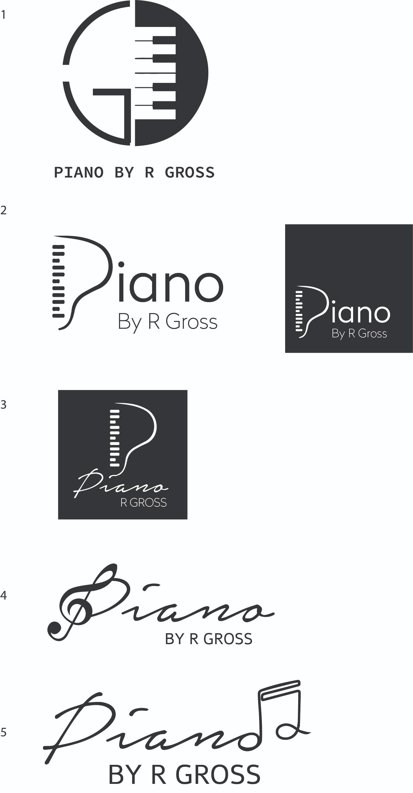
I had to send in to my client, and she chose number 2 of the above logo’s. Thank you so so much for all your help. You are really amazing!
Nice! I also like 2 the best