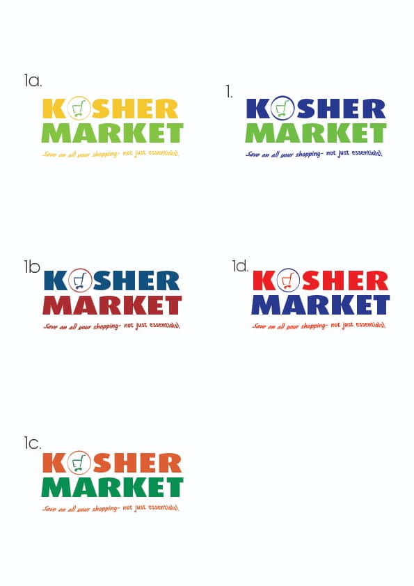
I’m working on a logo for a cost shop called kosher market. client has no ideas in mind. what do you think on these two ideas to send him and any more ideas pls? thanks
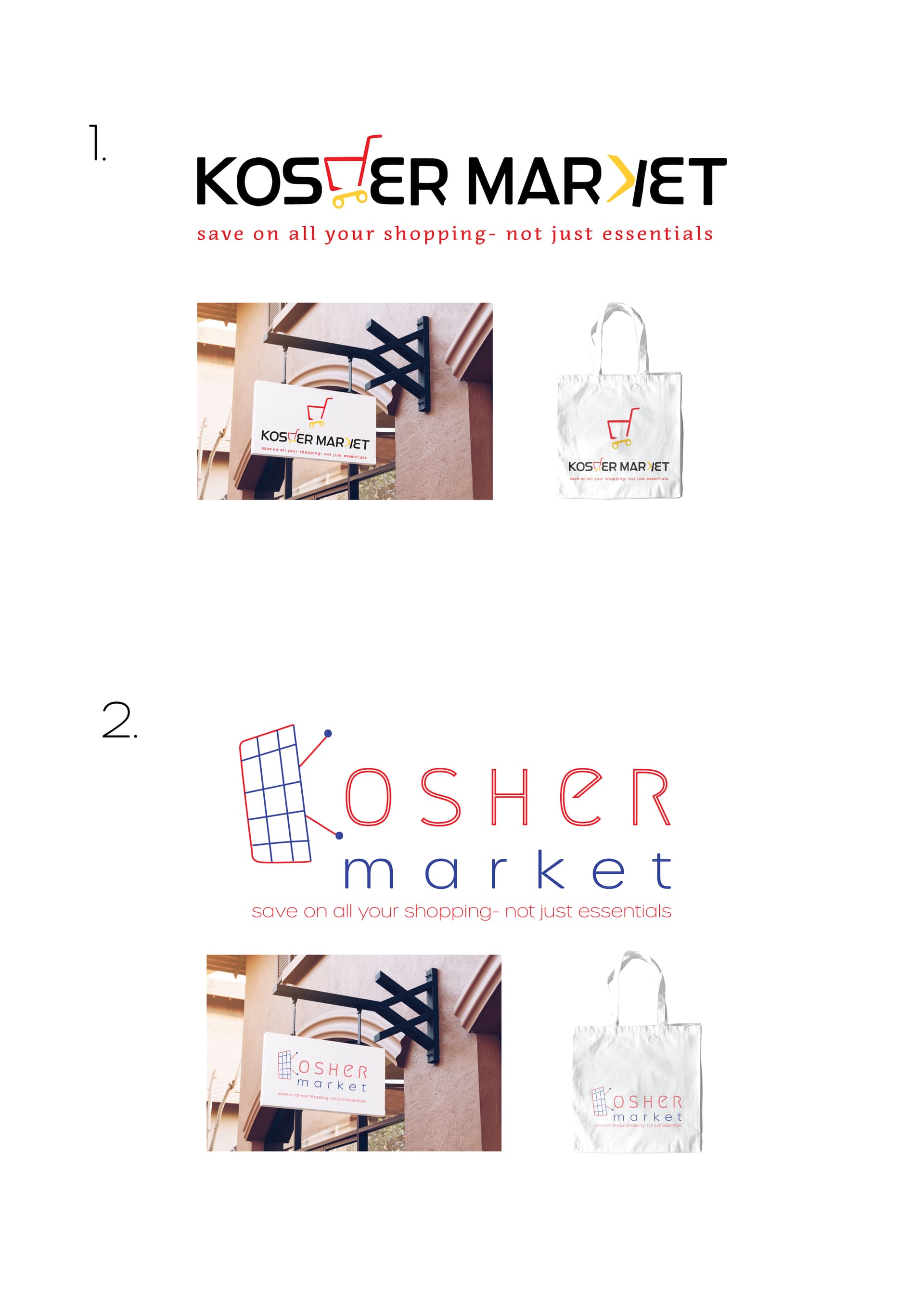
I like the concept of the first one!
Maybe put the market of the first underneath the kosher?
its quite long like you have here
i would also try one where the letters are more clear/bold and simple and keep the cart icon separate or just do something more subtle like lines on the side… ideas for inspiration

.
thank you breindy, adina and rivkah for your help!
bh i sent them 8 logos in the end and they have narrowed it down to two. I now need to send them color options, any thoughts on the logo colors etc? This is what I have come up with so far but feeling like its still not right…
thanks for all the help coz i still so new at this ![]()
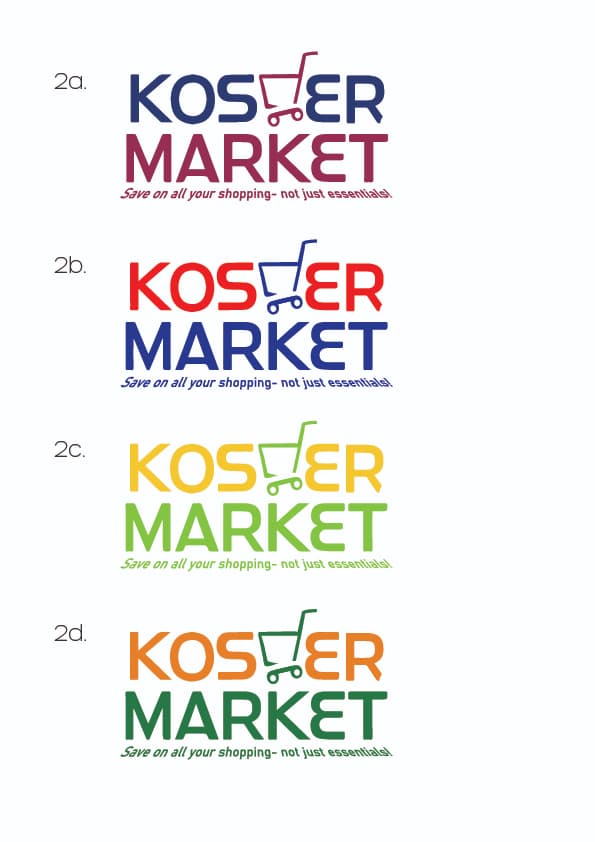
wow I love the logos numbered 2
I like the like green in number 2c - how about doing Kos(h)er in dark green of 2d - it would look very supermarket-y 
I also think #1 is good coloring…
Ye I second number 2 and colors of 2d
i really like the bolder text now  for the 2nd logo range, would it make more sense to flip the shopping cart so then it can kind of pass as a lower case ‘h’?
i’m liking the blue and red options b/c my brain associates it with tesco in uk and osher ad in israel! second to that i like the green/orange combos prob also coz os some supermarket association i have. i’m not so into the yellows…
color choices are also something you can ask client about…they prob have a preference…
I agree with @rivkah to flip the shopping cart.
Love the logo
I like the concept!
Orange and green makes me think of fresh fruits and vegetables, so I would think that’s a good option. But I think all the color options you chose are nice