Hi,
I am rebranding a day camp that’s been around for 43 years!
Here’s something I “sketched”. Can you give me a way to “polish” the look?
Also, does anyone have any other ideas?
They want the colors blue & yellow… and include “Chaim” in Hebrew as well as “Chaim Day Camp” in English.
Preferably if we can put in somethings they do in camp: learning, sports, trips, swimming, activities - a&c, woodworking, baking, etc…
Thanks for your help!!!
I really love the logo. I am wondering if you could remove the yellow (it might look more polished if the text does not have the stroke) and use the yellow in other places such as for the hebrew word chaim and the words day camp (or maybe try everything in blue and just the A and words Day camp in yellow). I would also try to shorten the A so it aligns perfectly to the words Day camp.
Thanks!
We actually are now working with both options.
I am liking the one on the right. Any way to make it more polished??
I would make all the shapes more of an icon simplistic style with no gradients/multiple colors.
I think that would make it bolder!
agree with @goldie-mezei - Also maybe choose one icon for the logo - either the bat and ball or siddur
and I personally think the one on the left is coming together better… the long A is interesting and the C has room for the Hebrew Chaim…
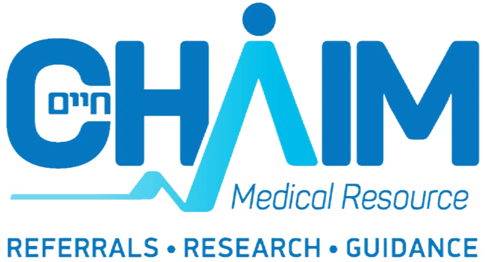
The first one when I first saw it reminded me very much of Chaim Medical’s logo - so if you go with that one make sure it’s not too similar.


