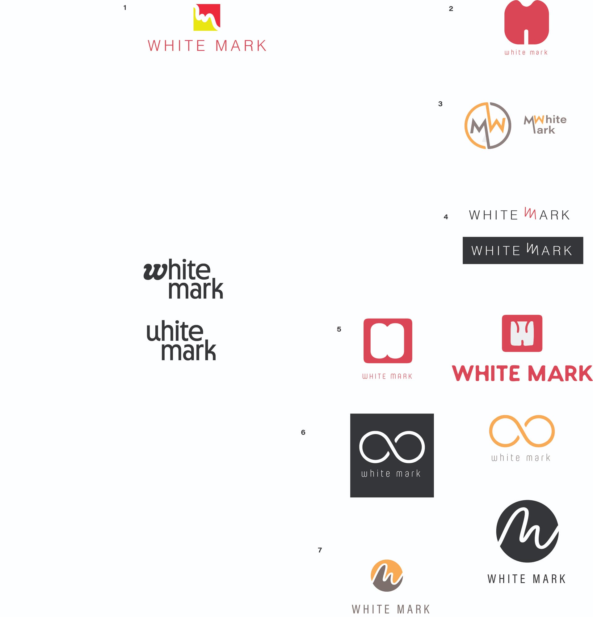
I am trying to create a logo for my freelance graphic design and finding it really hard…(guess it is easier to do things for other people…) Do any of these have potential, and any suggestions on how I could improve them?
Thank you so much
You need to label them so we can point out which ones we like!
The W/M in white on pink looks great to me!
as does the bottom ones with the circle m/w
I marked them 1-7, 1 is the first on the left hand side. then 2-7 on the right. for 4-7 there are two variations for each logo. (i did not mark two on the left hand side, bcs not finished working on them)
I will remark if not clear enough,lmk
Thank you so much

thank you @adinacahn (not sure which one you meant, was the circle one the same as @Breindy-S ) and @Breindy-S
circle one was the same as @Breindy-S
and I liked the one two above it
I like 3,4 and 7. Yes I find creating things for myself is the hardest because the options out there are endless!!
This is my favorite! And yes, I find designing things for myself way too hard! Anyone volunteering to do my logo? ![]()

thank you so much @adinacahn @Breindy-S @chavi @goldie-mezei
it seems it is between 4 and 7. Will work on them a little more and on the coloring. Really appreciate your help.
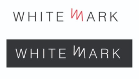
same i love the number 7 how the w and m flow so well and in black and white looks really effective… you could then switch the black to any color for diff uses, i dont like the three color version as much as the one on the right
Thank you
Oh and once someone’s doing Goldie-mezei logo you can also do mine 
You should design each other’s 
Lol didn’t get even 1 offer!