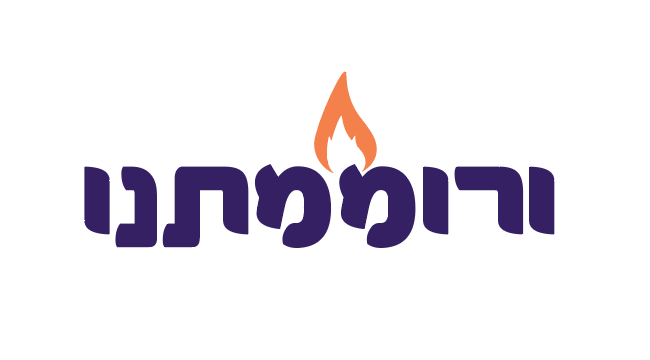
Hi! I was asked to do this logo for a technology night event for all the mothers of the school and i came up with this… maybe someone can help me with ideas… they want a bit more elegant… but at the same time very impressive and eyecatching
thanks
Did you mean to attach something?
Nice!
I wonder if going for a thinner font would make it more elegant.
I think the fire is overused on technology logos… but I like the logo style though
You may want to go with a font that has sharper edges, this one feels a little more playful than it should be.
I agree with @9618, the fire is a little overused. What about an arrow or something else connected to growth?
the fire is to convey danger not growth, no?
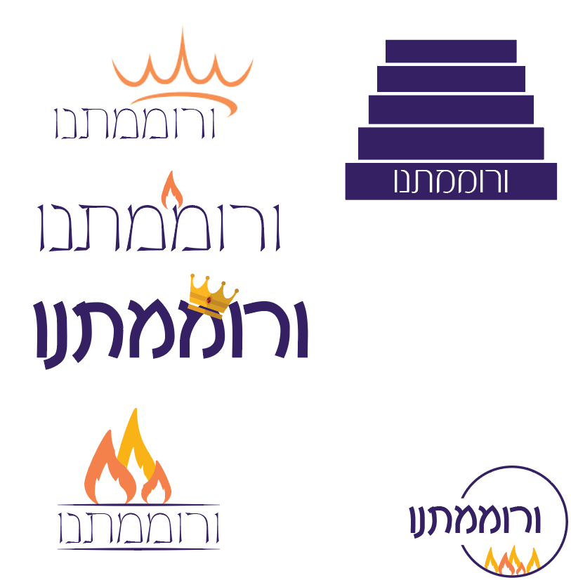
thank you everyone!! came up with this so far… since the name of the event is veromamtanu that Hashem elevated us it can be a crown or a ladder… .steps… i tried a few other options so far… what do you think??
Very nice!
I like the top one with the crown. its more elegant and I like the idea of the crown, it brings out a nice message. maybe make the crown a bit smaller.
the one with the single flame is also very nice.
also, maybe make the font in the crown one a drop more bold.
I like the top one with the crown.
I agree to make the crown a drop smaller. And the font a drop bolder.
Also make the stroke of the crown match the font. The thickness should be consistent.
like the abstract crown best. would make it a little smaller, and the words with a tiny bolder font
Thank you so much everyone for your opinion!! School chose the abstract crown as well 