So I am looking to earn some parnassah for my Mishloach Manos and for cleaning help for Pesach. So I am creating a logo to work with. Please lemme know what works and what doesn’t in the logos you see below. Constructive criticism allowed.
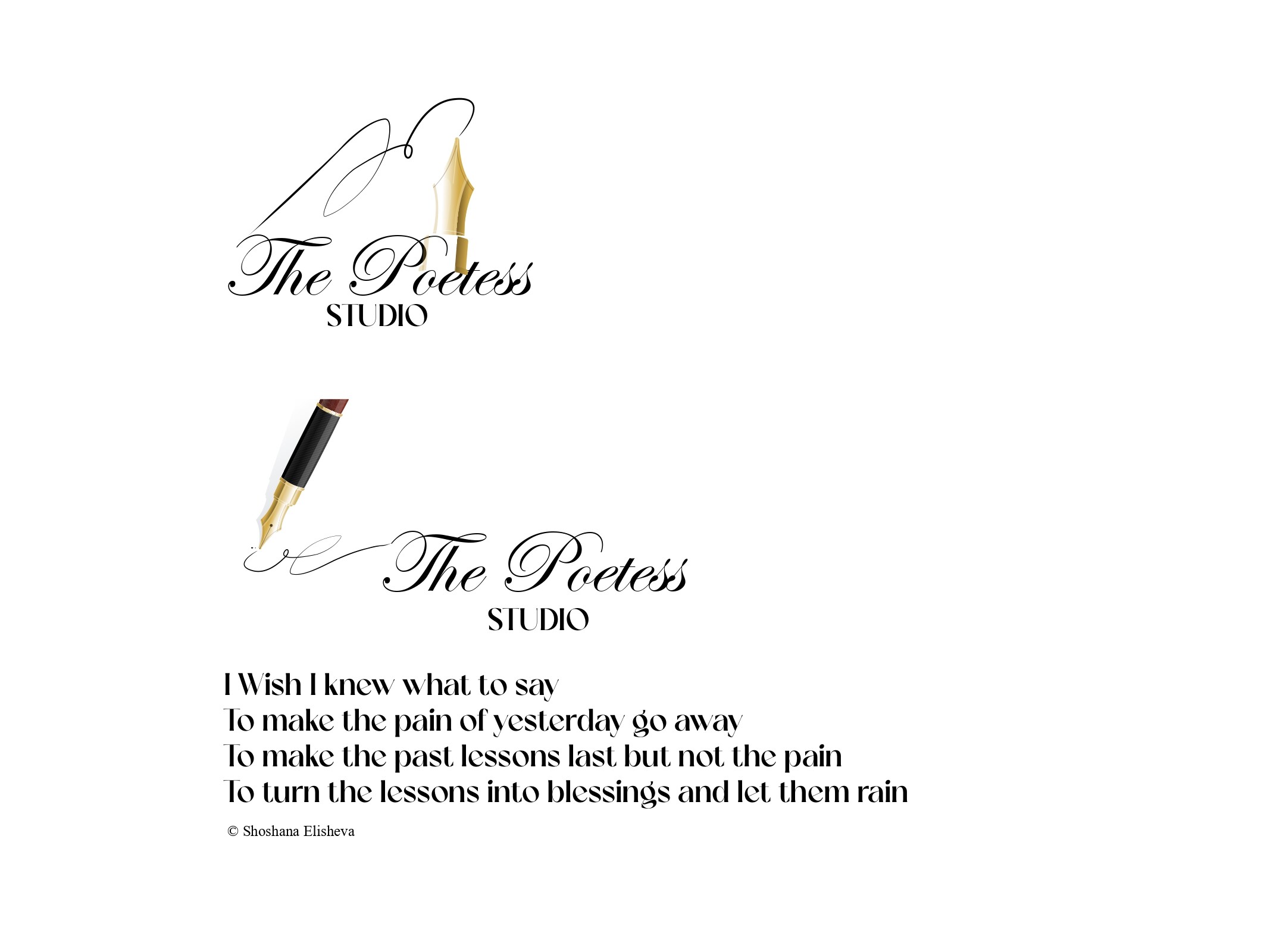
I prefer the second one. Looks very good!
Second being with the pens tip facing down?
I like the second, but maybe you can figure out a way to integrate the pen better. Right now it’s very detached from the words. Maybe move it closer and make it integrate better.
That could work. Thanks!
Like meaning not be too far away from the T and closer to the bottom? That work?
Yes, or I’m thinking if you can change the word studio to script and attach the pen there and The Poetess to a sans serif. Also if you can align the word studio right then the pen can fit in the space underneath the word The.
The pen should be drawing the T for the word The
Lots of ideas! Once I get to my computer after Shabbos, I will implement them! Thank you! We’re not done yet but we’re getting there. Thanks for your help and input and would love to see them come in for the second rendition and on. Thank you!