Hi,
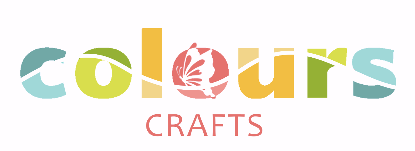
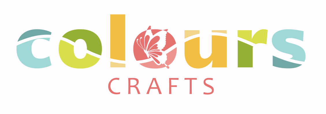
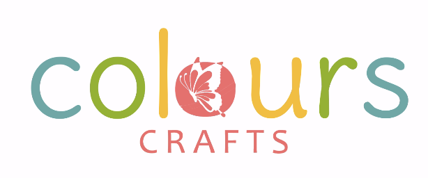
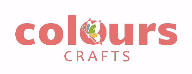
I’m designing a logo for a craft company. Any critic? And which one of these 2 look better?
Thanks!
Hi,
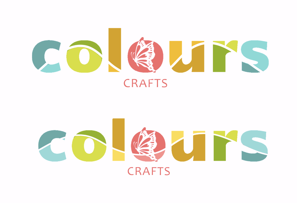
I’m designing a logo for a craft company. Any critic? And which one of these 2 look better?
Thanks!
Love it!!
I think the bottom one looks a bit better, though it took me time to chap what the diff is, so its prob not such a diff on which you decide
I like the bottom one even better. It flows even nicer. Really nice!
yup really nice! i like second one best.
Thanks! What about the colors? Are they too serious?
Really nice- I like the second one better
my thoughts re the colours was that it’s cool that you made it colourful without using rainbow colours (not that there is anything wrong with rainbows but i am shying away from them now that the world associates them with other things)…
i think they work well but u cud always try diff combos…
love it! so creative and sharp and also i like the pastel colors - not too bright or too plain
great job! 
and i also like the second one better
Love it! Love the colors you chose. Did you come up with this idea? Its amazing!
Really nice! I think its a bit much though i would probably take away the butterfly as at small sizes it will be very hard to see and increase the line then going through the words. And crafts at the bottom also needs to be much bigger in proportion to colours, again image the logo at a small size you want to be able to see it clearly
Thanks so much for the feedback! How does this look? I made the butterfly simpler and tweaked the colors a drop…
Just a small detail… the tiny triangle sticking out of the C is bothering me… Maybe you can move the line so that it is either a bigger triangle or take it off…
You’re right, thanks
looking good, i would love to see how it looks without the butterfly at all… did they request it specifically coz otherwise i think it could look rly neat without it… and i agree that the little triangle shouldnt be there and for crafts i would increase the leading a lot it should look more like this
just so you could see what i mean
Love it
They did want the butterfly…
I tried moving the line so the c should look better, does it look off if it’s not centered?
Really nice! You might want to try shrinking the butterfly so it doesn’t stick out of the o
thats what i like about it 
I like the first one