Hi! I was asked to design a logo for a company’s 50th anniversary. Are any of these sketches good enough to send to the client?
Any advice/feedback is welcome! ![]()
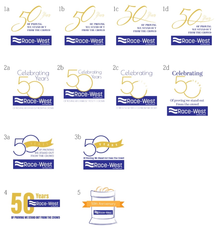
It’s for a company that distributes produce. The last one is supposed to be a bag of potatoes. I’ll develop it more if the client likes that idea.
I love all of them!
i would choose 3a however the words next to it should be a little smaller so theres more space between the words and the 0 from 50. Also i would do lowercase words cap first letter.
They look great! Agree about 3a, but would like to see the word “Years” a little bolder.
3a or 3b!
Thanks so much! I like that one a lot! I made those changes. The font that I used for the 50 doesn’t have a bolder font. Do you think I can use a different sans serif font for the word “years” or should I not use another sans serif font?
Are there any other ones that I should show to the client? I want to give a few options.
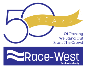
It’s looking great! What if you keep the font and add a small white stroke to make it thicker. Option 1d is a nice classy option, and 2d is neat and uniform. I would just make sure the word “years” is in a simple bold sans serif font, to be more clear and stand out more.
Good idea! I’ll try that.
Also, would I charge the same amount as a regular logo? Or is it less because they already have a company logo and I’m just adding “50 years” and their tagline?
I would say maybe 75% of what a logo costs?
these look great NechamaH - i love how you write ‘are any of these good enough to send to client’! i love how you played with the number 50…
Agreed!